How to build a sales one-pager in Flex
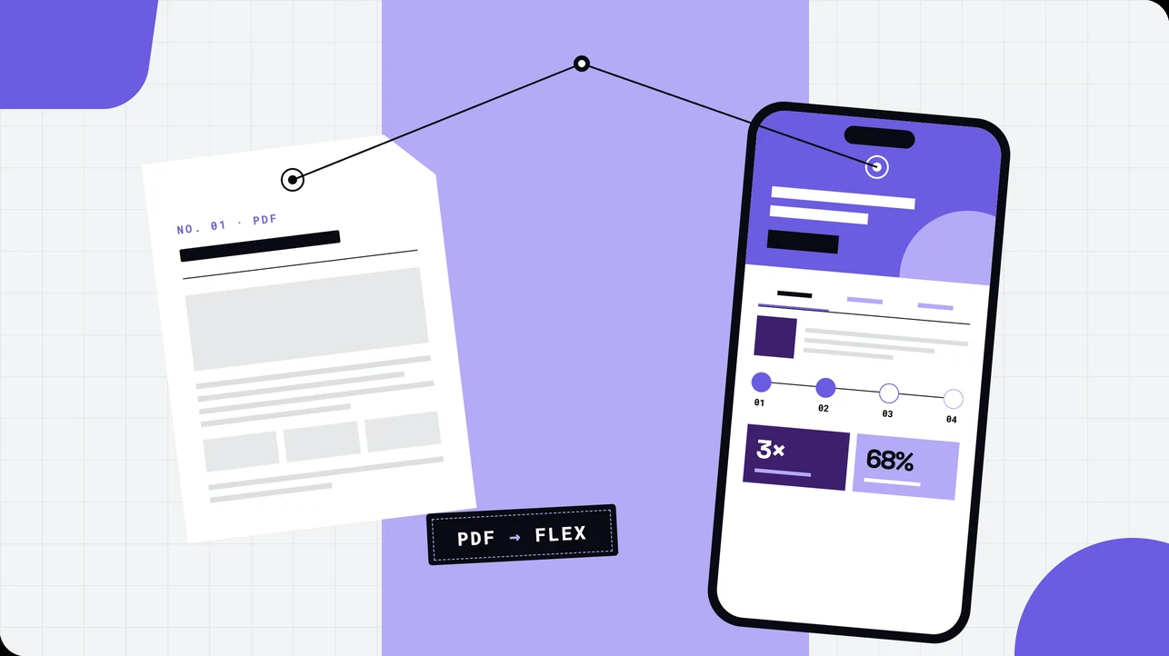
Replace the static PDF you send after a first call. Build a mobile-friendly sales one-pager in Flex with tabs, a timeline, and proof from one prompt.
BY Lydia Burns
October 23rd 2026 – 9 minutes
GUIDES & TOOLS
How to build a sales one-pager in Flex
A sales PDF has one job: get forwarded. Most never do. They open on a phone, pinch-zoom into columns nobody can read, and sit in an inbox until the deal moves on. A Flex one-pager lives at a link, reads on any screen, and updates in one place when your pitch changes. Here's how to build one from a single Flex AI prompt.
What is an interactive sales one-pager?
An interactive sales one-pager is a single-page web experience that does the job of a static PDF leave-behind. It summarizes who a product is for, what it does, and why it works, using tabs, a timeline, and proof points instead of fixed columns. Sellers send it as a link, and it adapts to any screen.
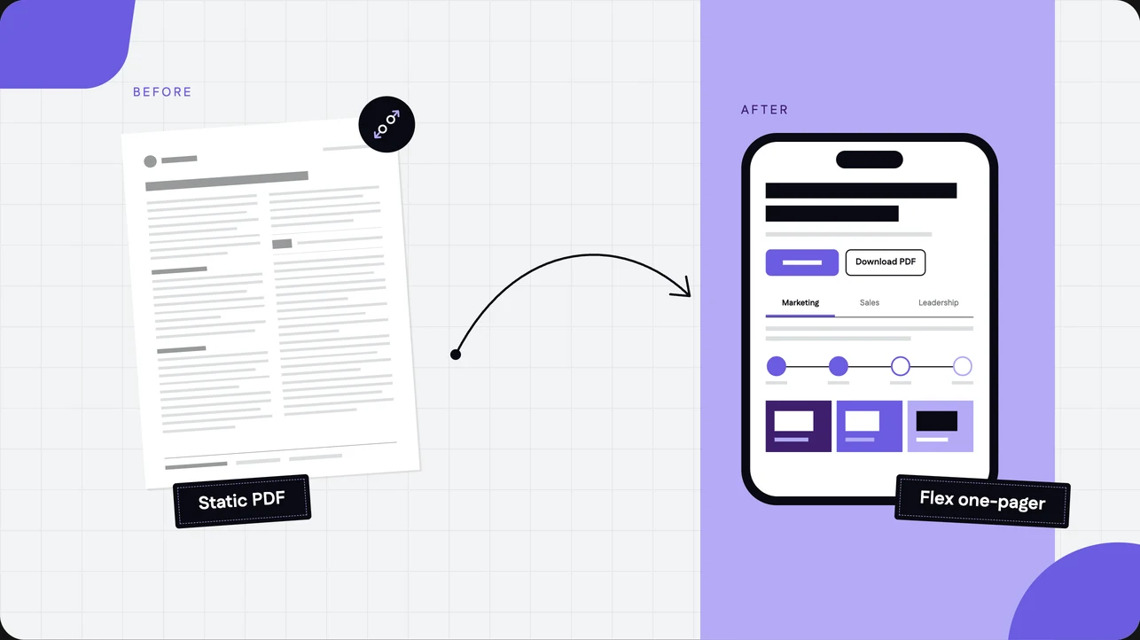
From PDF to page
Picture the PDF your team sends after a first call. Fixed columns, a logo, a paragraph about the product, a contact line. It's fine on a laptop. On a phone, where plenty of forwarded emails get opened, it's pinch and squint.
The Flex version keeps what the PDF did well, a single page a buyer can scan in a minute, and fixes the rest.
Static PDF | Flex one-pager | |
|---|---|---|
On a phone | Pinch and zoom | Fully Responsive layout built for small screens |
Different readers | One version for everyone | Tabs give a marketer, a seller, and an executive their own pitch |
How it works | A paragraph of text | A timeline a buyer can scan |
Proof | A logo strip, if you're lucky | Stat callouts and a customer quote |
Updating | Edit, export, re-send, hope | Edit and republish, and the link stays the same |
Still need a file | That's the PDF | A Download PDF button right in the hero |
Plan the page: six sections, one job
Decide the job before you open the canvas. This one replaces the PDF a seller sends after a first call, so every section earns its spot by answering a question the buyer has at that moment.
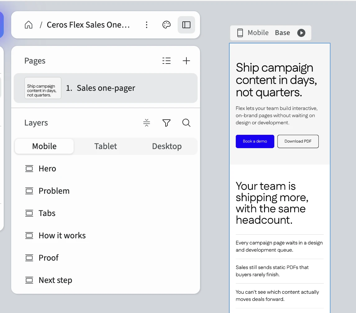
Hero. A headline that states the outcome, one supporting line, a primary button, and a Download PDF button beside it.
The problem. Two or three short lines on what your buyer is dealing with today. No more than one screen tall.
Tabs. One tab per reader. Each gets a short headline, three one-line benefits, and a small image or icon.
Timeline (How it works). A four-step "how it works," from first call to launch, with rough timing for each step.
Proof. Three stat callouts and one customer quote.
Next step. A closing headline, the same primary button as the hero, and a name and email for the seller.
The example in this guide is a one-pager a Ceros seller sends to a VP of Marketing at a mid-size company, with tabs for marketing, sales, and leadership.
Build it with one Flex AI prompt
Skip the blank canvas. Paste this into Flex AI, swap the bracketed parts for your own details, and you'll have a first draft in a few minutes.
Build a mobile-first, single-page B2B sales one-pager for [product or service name], aimed at [buyer role, e.g. a VP of Marketing at a mid-size company]. Use Fully Responsive mode. Keep the copy short and the layout simple enough that a small team can update it in minutes. No heavy animation.
Use this order:
1. Hero. A headline that states the outcome the buyer gets, one supporting line, and a primary button that links to [URL, e.g. book a demo]. Add a "Download PDF" button next to it that links to [PDF URL].
2. The problem. Two or three short lines on what [buyer role] is dealing with today. No more than one screen tall.
3. Tabs. Three tabs titled [Tab 1, e.g. For marketing], [Tab 2, e.g. For sales], and [Tab 3, e.g. For leadership]. Each tab has a short headline, three one-line benefits, and a small image or icon. Make it easy to swap a tab's copy without touching the layout.
4. Timeline. A four-step "how it works" timeline from first call to launch, with a short label and one sentence per step. Include rough timing like "Week 1" for each step.
5. Proof. Three stat callouts using [stat 1], [stat 2], and [stat 3], plus one customer quote from [name, title, company].
6. Next step. A closing headline, the same primary button as the hero, and contact details for [rep name and email].
Style: [describe brand, tone, colors, fonts, or say "use my Brand Kit"]. Use a clean white or light background, large readable type, and generous spacing. Make every section its own group so I can reorder or delete it. Name the layers clearly.
Two lines in that prompt do the heavy lifting. "Make every section its own group" means you can drag a section up, down, or into the trash without untangling anything. "Name the layers clearly" means you'll still know what you're looking at next month.
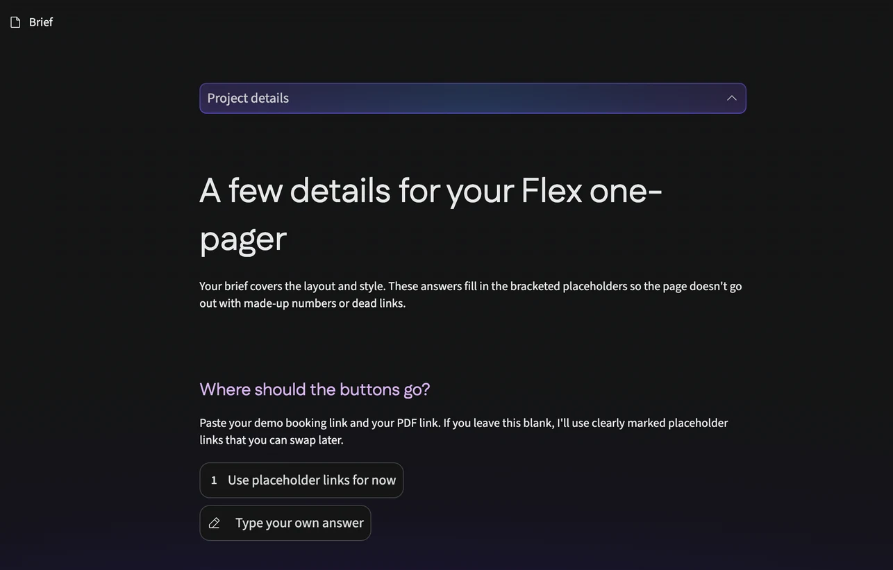
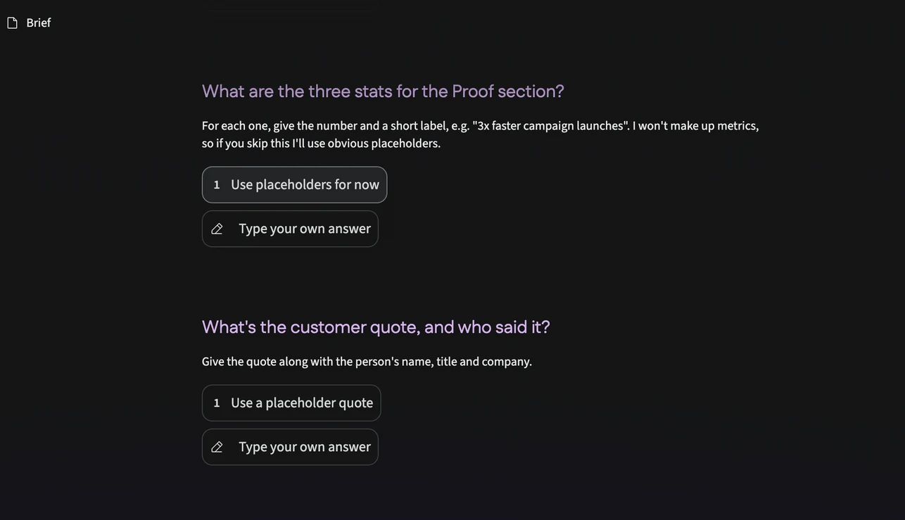
Flex AI will ask a few follow-up questions before it builds, and they only cover the bracketed parts: where the buttons link, your three stats, and the customer quote. Answer what you can. If you skip one, Flex AI uses clearly marked placeholders and doesn't make up numbers or links. Find them all before you publish.
Swap in real proof
Placeholders are fine for a first pass. They can't go out in a seller's email. The proof section is the one place to be strict: use numbers you can source, and say where they came from.
Because you're showing Ceros experiences in the sales process, the example stat here comes from a team that uses them in theirs: 16% more likely to close deals that used Ceros content (MX Technologies). Add two more of your own, with a source, and a real customer quote with a name, title, and company.
Retitle the section while you're there. "After switching to Flex" claims more than numbers like these do, so "What teams see with interactive sales content" is the honest version. Then ask Flex AI to make the swap:
Update the Proof section. Change the heading to "What teams see with interactive sales content." Replace the first stat card with: "16%" labeled "More likely to close deals that used Ceros content (MX Technologies)". Replace the other two stat cards with [stat 2 and label, with source] and [stat 3 and label, with source]. Replace the quote with [quote], attributed to [name, title, company]. Keep the existing layout and styling.
Your own numbers go in the same slots. If you don't have three yet, leave a labeled placeholder rather than rounding something up.
Fine-tune it with components
Flex AI gets you the structure. Three pieces are worth knowing by name, because they're what you'll tweak most or swap in when you want more control.
Tabs. The reason one page can talk to three readers. Each tab holds its own headline and benefits, so changing the pitch for one reader doesn't touch the others.
Timeline. Turns "how it works" from a paragraph into four steps a buyer can scan in seconds. Keep each step to a label, a week, and one sentence.
Download button. Keeps the PDF for the readers who still want one, like a procurement lead who needs a file for the deal folder. Link it to a PDF export of the page, and the PDF never drifts from the page.
When you paste a component into your build, it only picks up your Brand Kit if the token names and values match exactly. If they don't, reapply the colors and fonts yourself. Check the page after every paste.
Make it yours
Open the page and edit like you would any Flex build. Change a tab's copy, reorder a section by dragging its group, or delete the timeline if your sale doesn't need one. Because every section is its own group, none of those changes ripple into the others.
A few edits take two minutes and pay off right away. Rewrite the hero headline so it names the buyer's outcome, not your product. Cut the problem section to its strongest line. Put a real person's name and email in the next step, because a form with no face attached gets ignored.
Publish and share it as a link
Publish the experience, then paste the link wherever the PDF used to go: the follow-up email, the CRM sequence, the deck's last slide. Keep the Download PDF button live for anyone who still wants the file.
If you plan to embed the page on your own site instead, publish first. A preview link won't load once it's embedded.
Best practices
Use Fully Responsive mode. A one-pager gets opened on whatever device the buyer has in hand. Fully Responsive mode is built for that, and Scale mode isn't.
Give each tab one reader. If a benefit would fit under two tabs, it's too vague for either. Rewrite it until it only fits one.
Keep the hero to one decision. A primary button and a Download PDF button is the limit. A third option splits attention and weakens both.
Source every number. A stat with a name next to it holds up when a buyer forwards the page to their boss. A stat without one doesn't.
Check it on your phone before it goes out. Open the published link on a real device, tap every button, and read the proof section out loud. If anything makes you squint, fix it.
Bonus: prompts for building from scratch
Rewriting for a new buyer:
Rewrite the hero, the problem, and the three tab headlines for [new buyer role]. Keep the existing layout and styling, and keep the copy short.
Building the timeline on its own:
Add a four-step "how it works" timeline from [first step] to [last step], with a short label, one sentence, and rough timing for each step. Make it fully responsive and match the rest of the page.
Adding a quote section:
Add a customer quote section with a large pull quote from [name, title, company] and a small headshot or logo. Use my Brand Kit and keep it to one screen.
Specific inputs get you a usable result fast. Vague prompts are where the back-and-forth creeps in.
FAQ
FAQs
Ready to retire your next sales PDF? Start building in Flex for free and paste in your first prompt.