How to build a data-driven report in Flex
Turn a chart-heavy report into an interactive Flex experience. Pick the right data-visualization components, know when to reach for Graphy, and ship a report built for the web.
BY Mary Mattingly
October 2nd 2026 – 7 minutes
GUIDES & TOOLS


How to build a data-driven report in Flex
A report full of static bar charts is just a PDF with extra steps. Flex turns the same data into something people actually click through, scroll into, and remember, using components that already exist in the library. Here's how to build one, piece by piece.
What is a data-driven report?
A data-driven report is a document built around charts, stats, and metrics rather than narrative, such as a benchmark study, quarterly review, or performance recap. In Flex, it's built from data-visualization components instead of static images: charts, dashboards, and graphs readers can click through and filter, instead of screenshots pasted into a PDF.
Two ways to make a report data-driven
Not every data-driven report is doing the same job. Before you open a canvas, know which one you're building.
The data-led report treats the data as the whole point, and every component on the page carries the story. Vantage Development Group's 2026 market report builds its entire landing page around the numbers: stats like 840+ projects and $1.8T in transactions lead straight into scroll-triggered headlines, stacked cards, and an interactive self-assessment tool, with no separate narrative layer. Wunderkind's industry report goes even further on the data side: timelines and dynamic charts break findings into scrollable, click-to-reveal moments instead of one long narrative thread.
Data-backed thought leadership uses data to support an argument the report is actually making, relying on a single well-placed chart or stat to prove a claim rather than a data-first structure. Think a bar chart dropped in to back up a performance claim, or a stat carousel running through the middle of an argument before the piece closes on a references list to earn credibility. The data earns the point; it doesn't carry the whole piece.
Same components, different job. A data-led report can afford to put a dashboard front and center; thought leadership usually needs just one well-placed chart to land the point.
Start from structure, not components
Pick your shape before you pick your charts. Grab a report template from the Ceros library as your starting canvas: the interactive state of the industry report template and the annual report template are both built for this. Then bring in your brand.
A quick note before you paste anything in: Brand Kit only re-skins a component automatically when both the token name and the token value match your account's Brand Kit exactly. If your primary color is set as primary: #1A1A1A in the source component and your Brand Kit also defines primary as #1A1A1A, it carries over. Anything that doesn't match that precisely, including most backgrounds and some custom fonts, won't apply and needs a manual pass. Budget time for that pass rather than assuming a paste-and-go rebrand.
Build your component toolkit
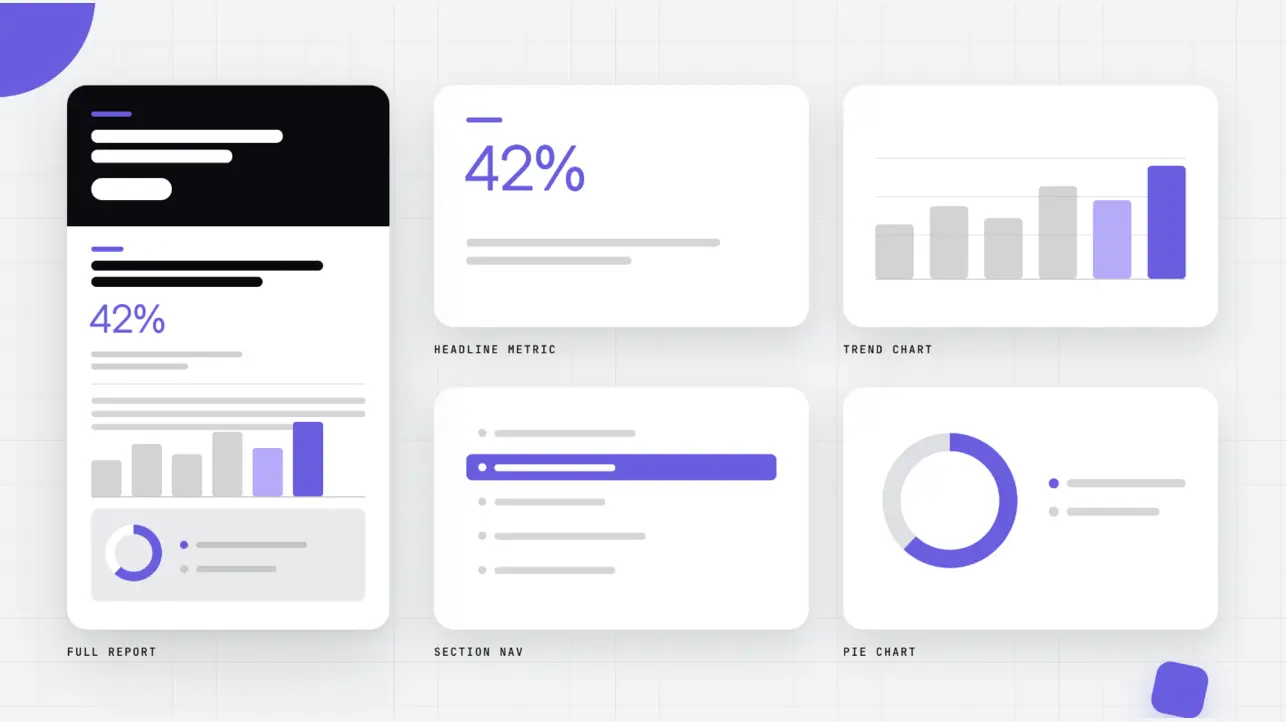
Four components from the data-visualization library cover most of what a report needs. Pick based on the job, not the prettiest preview.
Compare categories. Reach for the interactive data chart for a straightforward bar or column comparison, lining up values side by side.
Show a proportional breakdown. The interactive pie chart lets readers navigate through the list rows beside the chart to see each segment's value.
Track multiple metrics at once. The analytics data dashboard is modular by design (more on that below).
Tell one stat as a story. The interactive infographic ring chart is good for a narrative or segmented breakdown.
Treat the dashboard as a kit, not a finished page. The Analytics data dashboard comes packed with several modules at once, and the whole thing can read as busy if you drop it in untouched. Import it onto your canvas, then delete what your report doesn't need. If you only need to show a trend over a set time period, keep the line-chart module and remove any bar-chart or card modules that aren't relevant. You're not stuck with the full dashboard just because that's how it arrived.
When you need a real chart, reach for Graphy
Flex isn't a chart-creation tool, and it was never meant to be one. For anything beyond the library's preset components, build the chart in Graphy and embed it.
The payoff: a Graphy chart tied to a live Google Sheet or Excel file updates automatically when the source data changes, no re-embedding, no republishing. That's what makes a report genuinely "living" instead of a snapshot you have to rebuild every quarter.
Two things to plan around. Graphy generates one chart per data-selection action, so a report with several charts off one shared dataset still means setting each chart up individually. And Graphy's output isn't currently ADA-compliant, worth flagging early if you're building for a regulated industry or any customer with accessibility requirements.
What the SDK can and can't do here
The Flex SDK updates components that already exist on your canvas. It won't dynamically create or clone new instances from a dataset. If your report needs a variable number of chart elements or cards depending on the data, that's a job for a custom HTML/JS block, not the SDK.
One more limit worth knowing before you plan a build: the SDK and Graphy don't talk to each other. The SDK can show or hide a Graphy embed that's already on the page, but it can't reach into that embed and change the chart's underlying data. Plan your data flow around that boundary rather than discovering it mid-build.
Best practices
Keep Brand Kit token names simple. Stick to letters, digits, hyphens, and underscores. An unusual token name can run into validation issues down the line, so it's worth getting this right from the start rather than fixing it after the fact.
Flag Graphy's accessibility gap early, not after a customer asks. If the report is headed to a regulated industry or has to meet accessibility requirements, say so up front.
Turn on progressive image loading and lazy loading for chart- and dashboard-heavy pages. See how to set image load priority in Flex for the exact toggle. Large PNGs and video-converted images are the usual reason a data-dense report feels slow; the Flex performance guide covers more fixes if lazy loading alone doesn't solve it.
Test your Brand Kit paste before you build the whole report. A five-minute check on one component saves you from rebuilding a dozen after you discover the tokens didn't carry over.
If the report ends in a PDF download, build the teaser, not just the link. Surface the key stats and charts as the interactive Flex experience itself, then pin a download CTA, like an animated button or a pop-up modal, rather than a flat link out to the file. It's a stronger funnel than a static download landing page, and it's the direction most Ceros customers are already moving toward.
FAQs
Ready to build your own? Start a free trial and pull these components straight into a canvas.