How to build an interactive resource hub in Flex
Replace a static resources page with a browsable Flex hub. Pull a Discovery Grid, category tabs, and tagged resource cards from the library and publish in an afternoon.
BY Lydia Burns
September 25th 2026 – 6 minutes
GUIDES & TOOLS
How to build an interactive resource hub in Flex
Most "Resources" pages are a bulleted list sorted by publish date, and nobody scrolls past the fold to find anything. Build the same hub in Flex, and visitors can actually filter by format, spot your best three picks without hunting, and land on the one guide or case study that's relevant to them. Here's how to build one, using the same Components Library as the rest of this series.
What is an interactive resource hub?
An interactive resource hub is a Flex experience built to replace a static resources or content library page. Rather than a plain list of links, it organizes guides, case studies, webinars, and templates into a browsable grid that visitors can filter by category or format. It keeps the reach of a traditional resources page while making the content easier to discover, easier to scan, and easier to act on.
Start with what's already scattered across your site
You don't need new content to build this. You need an inventory: every guide, case study, webinar recording, template, and one-pager currently living on your blog, in a gated PDF, or on someone else's platform. Pull the list together before you touch the canvas — a hub built from an incomplete inventory just becomes another page people stop trusting.
Once you have the list, sort it into a small number of categories: by format (guide, case study, webinar, template) or by topic (whatever your prospects actually search for). Keep the category count low. A hub with three tabs gets used; a hub with eleven gets ignored.
Reach for the right components
The Components Library has the pieces of a content hub, rebuilt for the web. Here's what to reach for, organized by the job each one does.
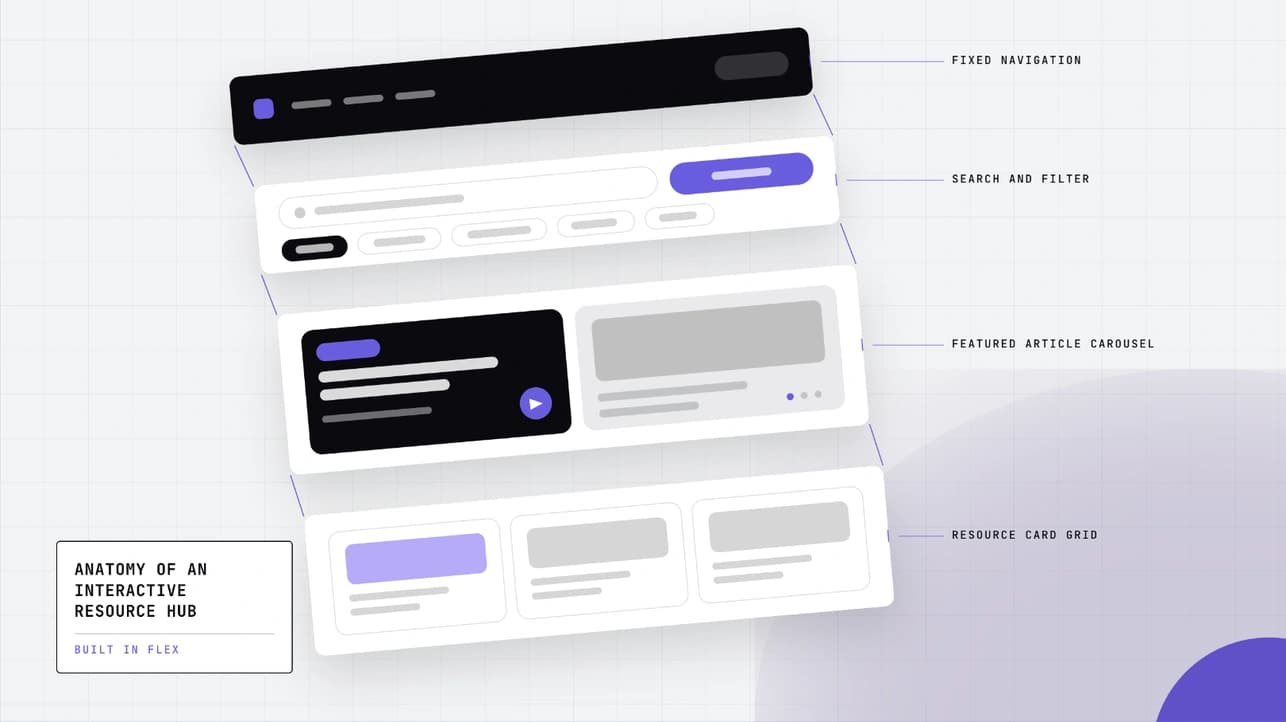
Let people browse everything at once. A Discovery Grid gives visitors a scannable, filterable view of your whole library instead of a scroll-and-hope list.
Group resources by category. A multi-category tab module turns your inventory's categories into a clickable filter, so a visitor looking for webinars never has to wade through case studies to find one.
Make each resource scannable. A tagged product card gives every resource a consistent shape: a label for its format, a one-line description, and a CTA that matches what happens next (read, watch, download).
Put your best picks up front. A bento-grid block above the main grid highlights your three or four strongest resources before a visitor starts filtering, the same way a homepage leads with its best case study instead of its newest one.
Let people jump straight to a category. An anchor navigation menu turns your category list into a jump-to nav, useful once the hub grows past a single screen.
Pull whichever match your inventory — a small hub might only need the grid and the tagged cards; a large one will use all five.
Drop them onto your canvas
Every component page has a Copy component button. Click it, open your Flex canvas, and paste — same workflow as any other build in this series.
A couple of things worth knowing for a hub build specifically:
Keep your tags consistent. Decide on a fixed set of category and format tags before you start populating cards. A hub with "Guide," "guides," and "How-to" as three separate tags stops being a filter and starts being clutter.
Don't let the grid outgrow the page. A Discovery Grid with 200 resources in it is a wall, not a hub. Paginate it, cap what's visible by default, or split a large library into a hub-of-hubs by content type.
Layer in the SDK
This is where the hub stops feeling like a list someone moved onto a canvas. Flex SDK powers anything logic-based — a tab that filters the grid instead of just scrolling to a section, a card that tracks which resource actually gets clicked, a featured block that rotates based on what's trending.
Name it before you script it. Whatever you're driving — a tab filter, a grid, a card — give it a locator in the SDK Locators inspector. That's what your script, or Flex AI if you're prompting it, hooks into.
A pattern worth knowing: wire your category tabs to filter the grid by a tag property on each card, instead of publishing a separate grid per category. It's the difference between a hub that scales as you add resources and one you have to rebuild every time you add a new one.
Worth tracking once the hub is live: which cards actually get clicked, and which category tabs get used versus ignored. Wire a click event to each card's locator, and you'll know within a month whether your "webinars" tab is pulling its weight or whether nobody's touched it since launch. That's the kind of signal a static resources page never gives you.
What about resources that live somewhere else?
Not everything in your inventory needs to be rebuilt natively in Flex. A gated PDF, a webinar recording hosted on your video platform, a third-party tool your team doesn't own — these can still get a tile in the hub. Treat the resource card as a pointer: the tag and description live in Flex, and the CTA sends the visitor wherever the actual asset lives. You're not migrating your whole content library into one canvas; you're giving it a front door.
Best practices
Match the tag taxonomy to how visitors actually search, not how your team organizes internally. "Guide," "case study," and "webinar" mean something to a visitor. Your internal content-calendar labels probably don't.
Feature sparingly. A featured section that shows ten resources isn't featuring anything. Cap it at three or four and rotate it on a schedule, not every time someone on the team has a favorite.
Check the hub on a phone before you publish. A filterable grid with five tab categories is the first thing to break on a small screen — test that the tabs and grid still work stacked, not just side by side.
Bonus: prompts for building from scratch
Turning an inventory into a first draft:
Build a fully responsive resource hub experience with a featured section up top, category tabs for [list your categories], and a filterable grid below. Use the actual resource titles and links I provide — don't generate placeholder content.
Building a tagged resource card:
Create a resource card component with a category tag, a one-line description, and a CTA button that reads [read the guide / watch the webinar / download the template]. Match it to [describe layout/tone].
Building a category filter:
Build a tab module that filters a grid of cards by a tag property when a category tab is clicked. [Describe the categories and how many cards each should show.]
The pattern holds across this series: specific inputs get you a usable result fast. Vague prompts are where the back-and-forth creeps in.
How to build an interactive resource hub in Flex FAQs
There you have it!
Ready to give your content library a front door? Start a free trial of Flex and pull your first component onto the canvas.