How to build a landing page in Flex using the components library
Build a landing page in Flex using pre-built components — no dev queue, no design bottleneck. Assemble a hero, feature layout, and CTA in under an hour.
BY Lydia Burns
September 4th 2026 – 5 minutes
GUIDES & TOOLS
How to build a landing page in Flex using the components library
A landing page shouldn't take three days and two rounds of dev tickets. In Flex, it doesn't. Pull a hero, a feature layout, and a call-to-action straight from the Components Library, swap in your own colors and copy, and you've got something worth shipping before lunch.
What is the Ceros Components Library?
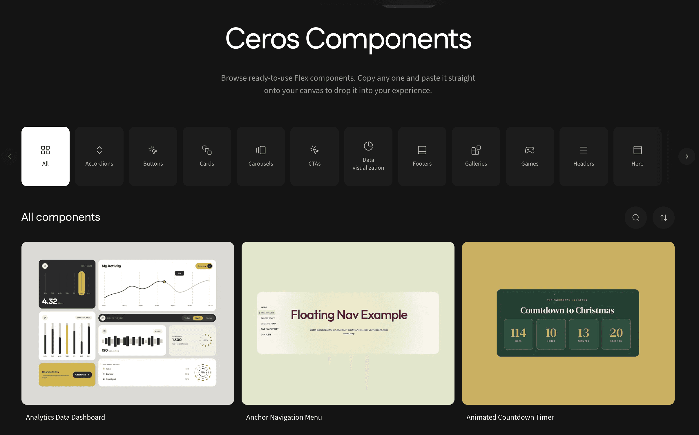
The Ceros Components Library is part of Flex Inspire, our library of ready-to-use components and templates. It's a collection of 100+ pre-built, fully designed elements—heroes, feature layouts, buttons, charts, and more—that you can copy directly onto a Flex canvas. Instead of starting from a blank page, you start from a finished, professionally designed piece and adjust it to fit your brand and your message. No dev queue. No design bottleneck.
Here's what building a landing page with it actually looks like, start to finish.
Start with a hero
Every landing page needs an opening that earns the scroll. In the Components Library, the hero section category has several options built with knockout text effects and full-bleed imagery. Get the kind of visual weight that usually takes a designer an afternoon to get right, in seconds.
Once you’ve copied it into your workspace, you're editing, not building. Swap the headline, drop in your own image or video, and adjust the subhead to say what your page is actually about. The layout, spacing, and motion are already solved.
Build out the middle with a feature layout
This is where most landing pages either earn attention or lose it. The component library includes card and grid components. Things like interactive cards, flip cards, and image card fans that you can arrange into a clean, three-or-four-across layout to walk visitors through what you're offering.
Duplicate a single card, line up two or three more beside it, and you've got a feature section without touching a grid system or fighting with alignment. Each card holds its own icon, headline, and short description, so the structure does the organizing for you.
Close with a call-to-action
A landing page without a clear next step is just a nice-looking dead end. The Components Library has purpose-built CTA components for exactly this. Try a "Get in touch" button, a download button, or a demo button. Each is animated and ready to drop in, just pick the one that matches what you actually want a visitor to do.
If the goal is a conversation, use "Get in touch." If it's a resource, use the download button. Be sure not to stack all three. One clear ask converts better than three competing ones.
Make it yours
This is the step that separates a landing page that converts from one that reads as generic. Once your hero, feature layout, and CTA are on the canvas, go through each component and adjust the colors and typography to match your brand.
A quick note on this: Brand Kit's automatic sync for new Inspire components is coming soon, so for now, updating colors and fonts is a manual pass rather than a one-click apply. It's a few extra minutes of work, but it's the difference between a page that looks like yours and one that looks like a template with your logo on it. Adjust the type to match your existing site, swap the accent color, and check that image treatments feel consistent across all three sections.
Publish and share
Once it's built and on-brand, publish the experience and grab the link. Embed it on your existing site, drop it into an email campaign, or share it as a standalone experience. Ceros experiences are responsive by default, so the layout holds up on mobile without extra work on your end.
That's it! A hero, a feature layout, and a CTA, assembled from finished components and made your own in under an hour.
Frequently asked questions
Ready to build your own? Start a free trial of Flex and pull your first component onto the canvas.