Components
Toggle tabs
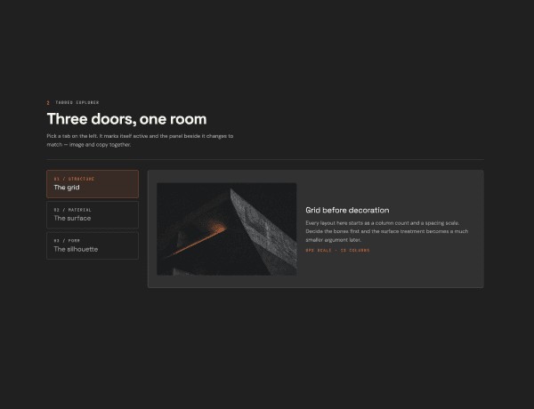
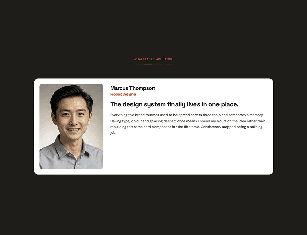
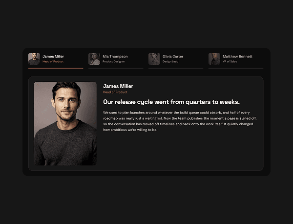
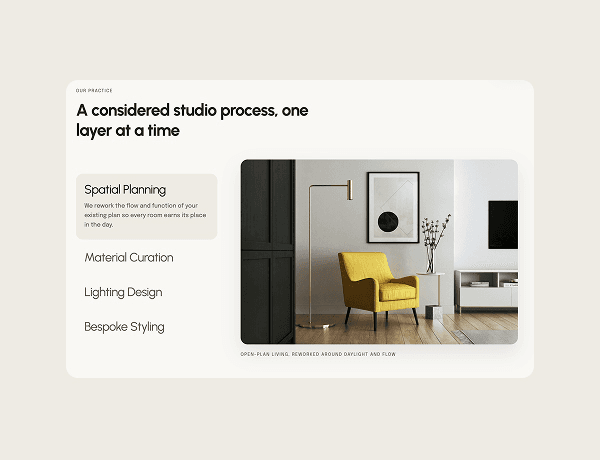
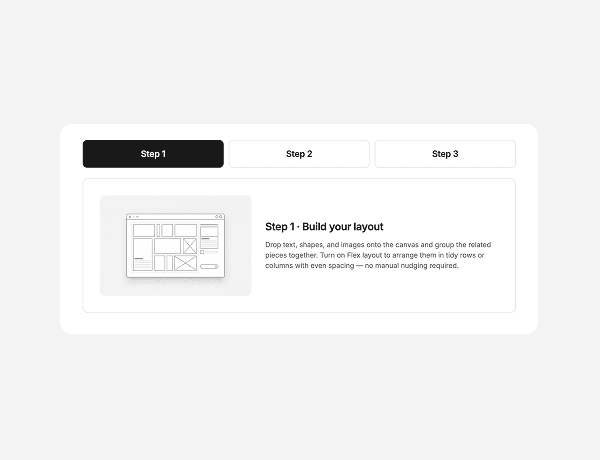
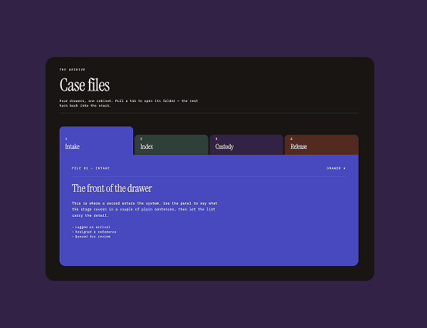
This interactive segmented tabs component provides an intuitive control for toggling between different UI states or display options. Built with smooth active states and visual feedback, it allows users to effortlessly transition between options such as light mode, dark mode, or alternative views.
Ideal for dashboards, settings panels, or product feature previews, this component features clear typography and responsive interactive states. Its minimalist design seamlessly integrates into modern web interfaces and digital experiences.
What Is Featured
Buttons
CTAs
Dark
Minimal
Responsive
Brand kit-ready
Tabs