Components
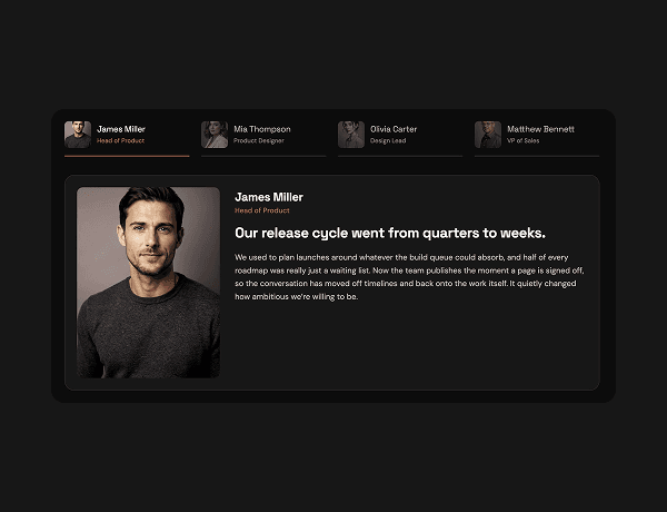
Tabbed content explorer
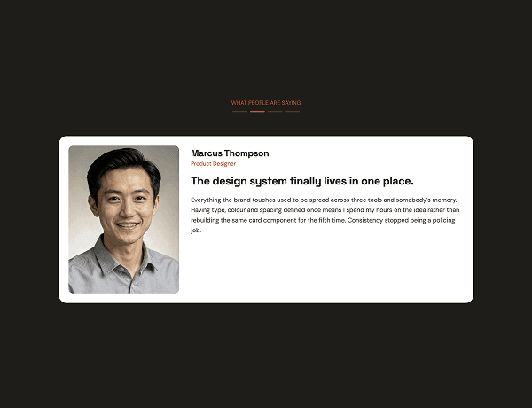
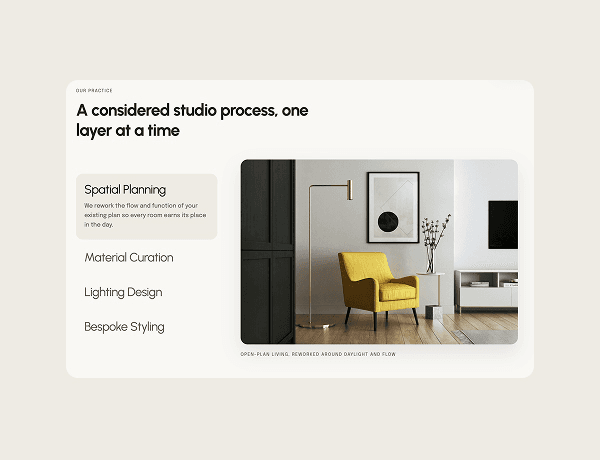
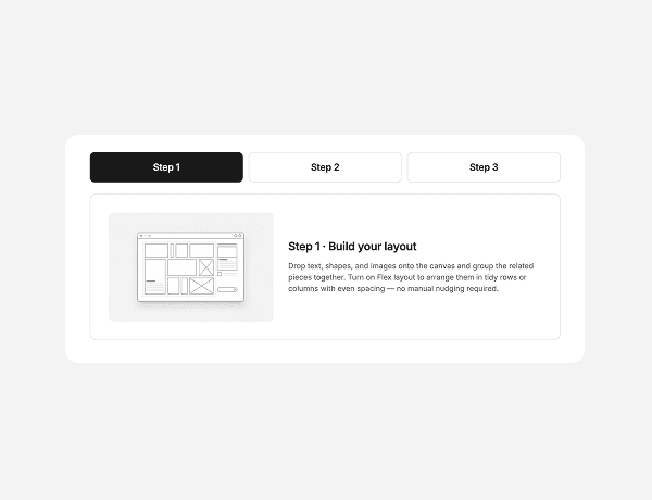
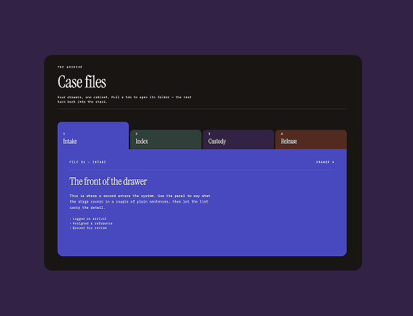
This interactive tabbed explorer component provides an organized, user-friendly way to display categorized information within a compact space. Users can seamlessly click through navigation tabs to reveal distinct content panels featuring cards, image modules, and structured text layouts.
Designed with modern typography and clean UI patterns, this component is ideal for product feature breakdowns, service offerings, or multi-faceted educational content. Its responsive structure ensures fluid adaptation across desktop and mobile interfaces without sacrificing usability.
What Is Featured
Tabs
Cards
Tabs
Cards
Hover interactions
Responsive
Minimal
Brand kit-ready
Dark
Content module