Meet Flex: Where design, speed, and performance come together
TLDR; With the launch of Flex, teams can now design, animate, and publish responsive content in one no-code platform built for speed, collaboration, and enterprise-grade performance.
For years, Ceros creators have pushed the limits of what’s possible with interactive content. But the game has changed. Today’s standards demand more: content that’s fast, responsive, accessible, and scalable from the jump.
That’s why we built Flex, the next evolution of content creation at Ceros. It combines everything you love about Studio — the freedom, the interactivity, the control — with a modern engine under the hood. One that’s built for real-time collaboration, lightning-fast publishing, and enterprise-grade performance.
BY Mary Mattingly
November 13th 2025 – 5 min read
PRODUCT
Meet Flex: Where design, speed, and performance come together
The creative workflow is stuck. Flex moves it forward.
Design keeps evolving. But the process is still playing catch-up.
Audiences expect content that adapts, moves, and performs beautifully on any screen. But for the people creating it, the workflow’s a mess. Most teams still juggle a patchwork of tools, designing in one place, coding in another, and testing in a third. Accessibility and performance are often afterthoughts. What starts as a creative spark gets buried in production hell.
And it slows everything down.
Flex changes that. It brings design, animation, and publishing together all in one place. Just one fluid design system that gets ideas out faster and makes the final product feel like the first inspirational spark.
Flex is built for results
Flex helps creative teams move faster, collaborate smoother, and publish content that actually performs. Because when every second counts and every click matters, your tools should fuel ideas, not fight them.
Teams already building with Flex are seeing the difference.
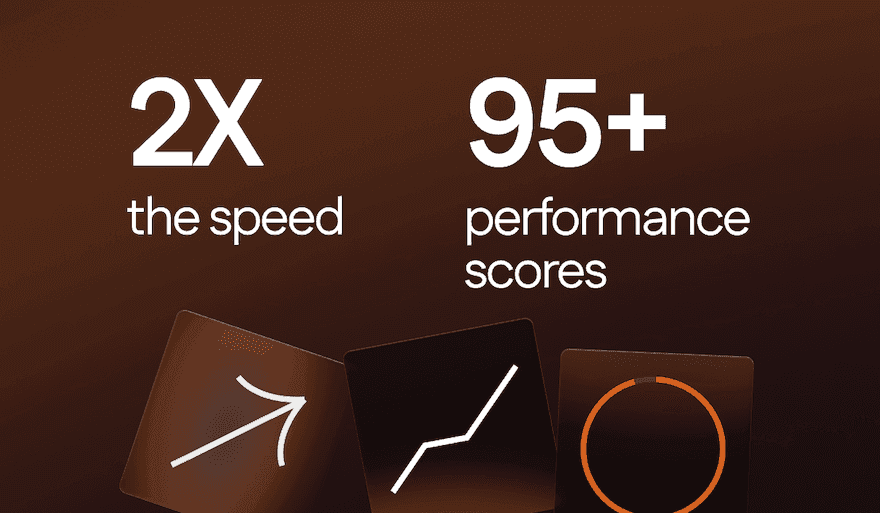
Early beta users saw it firsthand:
Lighthouse scores in the mid-90s for well-optimized builds
Dwell times up 80%
Click-throughs 10× higher than static content
2× stronger conversions
Flex shows that better performance isn’t just technical, it’s creative. When ideas move faster and content performs everywhere, your stories make a bigger impact.
With Flex, you can:
Build responsive, high-performing content in minutes
Collaborate and publish without developer handoffs
Ship work that loads instantly, ranks high, and keeps people engaged
Those results don’t happen by luck. Flex was built from scratch to pair creative freedom with serious speed.
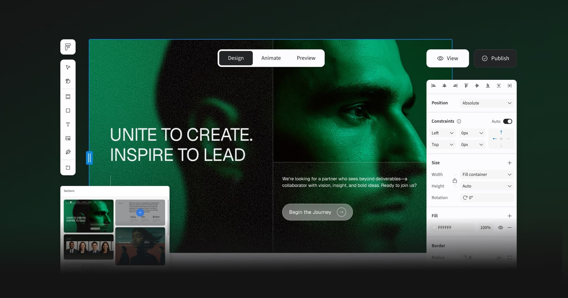
Flex delivers what creative teams asked for
Speed. Control. Performance. Flex brings it all together in one modern content creation system built for the way creative teams actually work. Here’s what sets it apart (and why it matters).
Reusable sections and components
Start with a library of clean, customizable layouts. Drop in your own copy, colors, and visuals. Every section is responsive out of the box, so they’ll look good anywhere you use them. Build faster, stay on-brand, and skip the pixel-pushing.
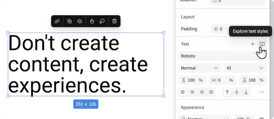
Global text styles
Stay on brand without thinking about it. Set your fonts and colors once, and they update across every layout. No more hunting down rogue headers or scrambling for last-minute fixes.
Responsive by default
Design once, publish everywhere. Flex adapts layouts automatically with cascading breakpoints that just work. Say goodbye to hours of endless mobile tweaks. Now, every experience feels intentional, no matter the screen.
Animate mode
This truly is motion made simple. Add scroll effects, fades, and parallax all in seconds. Preview as you go so there’s no guessing what it’ll look like live.
Real-time collaboration
Now your team can work together in real time, in one shared workspace. Everyone stays in sync. There’s no file versions, no silos, no endless pings. Just seamless collaboration that keeps creative momentum alive.
One-click publishing
Go live in a single click. Flex publishes directly to the web so there’s no need for exports, dev handoffs, or waiting. The moment you’re ready, your work is too.
Performance engineered
Built on a clean, HTML-first foundation, Flex delivers instant rendering and high Lighthouse scores across Performance, Accessibility, SEO, and Best Practices. Faster pages mean lower bounce rates, better rankings, and a smoother user experience out of the box.
Accessibility built in
Fast by default, Flex is built on clean, HTML-first code that renders instantly and crushes Lighthouse scores. For your content, this means better speed, better rankings and an overall better experience without the extra effort. Because accessibility isn’t an afterthought; it’s part of great design.
AI sidekick (coming soon)
The robot’s warming up. Soon, Flex will use AI to handle the grunt work—like fine-tuning layouts, running accessibility checks, and making bulk edits—so you can spend more time on the creative stuff.
What early users are saying
Before launch, we handed Flex to designers and marketers who don’t hold back. They built all kinds of content, pushed performance limits, and stress-tested every pixel. Their feedback helped shape the product.
And the results speak for themselves. 👇
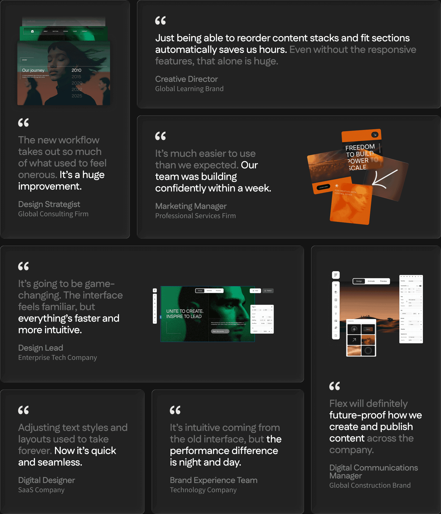
The verdict from early users? Flex isn’t just faster. It’s changing the way creative teams work.
Creative freedom. Zero compromise.
Flex unites design, performance, and AI in one design system built to help teams move fast, stay on-brand, and launch work that just works — everywhere.
This is the next chapter of interactive content at Ceros.
Ready to see what’s possible? Explore how Flex is changing the way teams create interactive content.
Already using Ceros? Flex is waiting for you. Log in to your account and start exploring.
Get the latest Flex updates: