How to create an infographic in 2026 (with examples and templates)

Infographics remain one of the most effective formats in a content marketer's toolkit—but the bar for what "good" looks like has shifted. Static images that once performed well now compete with interactive, AI-discoverable content that earns more engagement and more links. This guide walks through everything you need to create infographics that work in 2026: the types, the process, the tools, and the examples.
BY Lydia Burns
July 17th 2026 – 7 min read
DESIGN
How to create an infographic in 2026 (with examples and templates)
What is an infographic?
An infographic is a visual representation of information, data, or knowledge designed to communicate complex ideas quickly and clearly. By combining text, imagery, and data visualization, infographics make content easier to understand, share, and remember. Here’s one example:
It’s content showing six ways to reduce construction costs but what you see is a tagline for each step and an icon representing it.
And because it's interactive content, you can click on the steps for more information.
Now, one thing you’ll notice with this interactive infographic is that it’s exciting, engaging, and helps people remember the information in the graphic.
That’s how an infographic should be.
Types of infographics
Not every infographic serves the same purpose. Choosing the right type before you start designing saves significant rework later.
Statistical infographic — Presents data, percentages, and research findings using charts, graphs, and callout numbers. Best for survey results, industry benchmarks, and annual reports.
Informational infographic — Explains a concept or topic using a combination of short text blocks and supporting icons. Best for overviews, explainers, and "what is" content.
Timeline infographic — Shows events or milestones in chronological order. Best for company history, product roadmaps, and historical context.
Process infographic — Breaks down a step-by-step workflow or system. Best for how-to guides, onboarding flows, and operational processes.
Comparison infographic — Places two or more options side by side across shared criteria. Best for product comparisons, before/after scenarios, and decision guides.
Geographic infographic — Uses maps or location-based visuals to display regional data. Best for market coverage, demographic distribution, and global statistics.
Hierarchical infographic — Illustrates organizational structures, decision trees, or tiered systems. Best for org charts, reporting structures, and classification systems.
List infographic — Presents a numbered or bulleted list with visual emphasis on each item. Best for tips, resources, tools, and ranked content.
Anatomical infographic — Labels or breaks down the components of an object, system, or concept. Best for product explainers, technical documentation, and educational content.
How to make an infographic in 7 steps
Want to create infographics that can offer you the benefits we just discussed?
Follow these easy steps:
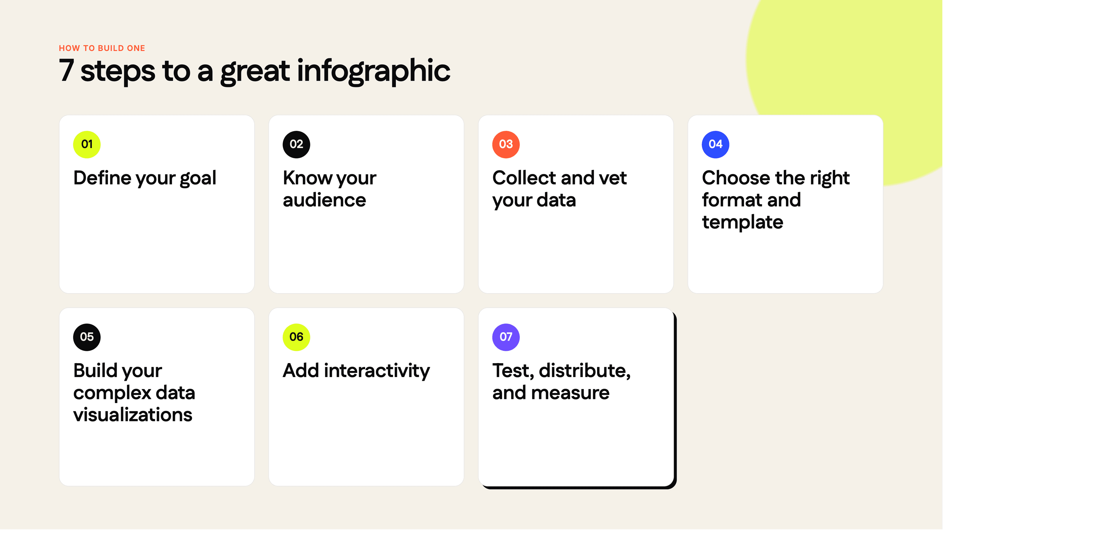
Step 1: Define your goal
Before opening any design tool, clarify what you want the infographic to accomplish. Are you trying to generate backlinks, explain a complex product feature, support a sales conversation, or improve organic search rankings? A clear goal shapes every decision that follows — the data you include, the format you choose, and where you distribute it.
Step 2: Know your audience
Defining your target audience determines the right level of detail, the appropriate visual complexity, and the channels where the infographic needs to perform. A technical infographic for a developer audience looks very different from a high-level overview aimed at a C-suite buyer. Document who the piece is for and what they already know before you start collecting content. Let those needs shape how you organize content into logical sections for a clear flow.
Step 3: Collect and vet your data
Gather your source data from credible, citable sources — original research, industry reports, peer-reviewed studies, or your own proprietary data. Weak sourcing undermines the credibility of the entire piece. As you collect, look for a narrative thread: the most effective infographics don't just list facts, they tell a story through data. Aim for three to five key data points that support a single clear argument or insight.
If you're not sure where to start, these are some good resources:
Statista. It's got tons of market research data you can leverage.
Google Trends Datastore: Need data for different industries, e.g. entertainment, sports, etc.? This database is the guy for that.
Pew Research: Your hub for finding research on public opinions, demographics, etc.
U.S. Open Data: The U.S. government’s research across different fields from agriculture to education, climate, health, and more.
You could also use Google’s search engine to search for data by refining search terms to include ‘data’ or data file formats like CSV or XLSX.
Step 4: Choose the right format and infographic template
Match your content type to the infographic format that best serves it (see the types section above). A premade template can help you save time and keep the design consistent.
If you're working with a tool like Ceros Flex, you can start from a template and adapt it, or use Flex AI to generate a first draft from your content. For static output, Venngage offers category-specific templates; Piktochart offers thousands of infographic templates; Canva has thousands of free templates for infographics; Adobe Express lets users browse thousands of infographic templates; and PowerPoint provides customizable infographic templates for different use cases, while Infogram also offers category-specific templates. Choose a template that fits your data structure — don't force a timeline format onto comparison data.
Step 5: Build your complex data visualizations
Translate raw numbers into charts, graphs, and visual callouts. The chart type matters: use bar charts for comparisons, line charts for trends over time, pie charts sparingly and only for part-to-whole relationships, and icon arrays for proportional data. Every visualization should be immediately readable without a legend — if it requires explanation, simplify it.
Step 6: Add interactivity
Static infographics have a place, but interactive infographics consistently outperform them on engagement, time on page, and shareability. Consider adding hover states that reveal additional data, clickable sections that expand detail, or embedded animations that guide the reader through a sequence. Platforms like Ceros Flex are purpose-built for this — you can add interactive behaviors without writing code.
Step 7: Test, distribute, and measure
Before publishing, test your infographic on mobile and desktop. Do a final file-output check so the design is ready to download as a PDF, JPG, or PNG. Check that all data points are sourced, all text is legible at full size, and any interactive elements work as expected. Teams often export infographics to email, a website, or social media and share them immediately after downloading them from the design tool. After publishing, track performance against your original goal: organic traffic and backlinks for SEO-focused pieces, engagement rate and time on page for awareness content, and conversion rate for bottom-of-funnel assets. Use what you learn to inform the next iteration.
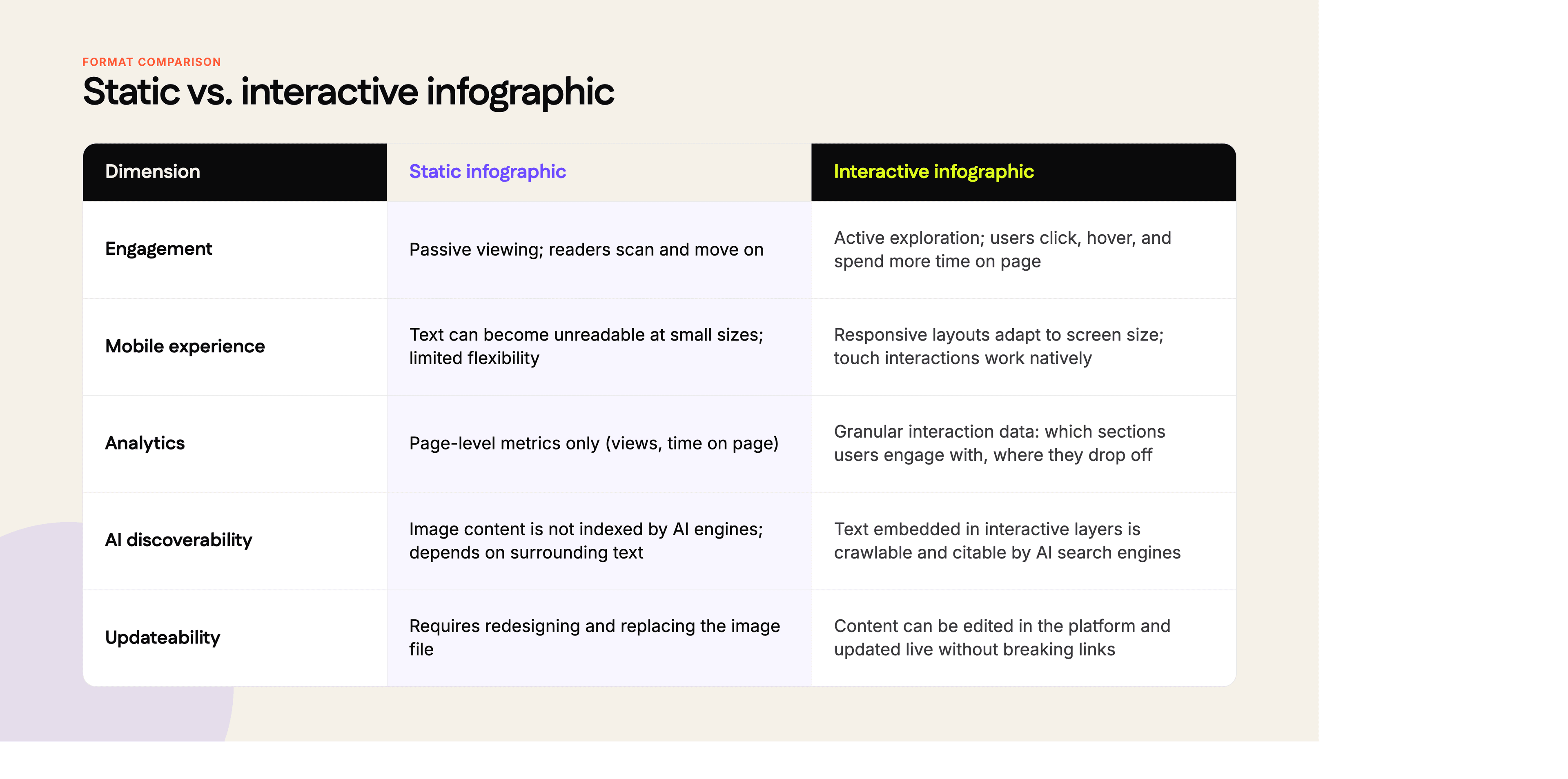
Static vs. interactive infographics in 2026
The choice between static and interactive is no longer purely aesthetic — it affects how your content performs across search, AI platforms, and mobile.
What are some best practices for infographic design?
If you want to make really great infographics, here are some factors to help with that:
Lead with one main point.
Every infographic should be reducible to a single sentence. If you can't state the core message in one line, the piece is trying to do too much. Identify that central insight and use clear visual hierarchy to guide the reader's eye through the piece.
Use negative space deliberately.
White space is not wasted space — it directs attention, improves readability, and reduces cognitive load. Crowded layouts cause readers to disengage before absorbing the content. Give each element room to breathe.
Avoid visual clutter.
Limit your color palette to three to four colors, and use high-contrast colors where data needs to stand out. Restrict font choices to two typefaces, keep typography readable with consistent sizing, and limit text so the reader isn't overwhelmed. Remove any decorative element that doesn't carry information, and maintain a clear balance of text and graphics. Every design decision should serve comprehension.
Match interactivity to intent.
Not every infographic needs interactive features, but if your content has layers — supporting data, definitions, related context — interactivity is the cleaner solution than trying to fit everything into a single static frame.
Standardize your production process.
Infographics become easier and faster to produce when you establish reusable templates, a defined color system, and a shared component library, often built around common structures like lists, cycles, or hierarchies. Teams using Ceros Flex can build and share templates across projects, which significantly reduces per-asset production time.
Source everything.
Include citations for every data point, either inline or in a source block at the bottom of the infographic. Unsourced statistics erode trust and create compliance risk. Prioritize data from the past two years wherever possible.
What are common mistakes to avoid when creating an infographic?
Infographics should help you communicate better with the audience. As such, you need to avoid the following:
Information overload: We know you have so much to share with the audience. But truth be told, infographics aren't the place for that.
Sharing lots of info would cause people to have a hard time understanding the central message. Here, you want to stick with key information, make it scannable, and ensure readers get the main points.
Incoherent story: Your infographic’s narrative can’t afford to be all over the place or the main idea will fly over the audience’s heads. If you are sharing information about reducing construction costs, don’t include why it’s important in the infographic.
Of course, knowing why people should reduce the cost is important but the infographic isn’t the place. Pick a single storyline and stick with it from start to finish.
Looking too generic: Infographics are all over the internet so if yours is looking too generic, it could be ignored. Your infographic should look mwah 🤌 with great visuals, colors, font styles, and all.
If you really want to be exceptional, we recommend making it interactive. It’ll capture people’s attention and encourage them to engage with it by clicking, scrolling, and hovering over design elements.
Poorly crafted charts: If you’re using charts, you can’t afford to have them looking drab or showing insufficient data.
Collaborate with other professionals so they can share feedback and point out mistakes. Another important step is to test the infographics before publishing them. Invite users to interact with the content so they can identify areas for improvement.
Bad information sourcing: The source of data used is almost as important as the infographic itself. You can’t afford to get data from a questionable source.
Stick to reputable sources and ensure they’re well-cited in the infographic. Don’t include sources you didn’t collect information from as viewers may want to visit them.
***
Your dates (creating infographic) seem to be going pretty well. Now, let’s chat about systems that can help streamline planning future dates so you’re not overwhelmed.
What are the best tools for creating infographics?
A research team, data sources, a writer, and a design team are typically needed to create infographics.
However, the process could be much easier with the tools listed below.
1. Ceros
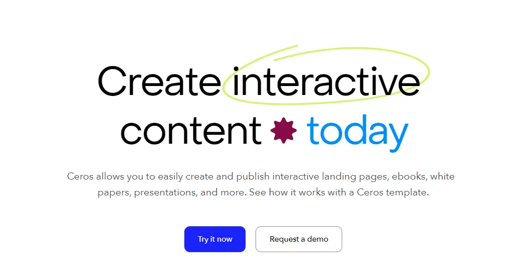
Ceros is a no-code interactive content design platform built for marketing teams that need to produce high-quality, interactive infographics at scale. Unlike image-based tools, Flex outputs fully interactive, browser-native experiences — meaning the content is responsive, analytics-ready, and indexable by search and AI engines.
The standout differentiator in 2026 is Flex AI, which can generate a first-draft infographic from a content brief or raw data, giving designers a structured starting point rather than a blank canvas. Flex integrates directly with marketing workflows and supports real-time updates without republishing new files.
Best for: marketing teams producing interactive, data-rich infographics; content that needs to be updated over time; assets where engagement analytics matter.
2. Venngage
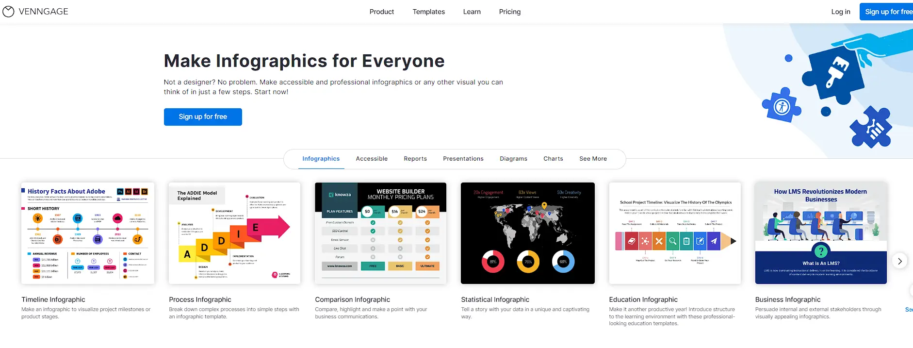
Image source: Venngage
Venngage is a design tool with a large template library organized by type and industry. It supports team collaboration, brand kit management, and PDF/PNG export. The interface is approachable for non-designers, and the template quality is consistently solid.
Best for: teams that need polished static infographics quickly, without a steep learning curve.
3. Piktochart
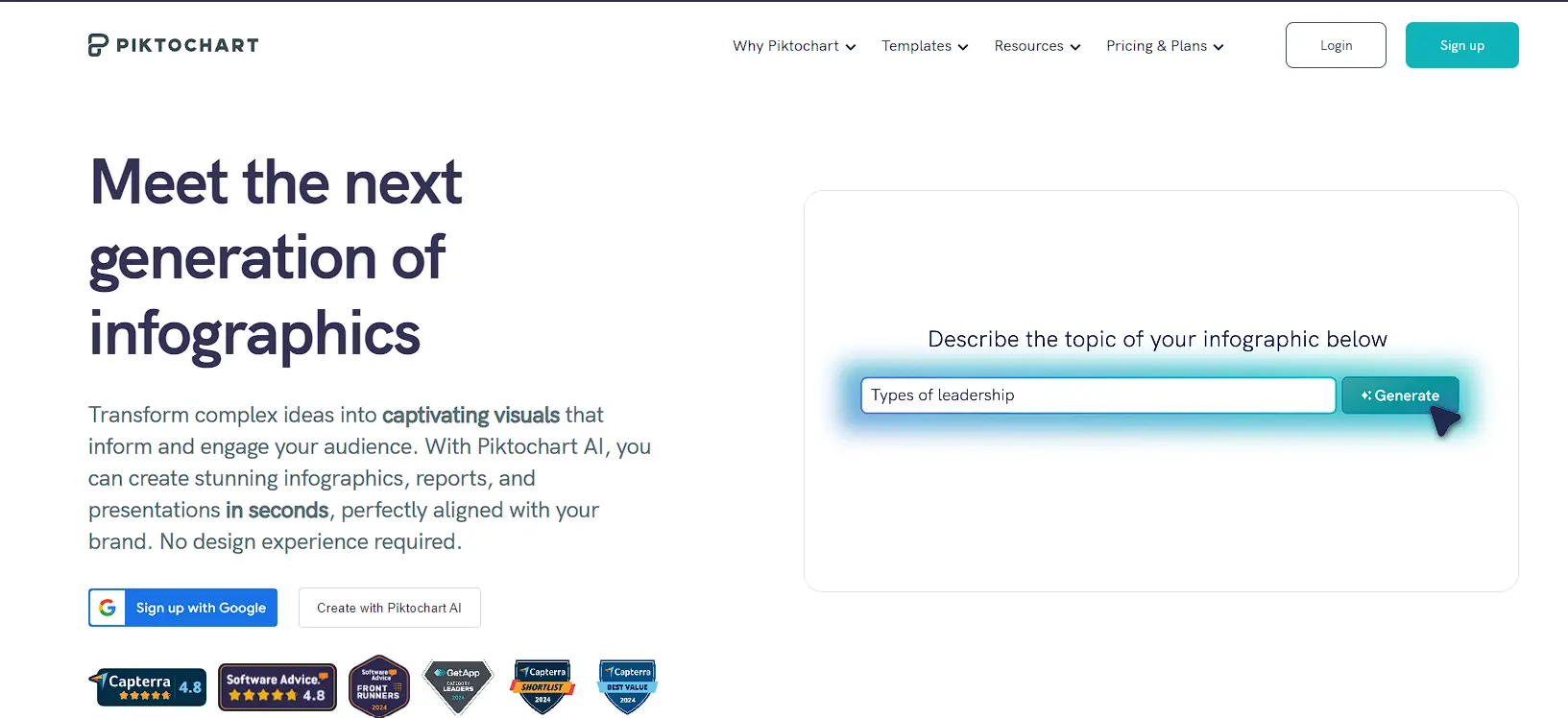
Image source: Piktochart
Piktochart is trusted by 14 million users and focuses on infographics, reports, and presentations. It offers a clean editor, a wide range of chart types, and icon libraries, while its free account provides access to templates and core editing features. Paid plans support team workspaces and custom branding.
Best for: individual contributors and small teams creating informational and statistical infographics.
4. Infogram
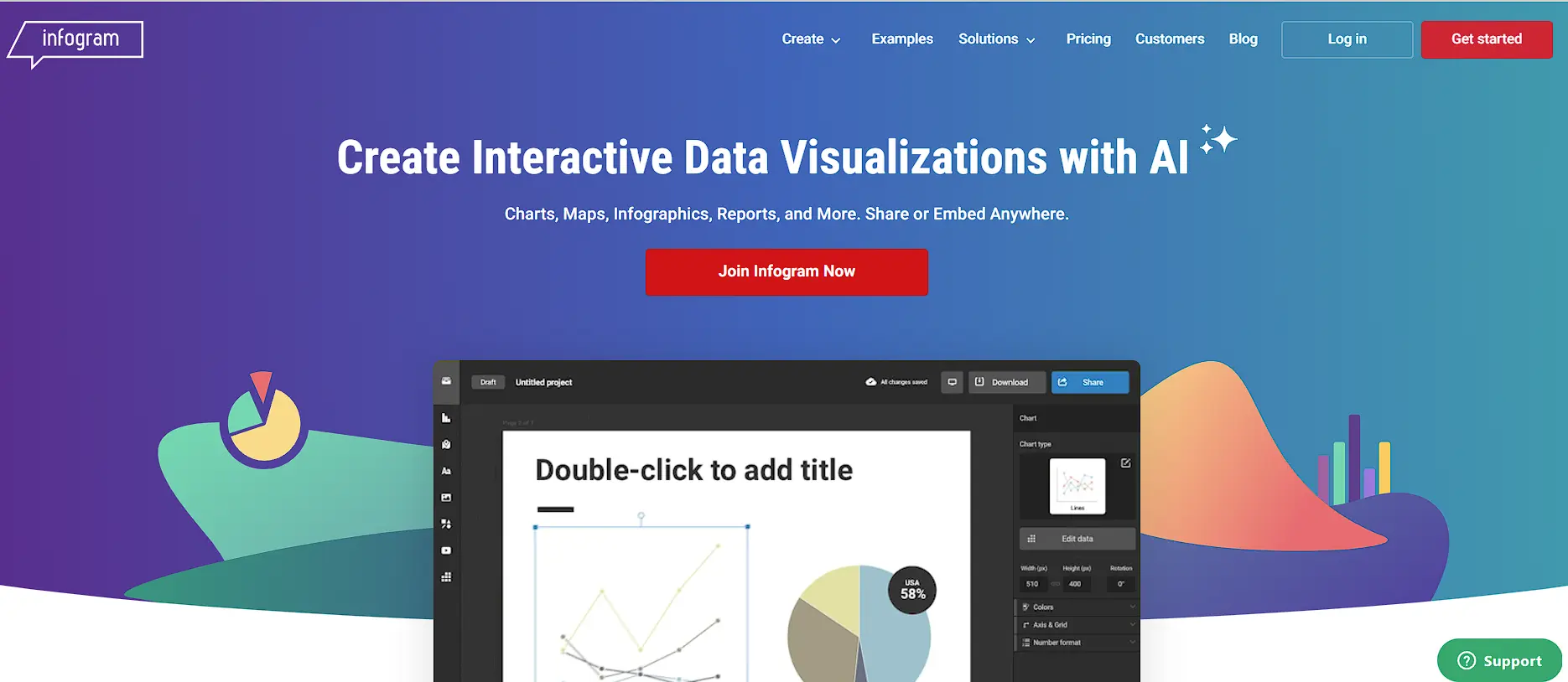
Image source: Infogram
specializes in data-driven infographics and dashboards. It connects directly to data sources (Google Sheets, Excel, APIs) and supports real-time data updates. Charts and maps are its strongest feature set.
Best for: data journalists, analysts, and teams that need infographics to reflect live or frequently updated data.
***
And so ladies and gentlemen, there you have it.
Over to you!
As you’ve seen, creating infographics isn’t so difficult.
And if you’ve got an effective easy-to-use tool like Ceros, your creation process can be as smooth as waving a magical wand.
With its intuitive interface, your role will be to find infographic templates, modify them with your data and text, and the content is good to go.
See for yourself, book a demo with Ceros, and see how easy it is to get started.