Components
Light button kit
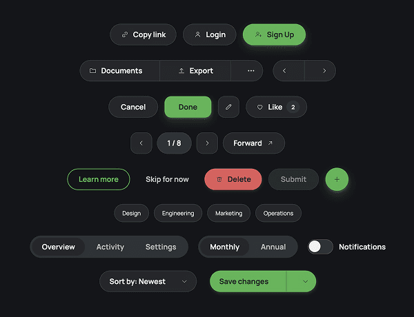
The buttons you'll actually reach for, in one place: primary, neutral, quiet, and destructive styles alongside segmented controls, filter chips, tabs, toggles, dropdowns, and a split button. Hover, pressed, and selected states are already built. Instead of rebuilding the same button states every project, drop in the row you need and swap the label.
What Is Featured
Buttons
CTAs
Animated
CTA section
Hover interactions
Light
Responsive
Tabs
Show/hide interaction
SDK