Components
Hover cards hero component
Hover cards hero component
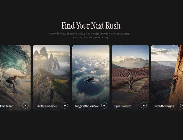
This hero section uses hover cards that expand to reveal details for different activities or offerings. Each card highlights an image and description on hover, then collapses back into the grid. Dark styling and responsive layout make it a fit for SaaS, sports, and product landing pages that want to showcase several offerings at a glance.