Components
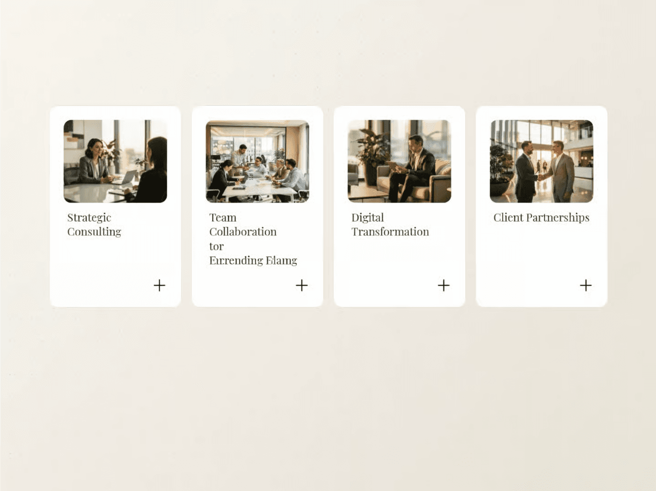
Flip cards component
A row of cards that flip on hover or click to reveal back-side content — a second image, a detail, a mood, a stat. Use this flexible component to highlight key features, for product lookbooks, team bios, feature grids, promotional callouts, or anywhere you want to layer in more without stretching the page. Its responsive structure ensures seamless interaction across desktop and mobile layouts. The interaction rewards a small gesture with a payoff, so visitors actually engage instead of skimming past a static grid.
What Is Featured
Cards
Cards
Animated
Hover interactions
Responsive
Brand kit-ready