Components
Light button kit
Light button kit
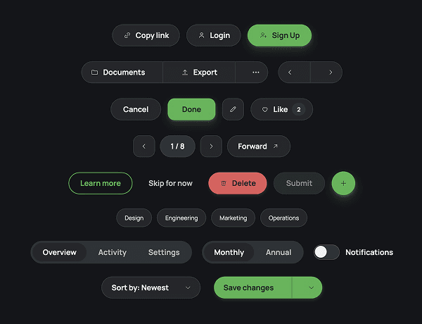
The buttons you'll actually reach for, in one place: primary, neutral, quiet, and destructive styles alongside segmented controls, filter chips, tabs, toggles, dropdowns, and a split button. Hover, pressed, and selected states are already built. Instead of rebuilding the same button states every project, drop in the row you need and swap the label.