It was quite a feat to find the Tokyo 2020 Summer Olympics logo, especially after the original choice was tossed out due to allegations of plagiarism in 2015. The Emblems Selection Committee eventually picked this winning design by Asao Tokolo, a Japanese artist with a background in architecture and sculpture, known for his mathematically precise and intricate designs.
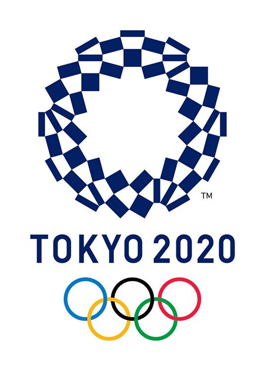
Picked from a shortlist of four (but out of a pool of almost 15,000 submissions) these “harmonized checkered emblems” consist of 45 indigo rectangles of three distinct dimensions, which create a checkered pattern using the white negative spaces between them. The design is meant to symbolize the variety and diversity of the games, as well as the athletes who participate in them. The Olympic ring and corresponding Paralympic crescent are both paired with a typeface that’s a version of a version of DIN 1451.
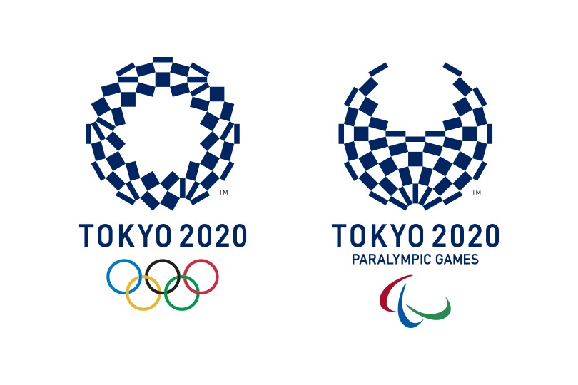
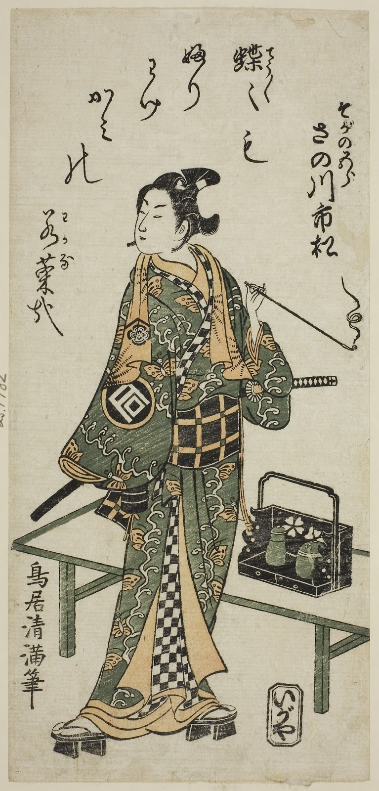
The checkered pattern Tokolo uses in these emblems is a reference to ichimatsu moyou, a traditional Japanese checkerboard pattern popularized during the Edo period (1603 and 1868). It supposedly got its name from the famous Kabuki actor Sanogawa Ichimatsu I, who was often portrayed in black-and-white checkered kimonos.
Source: The Art Institute of Chicago
The choice of indigo, or ai, a color used in many Japanese arts, was similarly meant to evoke a traditional era of Japanese culture and, as the Tokyo 2020 website says, express “a refined elegance and sophistication that exemplifies Japan.” Tokolo was also drawn to the simple indigo-and-white color palette because of its flexibility, as he explained to the Japan Times. “I was thinking of something like a coloring picture that everyone can add their own color to,” he said.
The significance of this checkered design extends beyond Japanese traditions—it’s also representative of Tokolo’s artistic concerns and ethos. For Tokolo, these emblems are a continuation of his pattern work. These pieces were partly made in response to the attack on September 11, 2001, an event that has deeply influenced his art.
“There was a big disconnect in the world because of terrorism,” Tokolo said. “so I wanted to connect things. This design is based on a similar philosophy.”
Source: https://aha.design/#/pachinko-tiger-kagitori/
Tokolo is also behind two of the art posters chosen by the Organizing Committee. Much like the official checkered logos, Tokolo’s spherically-patterned posters are comprised of a cross-hatching network of rhombuses and rectangles in indigo and white.
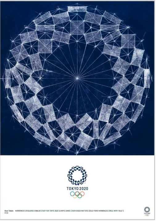
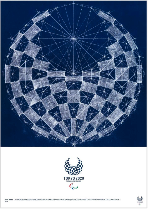
Composed partly by hand and partly on the computer, Tokolo sought to create a metaphorical “relay baton,” which could “be passed on from 2020 to future generations,” he wrote in his artist statement. The thin white lines connecting these various shapes are intended to be “projections of physicality”—a testament to his admiration of the athletes.
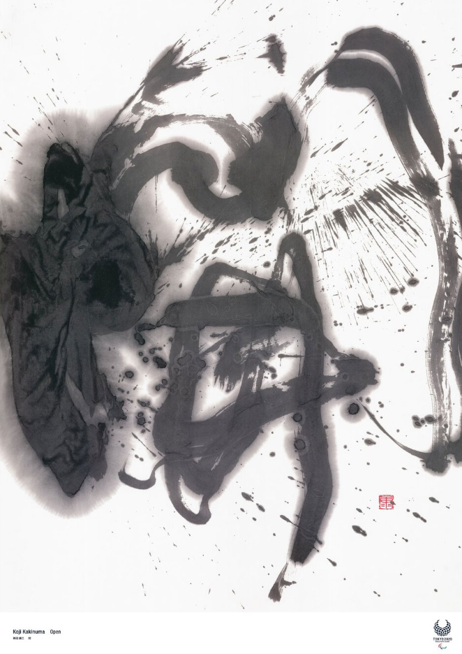
Several of the other art posters similarly hark back to Japanese artistic traditions—including Koji Kakinuma’s mesmerizing calligraphy painting, GOO CHOKI PAR’s Japanese Futurist-inspired poster, and Hirohiko Araki’s piece “The Sky above The Great Wave off the Coast of Kanagawa,” which takes both its name and its frothy bubblegum pink wave from Katsushika Hokusai’s famous print.
Source: https://tokyo2020.org/en/games/artposter/para-02.html
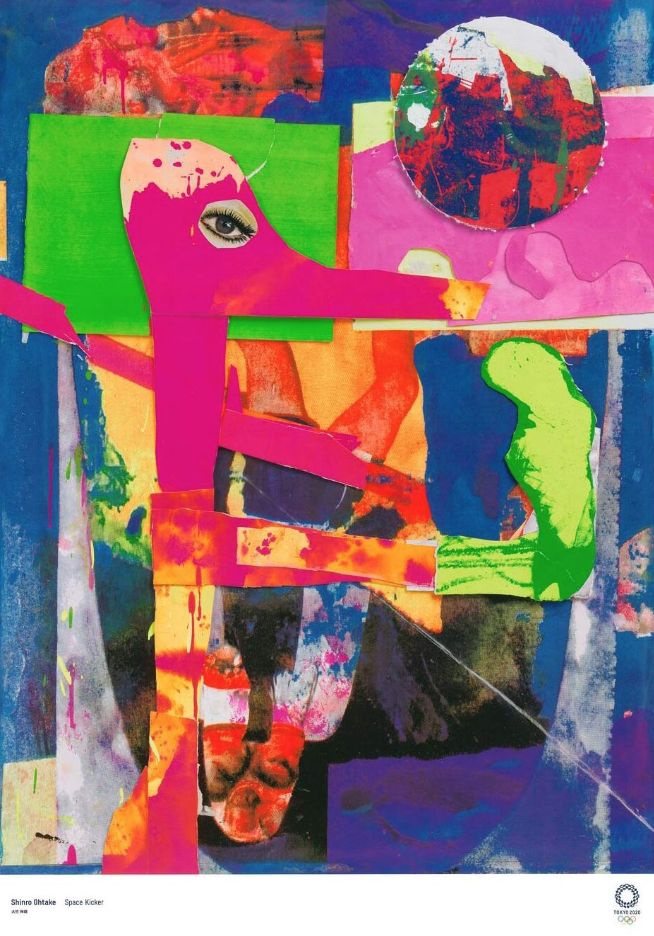
The painter Shinro Ohtake sought his inspiration in more recent history. Ohtake was only a young boy in elementary school the last time the Olympics were hosted in Tokyo, in 1964. So, he decided to only use the materials that he had access to at the time: paper, scissors, brightly colored paint, and glue.
Source: https://tokyo2020.org/en/games/artposter/oly-02.html
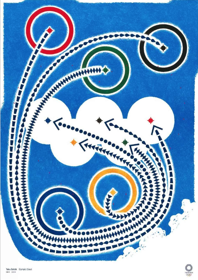
Other artists looked to deconstruct the Olympic logo itself, as with designer Taku Satoh’s Olympic Cloud, and Vivian Sasseen’s photograph of a joyful scene of two athletic figures mid flight—with colorful “dots” of ink overlayed onto the image, in an abstract reference.
Source: https://tokyo2020.org/en/games/artposter/oly-06.html
But Takashi Homma wanted to depict someone other than an athlete in his poster. He opted for a portrait of a young boy on the streets of Tokyo.
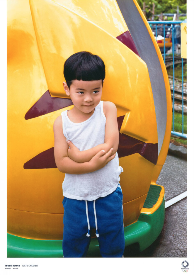
Homma’s objective, as he explained in his artist statement, was to remind us non-athletes that it’s not just about the participants, it’s about the viewers, too. “The Games are a memorable beacon of hope,” he wrote in his artist statement, “that belongs to all people, both young and old.”
Tokolo’s logo shares a similar concern. It’s somewhat banal traditional appearance seems to be an attempt to make it accessible—to both the athletes and the spectators. Of course, that’s sort of the point with Olympic logos—they’re meant to be telegenic, accessible to literally billions of people.With the Games still a few months off, it’s still unclear what the response to the logo will be, but chances are, these emblems will fade into Olympic history as inoffensive, albeit beautiful, efforts to brand the Games.