The new brand identity of PBS isn’t a radical redesign—and that’s the point. In celebration of its 50th anniversary, the broadcasting company has updated its graphics to emphasize its universal appeal, which, with over 330 member stations, is what PBS is all about.
The new identity, designed by global creative consultancy Lippincott, made subtle changes to the logo, created a custom typeface called “PBS sans,” and added a new “PBS blue” to the palette. All these changes aim to simplify and synthesize, ultimately attracting as many member stations as possible into adopting it with its uniformity and flexibility. So far, it’s proven a success, with over 70% of stations committing to adopt it within the coming year.

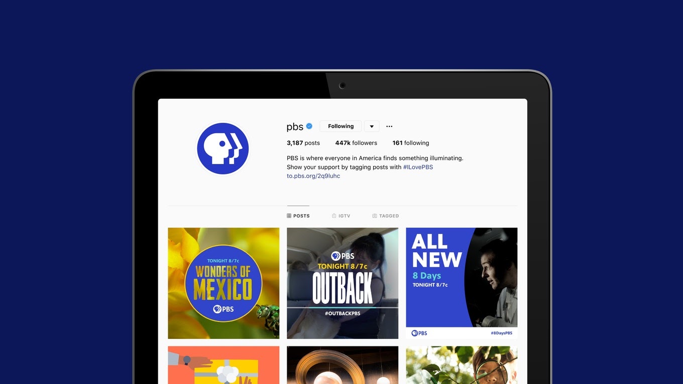
These changes are also about meeting their viewers where they’re at—on screens and not just the one in their living room. PBS Digital Studios network has 20 million subscribers, according to Lilly Smith at Fast Company. The logo has to pop, no matter the size of the screen.

In its half century, PBS has gone through a fair share of redesigns—but the central features of its identity, including those iconic profiles, have remained pretty much the same over the years. Here’s a look at how the company’s brand came to be.
1970-1971
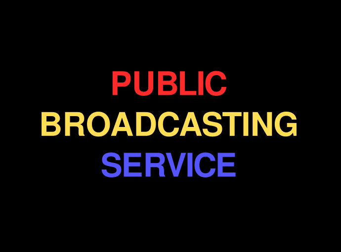
When the Public Broadcasting Service took over the public broadcasting role from for its predecessor, National Educational Television (NET), they needed a temporary “ident,” a network identification spot, to fill the screen. They opted for a simple Helvetica type in primary colors.
1971-1984
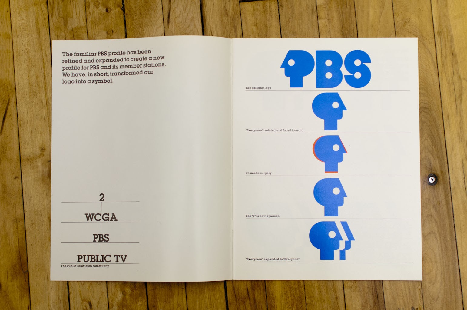
This tri-colored logo, which was designed by Herb Lubalin and his partner Ernie Smith, introduced the PBS “everyman” symbol, the profile that juts out of the P affectionately referred to as the P-head. The logotype was the ITC Avant Garde Gothic, which Lubalin designed with Tom Carnase. Although PBS went through a redesign in 1984, the popular tri-colored P-head logo continued to crop up on certain channels until 1994. PBS Digital Studios actually brought the logo back in 2014, so it lives on.
1984-1989
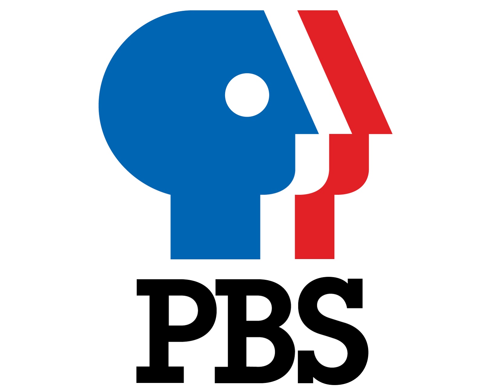
Designed by Tom Geismar of Chermayeff & Geismar, this third iteration of the PBS logo sought to distinguish the channel from the other popular tri-colored idents on TV at the time. They redesigned the classic P-head, reversing the profile to make it forward-facing, and then multiplying it to change “everyman” to “everyone.” They also replaced the ITC Avant Garde Gothic with the slab serif ITC Lubalin Graph, another type, as the name suggests, designed by Lubalin. Chermayeff & Geismar’s brand book goes into detail about the specific changes they did to the P-head icon, including the “cosmetic surgery” they performed on the profile, changing the angle of the nose to make it more upright. They also added several bright ’80s colors to the palette, including a neon yellow and an electric purple—as well as black, which was the most commonly used.
1992-1996
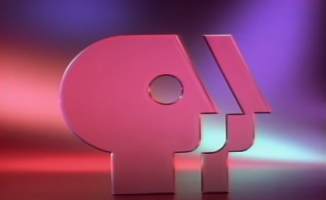
While the PBS brand identity stayed true to Chermayeff & Geismar’s design until the late ’90s, PBS experimented with different variants starting in 1989. This bright pink, holographic version of the PBS profile, designed by the firm Telezign, was released in 1992. In the mini-documentary PBS released alongside the new ident, the producers explained that they wanted the focus to be on the eye as a symbol of humanity and insight. The pink frosted glass of the logo itself, which picks up and diffuses the gauzy multicolored lighting in the background, is meant to mirror that sense of reflection.
1998-2002
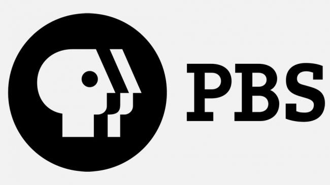
This monochrome logo introduced the circular black “shield” that encompasses white and black profiles, and added the PBS wordmark to the side of the logo. According to Chermayeff & Geismar, the disc was added to make sure that the logo appeared on TV screens crisply and clearly, with as little interference as possible.
2009-2019
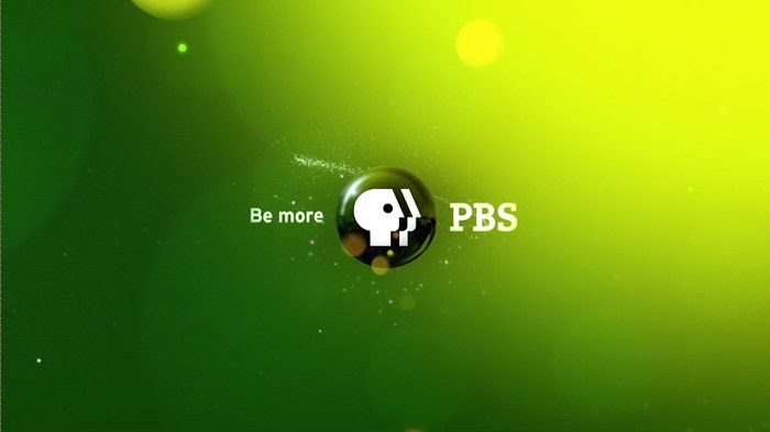
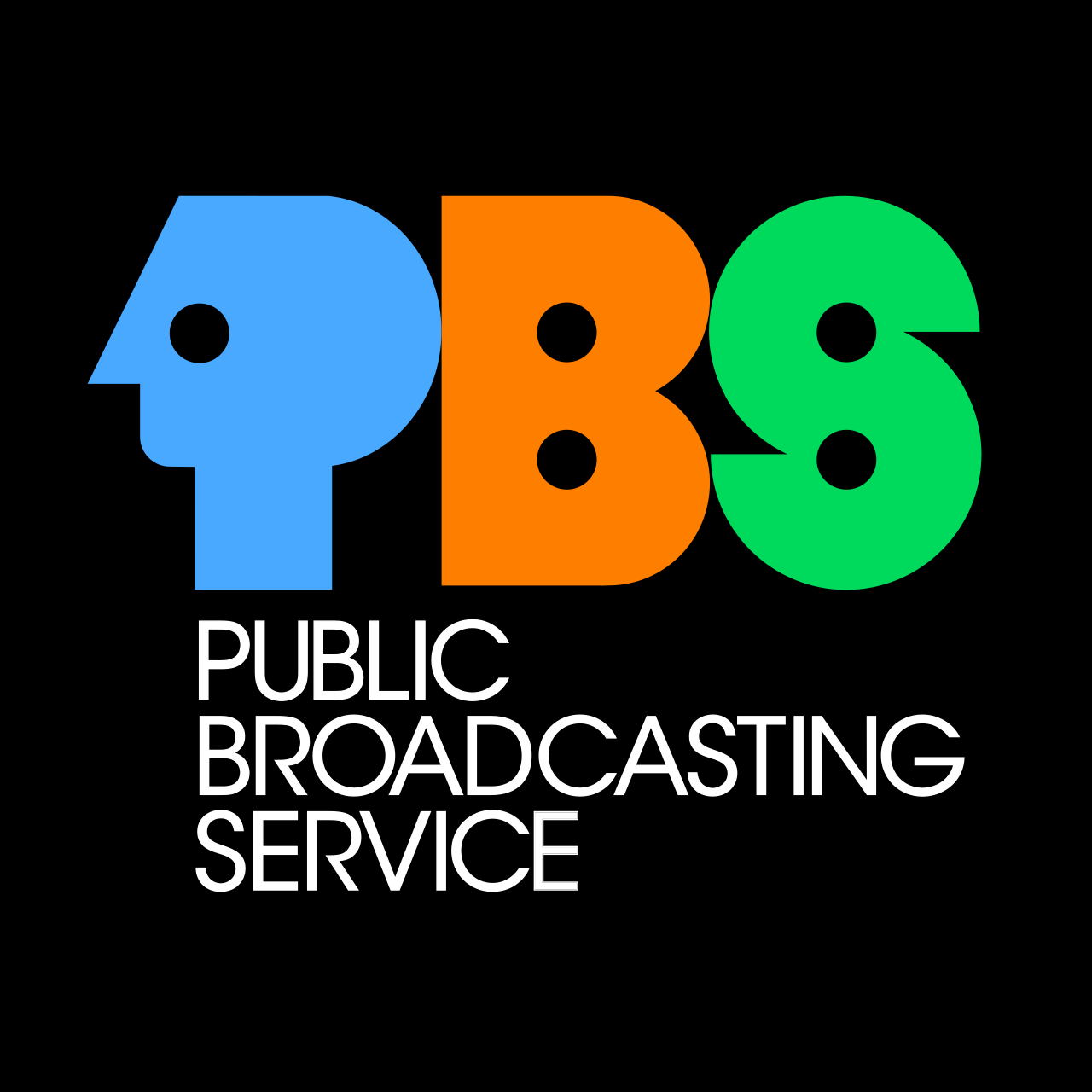
In 2009, the logo was given a little more depth: the design group Troika turned the shield into a spherical shape—much like the redesign of the ABC logo in 2007—and gave it a slogan to match: “be more.” They also used a new font for the wordmark, PMN Caecilia. The firm put together over 600+ new elements, including many idents with bright backsplashes of color (as seen above), and new templates for print and the web.
2020 and beyond
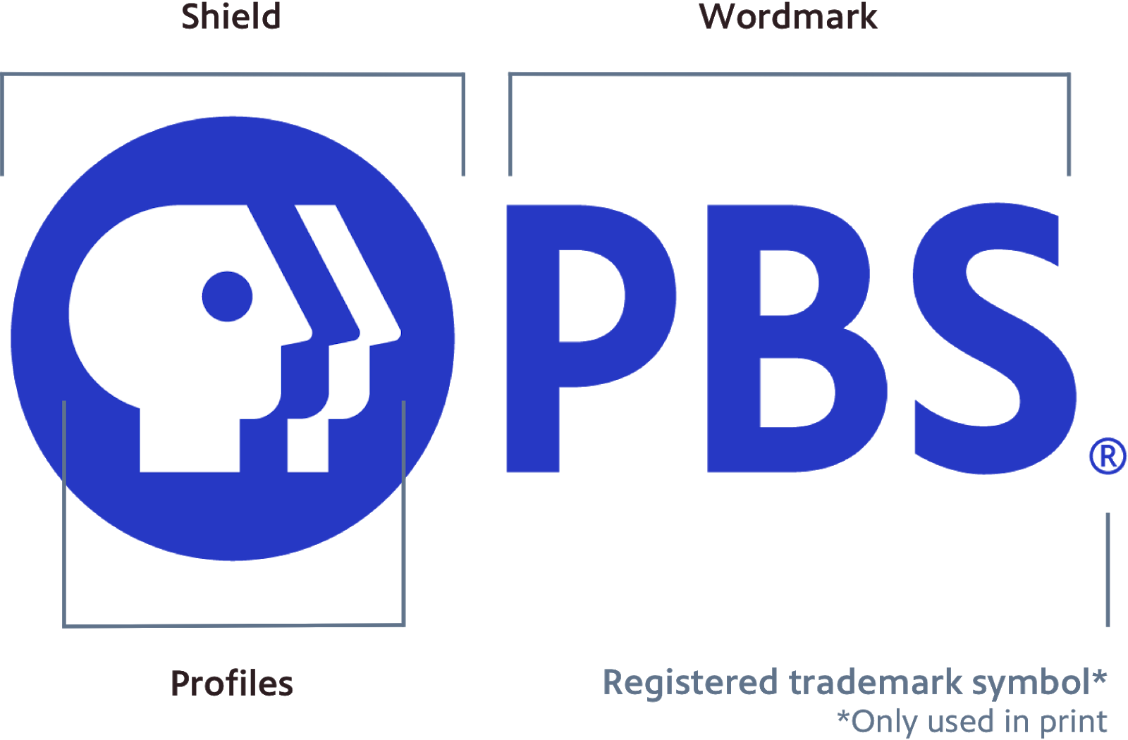
Some cosmetic surgery was once again performed on the logo profiles, this time to maximize visibility across platforms and devices. The profiles have shorter necks, and take up more room within the shield, now that vibrant “PBS blue.” Most important, the hard edge of the nose was softened, and given “a subtle upward gaze that feels more engaging,” according to Lippencott. And the wordmark, in the modern PBS Sans, has been made the same size as the profiles, so that the two graphic units feel and look more aligned.