Along with riding the subway and eating a folded slice of Joe’s while you walk up Bleecker Street, few activities capture the full summer in New York experience than enjoying the daytime breeze from within one of the Big Apple’s 551 privately-owned public spaces, known simply as POPS.
The spaces—not to be confused with New York’s more-than-1700 parks—include atriums, arcades, and other public spaces located next to or even within privately-owned residences and office towers. They are developed, owned, and maintained by the private property owners at no cost to the public or the City in exchange for easements of zoning. (This typically involves allowing a real estate developer to build extra floors beyond the original zoning in exchange for a postage stamp of a public space with some stone benches and a sleek water feature.) For many, these indoor and outdoor spaces offer an oasis of retreat away from the bustle—a place to enjoy lunch and catch up with a colleague or rest one’s legs while navigating a map.
While POPS have been in existence since the 1960s, it wasn’t until 2017 when the City enacted a law requiring specific signage for the 551 locations to take the mystery out of their location and function. These signs included the original POPS logo to signify the purpose of the space—a logo containing a single tree framed by a generic 5×5 grid.
The logo, which was created by corporate design powerhouse Chermayeff & Geismar over 40 years ago for a single space, at least according to Pentagram founder Michael Bierut—”the city liked it & just told people to copy it,” he said in a Tweet. Whatever its origin story, it is due for a modern overhaul. And to do that, Advocates for Privately Owned Public Space, the New York City Department of City Planning, and The Municipal Art Society of New York came together to spearhead a design competition, with funding provided in part by Knoll.
With 607 submissions presented over just a few months, a panel of 7 judges—which included Elizabeth Goldstein, President, The Municipal Art Society of New York and Glen Cummings, Creative Director, MTWTF, among others, sifted through design pitches for a design that would top Chermayeff & Geismar and become the new symbolism for enjoying a quiet moment in the city. Their choice to grace over 80 acres of NYC open space? A motif of three playfully-arranged chairs—simple iconography that eschews highbrow design in favor of universal function.
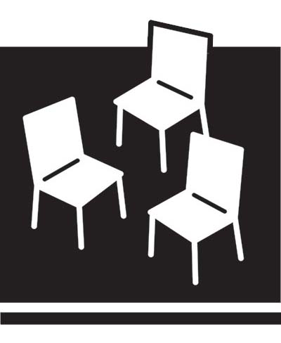
This image welcomes an individual or several people to sit down in a specified space. While the space is static and given dimension and a sense of weight by the use of the horizontal bar along the bottom, the arrangement of the chairs is freeform and open to the whimsy of its user. —”Have a Seat” designer Emma Reed
“I’m so honored to have my design chosen as New York City’s new Privately Owned Public Spaces logo,” said “Have a Seat” creator and competition winner Emma Reed in a press release. “I’ve spent many of my lunch hours in a POPS in lower Manhattan which, in part, inspired me to submit a design!”
Reed, a 2015 graduate of Syracuse University, is a professional graphic designer in New York City. Her new logo will be required on all POPS signage across 551 locations—a symbol that will become synonymous with open space for the public for many years to come. The public can expect to see the new logo at POPS in early 2020. Along with bragging rights, Reed will also receive a $2,000 cash prize.
While “Have a Seat” may have won top honors for its simplicity and ability to communicate the true purpose of the spaces, it wasn’t the only great interpretation. “More Than a Tree” from Gensler NYC Brand Design Studio and “Constellation” from graphic designer John Schettino—both runner-ups—also present compelling urban space motifs.
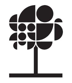
POPS are everywhere, hidden oases in an urban forest of glass, steel, and concrete. They come in all shapes and sizes, forming a network of treasured public spaces – spaces in which all can relax, eat, socialize, and explore. In the same way, our logo unites active and diverse shapes into one recognizable symbol. The tree makes a single statement, but close-up one can see the network of parts that form the whole. POPS are part of a city in constant motion. Our design captures this energy by encouraging the eye to move across a dynamic, playful composition. The rounded shapes feel friendly and approachable but are grounded in the structure of an implied “city” grid. In this way, it recognizes the iconic original logo. However, by unlocking it from the original bounding box we make it feel accessible and welcoming. -“More Than a Tree” designers Gensler NYC Brand Design Studio
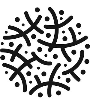
New York’s constellation of Privately Owned Public Spaces constitute a distributed commons; a city-wide array of shared space. Through everyday use – resting, reflecting, playing, convening – these spaces are invested with meaning and transformed from abstract space into active public places. This logo represents NYC POPS as a commons inscribed with activation and intersection, scaling from individual locations to an overall array of 500+ POPS. – “Constellation” designer John Schettino
“We challenged folks around the globe to design a logo for New York City’s beloved POPS – and the public responded with amazing creativity,” said DCP Director and final judge Marisa Lago. “There were so many incredible designs that it was hard to choose. But, the happy, almost-dancing, chairs of this logo bring a smile to your face, and say ‘Welcome!’”
