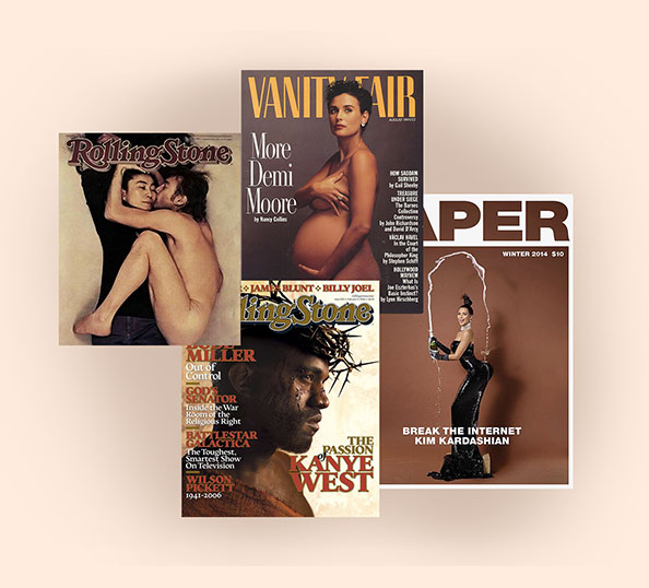
Something is stirring on the newsstand, but you’ll be forgiven for not noticing. After all, these days you need a flight delay or an overnight stay in some hipster hostel concept to find something even resembling a newsstand. But if you do find one, you’ll see magazine covers that are popping with images and type and cover designs going for broke. And not just on indie and European mags (they’ve always been cool), but on mainstream, personality-driven, American titles you probably dismissed as formulaic, safe, incapable of real surprise.
Now, those mainstream titles are bringing nerve and novelty to their covers, swerving out of bounds and flouting convention. In many cases, the magazine covers feature subjects in shapes, colors, and sizes that have long been overlooked, shot by photographers too young to have developed a formula. The cover type is more inventive, the image crops are compelling, the energy is refreshing. It’s Billie Eilish in her bedroom, Pharrell in a Moncler gown, Harry Styles’ armpit, and just about every Lizzo cover.
The cover is the most important page of any magazine (well, duh), but what made the cover so important was its function as a billboard; it is essentially an advertisement for all the other pages inside a given issue. And that free billboard would still matter, if only people still bought magazines. Single copy sales of magazines (as opposed to subscriptions) are roughly 10 percent of what they were in 2007.
And that’s the good news, if only in the sense that magazines can stop creating billboards and just make great images instead. What’s lost in single-issue sales is made up for in creativity and swagger. Magazines are producing cover images that 10 years ago would have been relegated to designer’s portfolios under STUFF THEY WOULDN’T LET US RUN.
Even as print’s decline seems irreversible, the creative people still making the magazines are finding an aesthetic groove and embracing a fatalistic derring do that makes dying look like fun. So, is there a creative renaissance happening on the magazine cover, and if so, why now? We asked the people who make them.
The Sky is Falling. Sweet.
A funny thing is happening to magazines—as consumers stop buying them, the people who make them feel less pressure to make covers that people will buy. And so they’re abandoning commercial formulas that have dictated glossy magazines in our lifetime. Will Welch, who took over GQ late last year—arguably the worst time in history to take the helm of a magazine—is finding an upside in the timing. “Resources are tighter,” he says. “Budgets are smaller, staffs are smaller, and there’s been a lot of difficulty in that. But the plus side is, and this is partially a credit to Conde Nast, I’ve found incredible creative freedom in this era, and that applies to everything we do, but the cover is a place where you really see it.”
Japp Biemans, the art director of Volkskrant Magazine and probably better known as The Cover Junkie, a site where he’s been collecting, sorting, and celebrating magazine covers for close to a decade, has noticed a flush of innovation. “Mags now are more free to do what they’re good at! Being creative. Being different. I think advertisers had them in a headlock. The newsstand was a headlock. They were afraid to do to controversial stuff. Now they can. The public likes more statements from their mags.”
How the Internet Killed Cover Lines
In the not-so-distant past, cover lines were believed to actually sell magazines. Promises of “rock hard abs” or “an exclusive report” or “her most revealing interview yet” was the difference between a strong-selling issue and a dud. And some publishers still focus-group cover variations for optimal impact. But nothing clutters, cheapens, and generally degrades a compelling cover image than a bunch of carnival-barking come-ons. At one point, you could find a dozen separate cover lines on Men’s Health or Cosmopolitan, both of which, to be fair, sold a lot of issues in their day.
But now, how a magazine cover does on Instagram is just as important as how it does on the newsstand (where actual money is still exchanged), so covers are less about competing for a shopper’s $6.95 and more about creating a unified statement and an image that will pop on a phone. “Wordy cover lines used to be de rigueur,” says Elle Editor-in-Chief Nina Garcia, “but we’ve found there’s more design impact when we use succinct, powerful phrasing.”
In fact, every editor and art director we spoke to talked about paring down magazine covers for optimal Instagram. New York Design Director Thomas Alberty says, “fewer secondary cover lines allow the cover to be more of a single image poster. It’s cleaner.”
But it also allows you to maintain a tone that too many competing lines can erode. “You don’t want to have a story about someone being assaulted by the President with, you know, Cheap Eats or whatever,” Alberty said. “That’s self-defeating.”
Welch says cover lines are increasingly unnecessary. “We’re doing fewer cover lines and not using up every little bit of space to sell what’s inside the magazine because we do that with our social handles and with GQ.com. We have other means to promote everything that’s happening inside of an issue now.” And it allows them to focus the cover on the main theme, like their recent New Masculinity issue, which required them to “get one big idea across.”
Rolling Stone’s new, cleaner covers put aesthetic distance not just from its recent past, but from its newsy, “OK Boomer” origins.
“Rolling Stone was always this strange, compelling hybrid of newspaper and magazine,” Editor Jason Fine explains, “and over time, the newspaper part has moved online.” Fine explains that the 2018 shift from bi-monthly to monthly (and a change in ownership) loosened up what a Rolling Stone cover could be. “It’s a keepsake, something you want to hold on to. We have a whole online operation to do the news,” he says, “the print magazine is more timeless.”
What Are Those Rules Again?
For an industry that talked about surprise and delight and finding innovative ways to make a statement, mainstream magazine-making followed formulas as strict and unwavering as a ‘90s sit com: famous (usually white), sex symbol / movie star / athlete / heartthrob in a color photo cropped at the bust, making eye contact, preferably smiling, wearing the latest offerings from top advertisers.
Across Instagram, or wherever the newsstand lives now, magazines are breaking the old rules in a brazen, often glorious fashion. Elle’s Garcia contends that the speed at which graphic design trends are embraced and discarded in the digital age rewards the bold. “It encourages everyone to ignore the so-called ‘rules,’ to experiment, and think multi-screen. We are living in an image-driven culture,” she says. “We all get inspired by things we see on social media, where the bolder an image is, the more it stands out. ”
Welch insists that despite Keanu Reeves in shades and black and white (once strenuously avoided on Conde Nast covers), and the “Is That Brad Pitt?” cover, conventions are always top of mind. “I’m very aware of the old rules. And it just feels good to like, be really clear on what they are and why they exist. And when we’re breaking them, I want to think about that choice. You know?”
Everywhere is Everything
Every editor and creative director eventually stopped seeing Twitter and Instagram and Facebook as revenue-stealing competitors and now see them as revenue-stealing partners.
But social media means that, as GQ’s Creative Director Rob Vargas puts it, “you’re never actually taking a picture for just one platform. You’re considering how the image will work in a variety of iterations. And there’s the clear acknowledgement that most people will be experiencing these images on their phone, which is unfortunate because a lot of the photos have all this satisfying detail and color that gets lost on a handheld screen.”
Elle‘s Garcia is agnostic about how and where she reaches her readers. “We want these covers to be moments that connect with people wherever they see them, whether it’s on the newsstand or on their grid. Having an image that’s hyper-popular on social—the October 2019 Billie Eilish cover (one of our three themed Women in Music magazine covers) garnered 7.6 million likes when she posted it on her Instagram. When it comes to brand awareness, that’s invaluable.”
Still, it’s that phone screen that’s driving this new wave of creativity. Vargas contends that phone has forever altered our relationship with images, or at least the volume at which we experience them. “People are so immersed in images. They see thousands and thousands of images a week, and I think being distinct and establishing a specific brand identity is so important. If you see one person standing in a studio with a white background, you’ve seen a million of them.”
In a lot of ways, Instagram and Apple News and Twitter are lucky to have magazines driving the visual conversation and producing some of its most ambitious and arresting images. Because they may not be doing it forever. While none of the designers or editors we spoke to would concede any sense or mortality—in fact, the Cover Junkie wrote “It’s just a matter of time, peeps will shout it out: #printisthefutureofonline”—there’s a certain fatalism and respect for a dying art form that’s drives innovation—that if you’re lucky enough to still be making magazines, you damn well make the most of it.
“You can’t argue the newsstand product isn’t going away, Welch says. “But fuck, magazines are awesome. And while we’re while we’re still making magazines, let’s make them as good as possible.”