Meet some unsung graphic novelists: Kurt Vonnegut, J.R.R. Tolkien, J.D. Salinger, Günter Grass. Some of post-war literature’s most titanic literary figures were not just pioneers of fantasy, magical realism, or counter-cultural Sci-fi. They were painters, illustrators, publishing-industry graphic designers. Tolkien, for example, not only drew the cover of his debut novel The Hobbit, but he illustrated scenes from Middle Earth (even providing a handy map to his epic’s world) and designed the mysterious runes of the characters’ elvish language.
In some cases, the author’s visual output was so masterful, so distinctive, or so thoroughly integrated with his larger vision that it formed a key part of his literary persona. In other cases, it… didn’t. This is a quick survey of the highs and lows in author-executed book design.
J.R.R. Tolkien
A proficient painter since childhood, J.R.R. Tolkien led British troops at World War I’s Battle of the Somme before taking a job at the Oxford English Dictionary (where he specialized in Germanic words that began with W). Tolkien then left to work at the University of Oxford, where he killed time between lectures by inventing new languages. Like Salinger, Tolkien rejected his publisher’s suggested cover and preferred to design it himself. Instead of sketches, he executed his own book-jacket-sized landscape in pencil, black ink, watercolor, and gouache, the white-topped Misty Mountains backgrounding his rendition of the title’s words. The serpentine ink-drawn dragon Smaug looms from the bottom of his cover.
He illustrated each book of his Middle Earth saga as he wrote them, creating elaborate maps of the mountains, rivers, and kingdoms, producing runic calligraphy for elvish. These visual creations served as a record of the world he built.
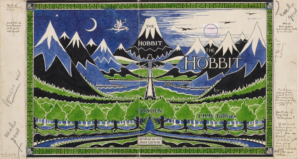
Courtesy of the Morgan Library and Museum.
Günter Grass
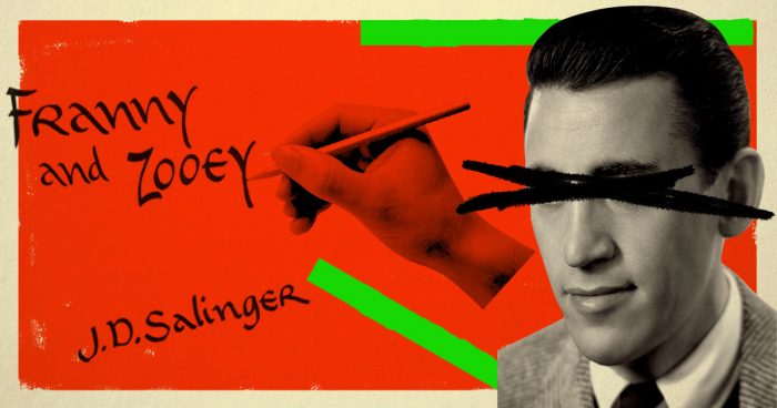
In a sense, Grass was World War II vet J.D. Salinger’s German counterpart. Drafted into the Waffen-SS when he was a teen, Grass waited out the war in a prison camp with a few gripes about humankind. A ferociously diverse talent, the young Grass worked as a writer, graphic artist, and sculptor before founding European magic realism with his debut novel The Tin Drum in 1959.
Thanks to the riveting painting on its cover, he gave the movement its own jagged, art brut look: Grass’s stark black brush strokes rendering his demonic hero Oskar, red triangles on the drum case, two blank blue dots for eyes. Grass etched his tortured vision into both his words and images, the text of his poems and prose entwined with drawings from their inception, his own art on every book cover. His 1999 Nobel Prize in literature suggests this hybrid worked.
Antoine Saint-Exupéry
As a pilot, Saint-Exupéry was reputedly a “distracted flier,” refusing to land until he finished reading a novel, leaving his crumpled-up sketches in the cockpit afterwards. These three strands of life wove together in the 1943 novella Le Petit Prince, an allegorical fantasy that, like Lord of the Rings, sprung from its author’s experience with wartime horror.
The slim volume became one of the most translated books ever published, due partially to its deceptively simple prose and partially to the inviting watercolors Saint-Exupéry painted for illustrations. In telling his tale of a desert-stranded pilot’s life-changing encounter with a boy who fell to earth, the author draws visual puzzles and trompes-l’œil to evoke an alien’s child-like worldview—beginning with a single-line drawing of a boa constrictor digesting an elephant, which all adults would mistake for a hat.
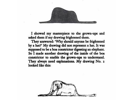
A Duchamp-worthy micro-illustration, the snake/hat unfolds a strange, poetic tale that ends with an aphorism from a fox: “One sees clearly only with the heart. What is essential is invisible to the eye.”
Kurt Vonnegut
Vonnegut’s first drawing to appear in a book was the line drawing of a locket hanging between the breasts of teleported porn star Montana Wildhack in 1969’s Slaughterhouse Five. The Indiana-born novelist was always a prodigious doodler, like his mustachioed satirical predecessor Mark Twain. After this science-fiction WWII epic made him a fixture of U.S. counterculture, Vonnegut cemented that place with felt-tip pen drawings that ran throughout 1973’s Breakfast of Champions.
While New Journalism pioneer Tom Wolfe was also dotting his reportage on American subcultures with fine, Daumier-like sketches, these never quite connected to his whiz-bang prose. An extraterrestrial’s guide to Earth, Breakfast, was illustrated throughout with Vonnegut’s witty, efficiently obscene drawings (see: the could-be starfish anus), carving out a niche between Great American Novel and underground comic. Today, Vonnegut’s drawings are nearly as famous as tattoos as his books are as prose narratives.
Alasdair Gray
Gray, the most recent of these authors who died last year at 85, launched a literary renaissance in his nation and was himself a renaissance man. Like a better-adjusted version of outsider artist Henry Darger (or maybe Flan O’Brien with a fine-arts degree), Gray made his 1981 breakthrough Lanark by melding autofiction and science fiction, formal subterfuge and baroquely innovative painting.
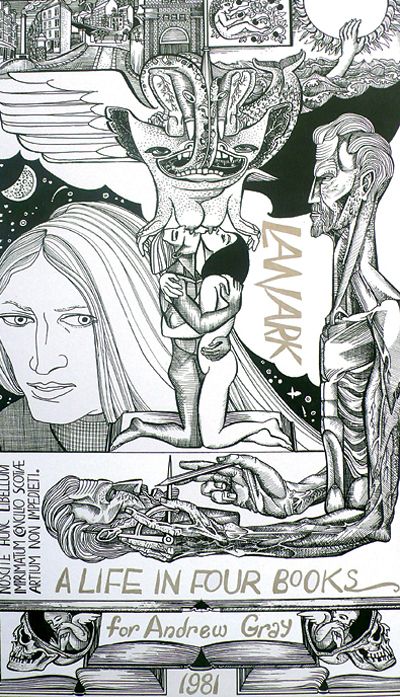
After his ex-nihilo masterpiece inspired the likes of Irvine Welsh, Alan Warner, A.L. Kennedy and Janice Galloway, Gray was nearly as busy as muralist and illustrator of books and magazines as he was writing fiction, an act married to visual art from his beginning. His distinctive images—dogs and doves, a skull-housed fetus, an imposing amazon—came to populate the popular landscape as much as his tortured characters did his fiction.
Jack Kerouac
Though he was also known to doodle, this Beat icon’s illustrations are cautionary tales more than triumphs. A year after Catcher in the Rye came out, Jack Kerouac was shopping a follow up to his 1950 debut, The Town and the City. He, too, sent a publisher some thoughts on cover design. Along with his manuscript for On the Road, Kerouac sent A.A. Wyn a mock-up of his proposed cover: a study-hall pencil scrawl showing a man, on a road (get it?) the path spreading out before him marked by all-caps destinations like “Denver,” “Chicago,” and “New York.” His note explained this as “my idea of an appealing commercial cover expressive of the book.”
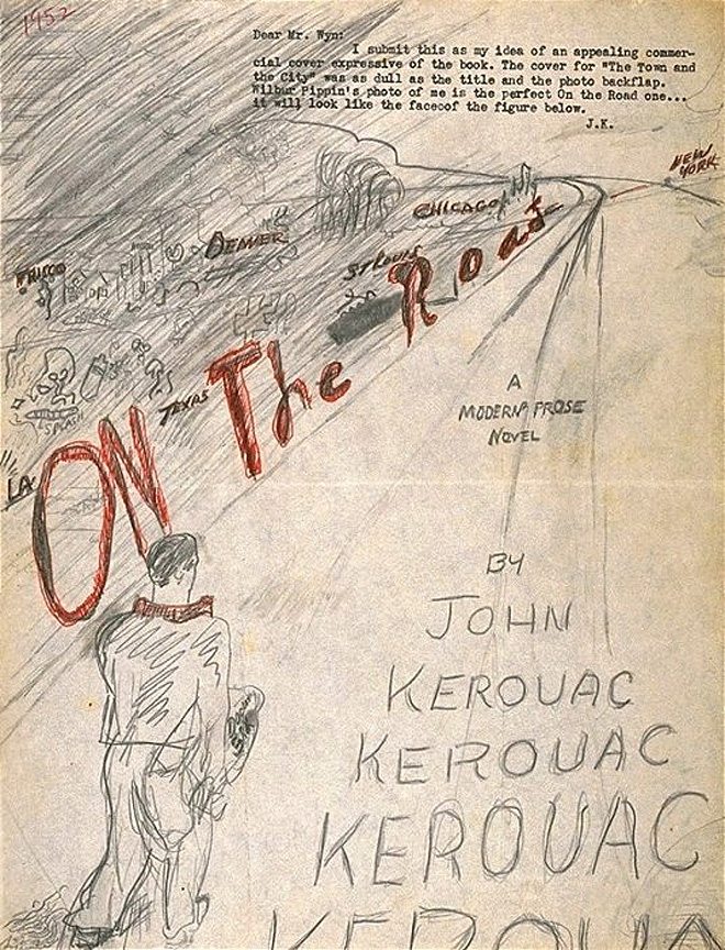
Wyn passed. On the Road took another five years to find a publisher.