A logo can make or break a brand. It’s the most public aspect of a company—the first thing a customer engages with and, hopefully, comes to trust. That’s why a bad logo can have a big impact on a company’s bottom line, and not just because they often pay top dollar for a disastrous rebranding. Here, we look at some of the biggest failed rebrands of the last few years. This is what happened to companies whose new visual identities went horribly awry, and here’s what we can all learn from their design mistakes.
Tropicana
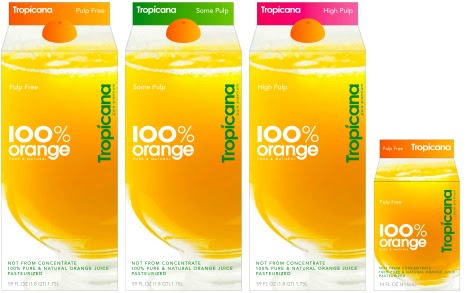
In 2009, Tropicana briefly ditched its emblematic orange and colorful straw for a tall, boring glass of OJ. The new packaging was conceived by the agency Arnell, replete with an awkward slogan—“Squeeze, it’s a natural”—for a sum of $35 million.
Source: The Branding Journal
Sure, the new carton was sleek, but it was also disorientingly unrecognizable. The eye is trained to spot familiarity as you reach into that fridge at the grocery store, and this just didn’t ring any bells for customers. The Tropicana wordmark was moved to a vertical axis, making it, among other things, just difficult to read. So customers weren’t buying it, and as a result, the company’s sales dropped nearly 20%—about $30 million in losses. After two months, Tropicana put the old design back on the shelves.
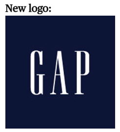
The Gap
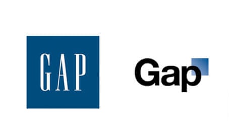
In 2010, the Gap tried to rehabilitate its classic corporate identity, but ended up offending its customer base to such an extent that the brand was disgraced. The company replaced its classic white serif wordmark with a simple Helvetica, next to an accompanying blue square icon with a gradient. The public response was swift and vicious—suffice to say, the new logo was not well-received. The company reverted to a version of the old logo within a week.
Source: The Guardian
The updated version of the tried-and-true Gap logo had one slight change to it: The crossbars on the G, A, and P were all made uniform. And the blue backdrop became a slightly darker shade.
Source: CBS News
In hindsight, the offending logo, designed by New York’s Laird and Partners, looks like it would fit right into the tech trend of the bold san-serif that’s been popular in recent years—just take Google, Facebook, and Pinterest’s generic redesigns of the past decade as proof.
EVERYBODY FALL IN LINE! pic.twitter.com/B9JU5nvpMu
— OH no Type Co (@OHnoTypeCo) February 13, 2018
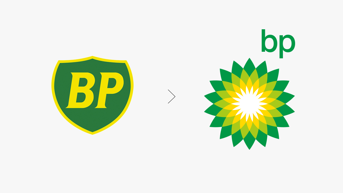
BP
In 2000, in a dramatic turn away from its trusty shield, BP adopted this “Helios” mark. The bright yellow-and-green sunflower is named after the Greek god of the sun. Designed by Landor Associates, the new emblem was meant to signify the environmental awareness of the oil company—and show its investment in reusable energy. “BP” was meant to stand for “Beyond Petroleum.”
Source: Landor
The irony of an oil company claiming to go green wasn’t lost on critics. At the time, many considered the new visual identity to be insincere and poorly conceived—especially with the hike in gas prices at the time. The new brand cost the company upwards of $8 million, with another $100 million in marketing—a sticker price that was in stark contrast to the pittance spent on green initiatives.
Source: Guardian
It was the devastating Deepwater Horizon oil spill a decade later that cemented the bad reputation of the visual identity. In the wake of the catastrophe, BP’s Helios mark became a joke, a cultural emblem for global destruction.
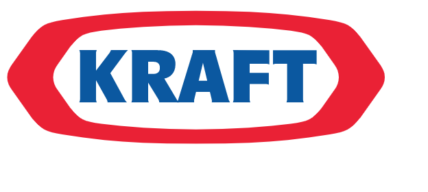
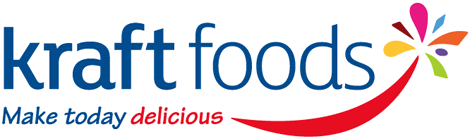
Kraft Foods
In 2009, food manufacturer Kraft decided to adopt a new corporate logo. In theory, this new logo would separate the company’s visual identity from the one found on the packaging of Kraft products in the grocery aisle.
Source: Wikipedia
Source: Brand New
The new corporate identity was a messy conglomeration of several visual entities that spoke very little to each other. The red underline, a reference to the former logo, was designed to look like a smile with “a colorful flavor burst” at the end of it. It was meant to signify the company’s promise to “deliver ‘delicious,’” as its press release stated. And the font chosen for tagline was the wacky Tekton. From its initial release, the logo was poorly received. No wonder, then, that the company went ahead and altered it only a few months later.
Source: Food Navigator
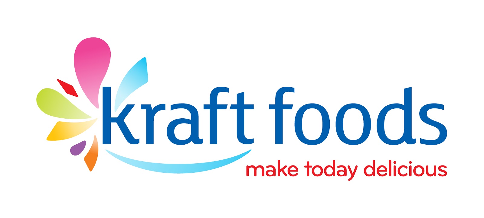
The updated version of the logo, which appeared only five months after the first rebrand, was simplified. The “smile and colorful flavor burst” were moved to the left, the cheesy tagline given a slightly more sophisticated font, and the two elements of the wordmark were made an equal weight. But despite the fact that the company tried their best to bring dignity back to the brand, the damage had been done.
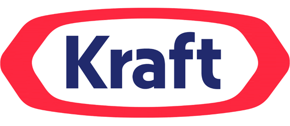
In 2012, when Kraft Foods Inc. split its company into two—Mondelez International for the global snacks and Kraft Foods Group for the U.S. brands—they also unveiled a totally new corporate logo. A simple refresh of the original, beloved consumer emblem, the new identity had the title case san- serif wordmark in a darker shade of blue, in a near complete retreat to the original.
Source: Brand New
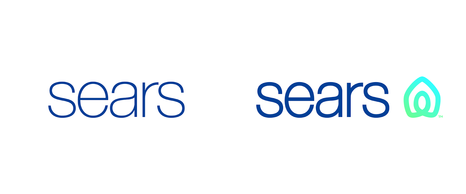
Sears
The century-old retailer has fallen on hard times—there are only 51 stores in the U.S. left, down from 3,500 locations at the time of its merger with Kmart in 2004. Last year, in an effort to save the company, the company gave its 2010 logo a reboot. They bolded the san-serif font and added an icon next to the wordmark. The shape, designed to symbolize both “home and heart”—as well as “an infinity loop,” as it was explained in the company’s Facebook message—not only took flack for being a meaningless addition to the brand, but also for being a knock off of the Airbnb emblem.
Source: Brand New
Source: FastCompany
The difficulties of a redesign in 2020
Some of the challenges that designers and marketers face in a rebrand in 2020 have only become problems in recent years. Because of our hyper-connectivity, public vitriol can be stirred up within moments of going public—and even slander good designs, the ones that designers love. Slack’s Pentagram-designed pinwheel from 2018, for example, is proof that you can’t win ’em all. Some love it, for its versatility and legibility. Others find it offensive.
This desire not to ruffle feathers might explain the trend toward simple san-serif wordmarks—like Facebook’s all-caps redesign from November—that are variable and legible in a variety of environments, digital or otherwise. Regardless of the motivation, it’s clear that the trend toward inoffensive wordmarks is here to stay, at least, while the public is waiting on the sidelines, ready to heckle.