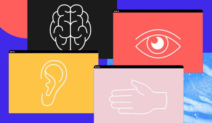
Whether you consider it as an extension of your pointer finger or forget that it exists altogether, the cursor is the unsung hero of web interface design. From the antsy blink of an empty word doc to a slanted point whizzing around the Adobe suite, it’s a simple but all-important piece of our everyday digital lives.
But the cursor can be something more than a simple indicator. It can be a strategic way to guide the user journey or, at the very least, add a little character using unexpected real estate. That’s why some designers are imagining new ways to put the cursor to work.
Let’s examine the point at which the cursor meets design, and see how you can get more from the mouse.
UX Design, 50 Years in the Making
Why, exactly, does the cursor tend to have such a uniform look no matter where you click? After all, most sites experiment with typeface, layout, and color schemes.
The answer goes all the way back to 1968, when an engineer named Douglas Engelbart shared his vision to make computing more interactive. Rather than manually writing code to perform a simple command—say, opening up a different application—he devised a visual control system all relying on cursor and arrow keys. Then came another question altogether: how should it look?
Engelbart was constrained by the low-resolution screens of the day, meaning vertical lines weren’t easy to distinguish while navigating through text. This highlights another lesson from the cursor: prioritize accessibility from the start. So his research team tilted it roughly 45 degrees to the left; problem solved. Steve Jobs liked it, using the mouse as an integral differentiator in Apple’s style of intuitive personal computers. Bill Gates was a fan, too, and made it part of the Windows operating system.
Today, however, there’s no reason why the cursor needs to have the same appearance, especially since screen technology is eons ahead of where it was in Engelbart’s prime. Yet the trend persists and, consequently, changing up a decades-old browsing convention is a bold move.
Mouse Trap
Today’s designers, UX writers, and developers generally work together to minimize—but not completely eliminate—friction, or anything that gets in users’ way. So while it may seem foreign and add a shock-value level of friction to use a custom mouse, it also presents an opportunity to change the way users interact with content. Here, the cursor offers us a chance to get philosophical. Is it possible to balance our love for all things familiar with a desire for something novel? You be the judge.
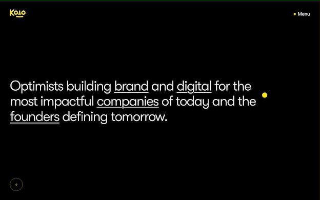
Take the creative studio Koto, for instance. At first glance, this website seems simple: a company description set over a black background. But when you begin to move their circular yellow cursor, things come into focus. Float over what would traditionally be a hyperlink requiring another click and you get an instant, pop-out view of the studio’s work and clients. That quick view might just win attention that would’ve otherwise faded.
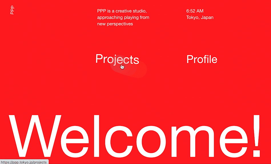
For an even more playful effect, there’s Tokyo-based game design studio PPP. It utilizes what’s known as a trailing cursor to give things a lighthearted feel, almost akin to playing a game. In this case, the cursor is also a way to reflect PPP’s mission to build the future of play.
Finally, consider one of the biggest cursor experiments in recent memory, the iPad. In 2020 Apple built a cursor for the trackpad generation, using a circle that follows your finger and mimics the sensation of pointing and stopping on apps with a subtle pulse.
Chronicling its novelty in Wired, writer Craig Mod describes the iPad cursor as a “shapeshifting blob” that enhances the overall experience of using the device as a whole. “You are never “scolded” by hitting a dead end—you reach a soft bounce at worst,” he said. “And so, for me at least, exploration is encouraged.”
When Does a Custom Cursor Make Sense?
Of course, there’s such a thing as distracting design—and some critics argue that custom cursors bring an unnecessary strain on users, especially from an accessibility standpoint.
Eric W Bailey, an inclusive design advocate, warns against them for that very reason. “A considered, inclusive design enhances a digital experience for all,” he says. In his view, custom cursors can be an eye-catching feature but often “fall apart under scrutiny.”
If you do want to go forward with your own cursor, he advises creating a checklist to ensure your site still works for people with low vision and those with lower levels of technical literacy. Above all, Bailey notes, “If the entire experience relies on a custom cursor, I’d say the problem lies a little deeper than surface-level aesthetics.”
To design advanced cursors with unique functions, you’ll need to team up with a developer or beef up your Javascript skills. Luckily, there are also libraries of code snippets that you can modify to get the ball rolling as you workshop new designs.
The cursor is here to stay, yet that doesn’t mean it has to be static. Consider how customization could add another dimension to your digital design without sacrificing accessibility, then decide if things really click.