Let’s face it: first impressions are essential, nowhere more than online.
Today’s audiences are more discerning than ever; in fact, research from Google shows that a website’s visitors judge its aesthetics in the blink of an eye. That’s 50 milliseconds, to be precise.
We all know a stale website when we see one, but understanding how to maximize your website’s visual impact requires more than just adopting the latest design trend. To take things to the next level, you don’t need to play it safe and simply choose a sleek font or input a few new CTA buttons to elevate things. You’ve got room to be creative, from video integration to motion branding to messaging.
Let’s take a closer look at the benefits that come with freshening things up and dive deeper into how some leading companies keep their websites on the cutting edge.
What a design reshuffle can really do
Website redesigns and refreshes go beyond just routine maintenance. As Brian Morrisey, former CEO of Digiday and founder of media newsletter The Rebooting, describes, “Good design, consistently executed, can be an important competitive advantage.”
In reality, your site might be working perfectly fine—but an update might still be necessary. So how often, exactly, should you consider a website update?
The general rule of thumb is that a website left unchanged has one-and-a-half to three years of shelf life. This isn’t only due to the risk of looking outdated. Design updates help you adapt to online market demand, increase accessibility, and, occasionally, appease the algorithmic powers that be.
Boost accessibility
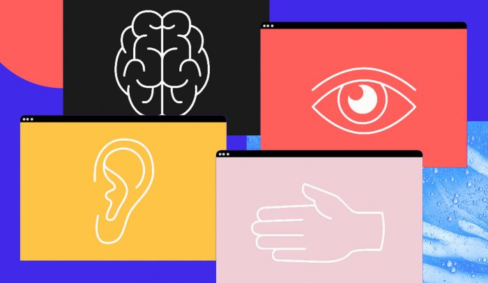
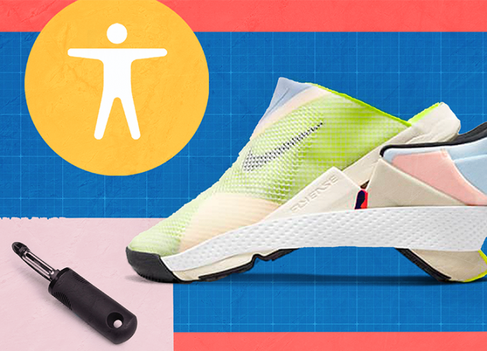
A crucial aspect of redesigns lies with accessibility, which is fast becoming an imperative for websites seeking to be more inclusive and maximize their audience. While nearly one in four Americans lives with a disability, research suggests that 98% of the top one million websites don’t offer a fully accessible experience. Creating accessible websites improves usability for those with vision, hearing, or motor impairments.
If you’re strategizing about how to up your site’s performance, accessibility is a great starting point. To make better accessibility a reality, website updates can reevaluate color contrast, ensure all images contain alt text, and equip all videos with built-in closed captions.
Conquer search engines
Try as you might, there aren’t many sure-fire ways to gain a coveted slot on Google’s first page. But as years go by and algorithms change, two themes ring true.
First, it pays dividends to home in on great UX. It’s obvious that great content will always rise to the top, but, as Google developers outlined in a 2020 blog post, “in cases where there are many pages that may be similar in relevance, page experience can be much more important for visibility in Search.” How can you update for a great page experience, according to Google? Make your page accessible, double down on mobile-friendly pages, and be sure all interactive features don’t get bogged down by lags.
And secondly, search engines reward refreshed content. Regularly updating your webpages shows that the site is monitored for accuracy and doesn’t include outmoded guidance.
Site redesigns in action
Unless your brand depends on a consistent, unchanging aesthetic—think Craigslist—a website refresh or redesign is likely on your horizon (and if it’s not yet, perhaps it should be). Luckily, some organizations have documented their design decisions and pulled back the curtains on how they approached the process.
Let’s look at a few examples of redesigns that boosted performance, highlighted a brand’s true identity, and brought companies into the future.
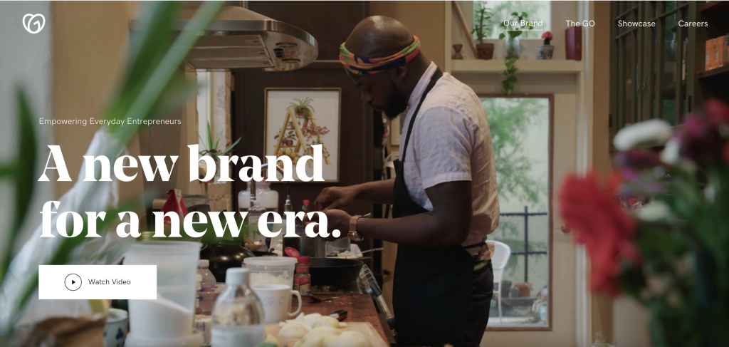
GoDaddy
How can a website hosting platform inspire entrepreneurs to up their design games themselves? That’s the question GoDaddy asked during a 2020 redesign. While they revamped main site features like font, color scheme, and logo, they also made a point to include subtle animations and illustrations. The refresh, as they note, was done with a cohesive goal: creating a “world that sparks the possibilities our customers can create.” Embracing a more modern identity proved to pay off, too. GoDaddy added nearly 1.5 million new users in 2020 alone, double its previous year’s total.
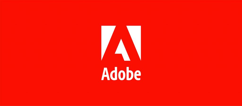
Adobe
In 2020, Adobe unveiled its first new logo since 1993. But this rebrand spanned further than just what appeared in their website’s upper-left corner. With a roster of new product identities to share—including the hugely popular Creative Cloud and its associated 20 applications—they took to their website to highlight and recategorize each tool. Every video app, for instance, assumed new shades of blue and purple; logo colors are also optimized for accessibility.
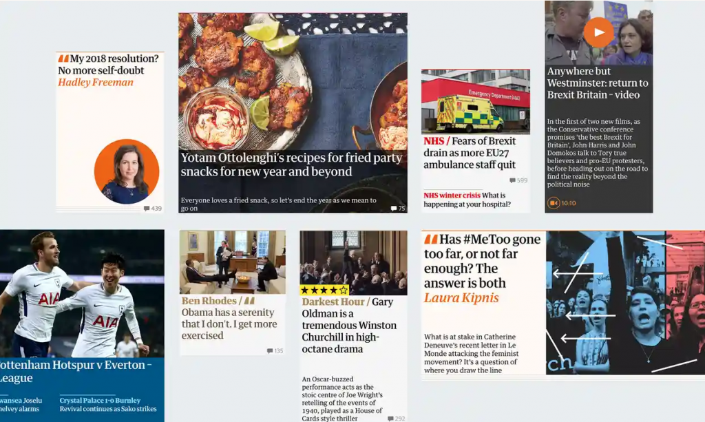
The Guardian
Updating the design of a daily newspaper in operation since 1821 is no small task. So when The Guardian made changes, it turned to its core values to inform how readers could best take in the news. Katharine Viner, the paper’s editor-in-chief, outlined the stylistic choices as, “grounded in the qualities readers value most: clarity, in a world where facts should be sacred… imagination, in an age where people yearn for new ideas.” The result is a modern riff on their classic typeface, enlarged for accessibility and featuring energetic colors across sections.
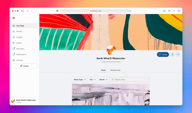
Patreon
Patreon is a crowdsourcing membership platform made by creators, for creators. That’s why, in May 2022, it introduced a redesign to make users’ common workflows “quicker and more intuitive.” Patreon also took notice of the overlap between patrons and creators and launched an interface that lets members seamlessly transition between each type of profile. The brand also centralized key metrics and analytics onto a single page, keeping data at the ready in a simple format.