Browsing a brand’s website shouldn’t feel as impersonal as an automated call with customer service. ”Speak with a representative. Speak. With. A. Representative. SPEAK WITH A REPRESENTATIVE!”
(Anyone? Untethered fits of rage with the robot voice? Just us? Moving on…)
Many brands have decided that some parts of their websites don’t need to reflect the same level of customer care that they provide in person. At Ceros, we’re on a mission to make all digital experiences feel more human—like a real person made them—and being more mindful of the real people that consume them. For us, that meant reviewing all of the possible digital touchpoints that a Ceros reader could encounter, and giving them each honest consideration.
The touchpoint that is perhaps most frequently overlooked is the 404 error page, whose history dates back to the 1980s. Many websites erroneously cite the origin of the numbers “404” as the office number of the room that held the World Wide Web’s central database. Rui Alves, a contributor to the Medium blog “The History of Yesterday,” hypothesizes that 404 is a reference to Pakistan International Airlines Flight 404, a missing flight that was never found in 1989—the same year that Tim Berners-Lee founded the Web. But one of the creators begs to differ: Robert Cailliau, the Web’s co-developer with Berners-Lee, said in an interview that the number 404 was chosen “according to the whims of the programmer.”
No matter how it started or what it means, the 404 error page is a lasting figure from the early days of the Internet. And on most sites, it doesn’t look a whole lot different now than it did in the ’80s. Ceros, too, was guilty of overlooking the potential of the 404 error page.
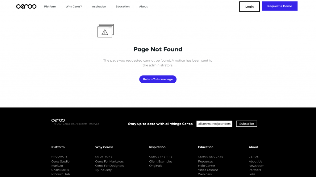
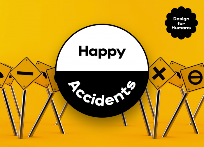
That is, until now. Even though it represents a trip gone awry, we know that many of our users will, at some point, land on a dead page (for any number of reasons). And we know that we’d hate for them to see that dreaded error message, simply shrug their shoulders, and close out the tab, taking their attention elsewhere. So we’ve revamped our 404 page to be more consistent with the things we stand for.
“Landing on a 404 page is never a fun experience, so we made it more interesting by including an interactive wheel that randomizes some of our prominent projects,” said Tri Vo, our senior designer and the creator of our new 404 page. “Our goal is to make sure our viewers always have a great experience, even when they’re boxed into a corner.”
The new error page serves a few purposes. First, it helps wayward users to land on a new page of interest, rather than being faced with a dead end. Second, it is designed to introduce new readers to our representative work and showcase the creative potential of the Ceros platform. They’ll get a sense of what we do and why we do it. And third, like Tri said, it’s just fun. We want to delight our readers at every possible turn.
So for once, we’re actually going to encourage you to land on our 404. Go on: seek a dead page out! Replace the slug in our URL with whatever you want, or just click here for a faster version.