Despite the company’s seeming permanence, the Apple brand has gone through radical changes in the 43 years since its launch. Join us as we take a look at Apple’s ever-changing brand identity.
1976
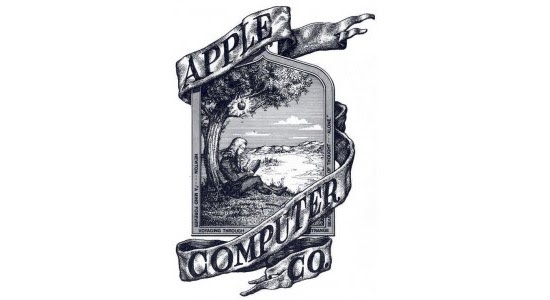
Designed by Steve Jobs and his former Atari coworker Ronald Wayne, the first Apple logo featured Isaac Newton sitting under his legendary apple tree. Adding even more gravitas to the image, Jobs and Wayne included a quote from Wordsworth, “Newton… a mind forever voyaging through strange seas of thought.” Wayne later relinquished his 10% stake in Apple a few days after the company’s launch, for $800.
1977
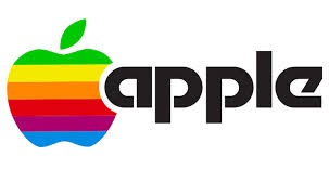
Jobs commissioned Rob Janoff to design Apple’s new, more familiar logo, known as the “rainbow apple.” The logo continued to honor Isaac Newton — the spectrum is a nod to his experiments dividing a ray of light into its constituent colors, while also hinting at the Apple II’s color capabilities. The typeface is Motter Tektura, designed by Othmar Motter of Vorarlberger Graphik in 1975, chosen for its “playful qualities and techno look.”
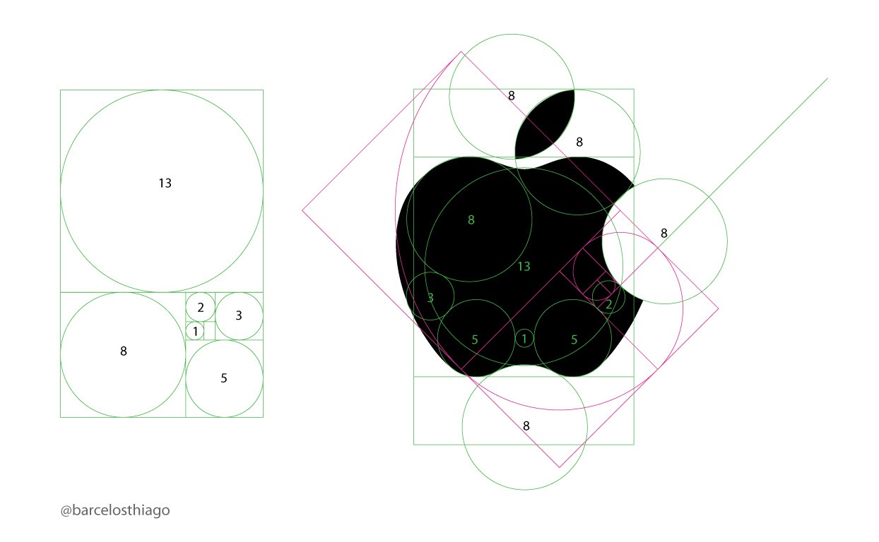
Fun fact: the Apple logo maps quite nicely with the Golden Ratio.
1984
1984 proved a seminal year for Apple as both a company and a brand. Landor Associates removed the text from the Apple logo, the Macintosh was launched, and Ridley Scott’s legendary “1984” ad aired only once, during the Super Bowl.
1987
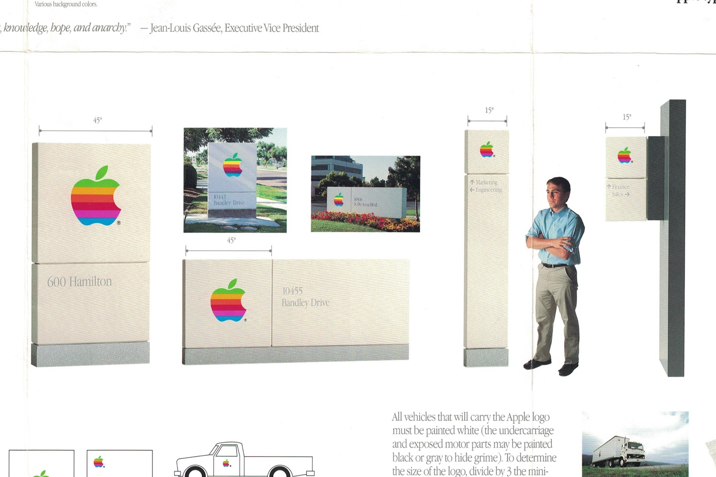
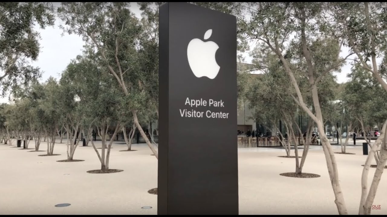
Apple’s 1987 Identity Guidelines standards manual (rediscovered by designer Arun Venkatesan) contains a wealth of gems around the company’s post-Steve Jobs branding. We’re particular fans of the section on Apple’s corporate signage, which remained structurally unchanged until the opening of their massive new campus Apple Park in 2017 (more on that later).
1997
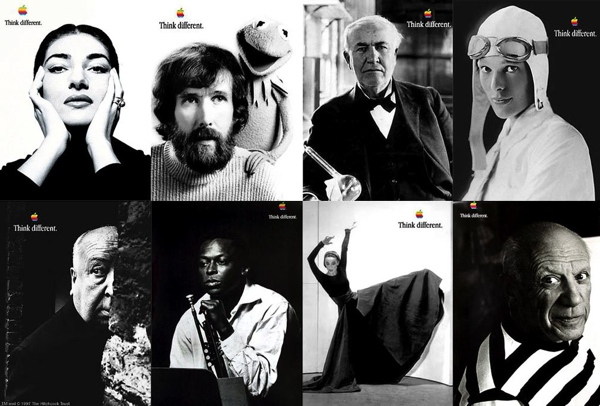
With Steve Jobs back at the helm, Apple launches their “Think Different” campaign, created by Chiat/Day art director Craig Tanimoto. With television spots voiced by Richard Dreyfus and a series of billboards and print ads depicting revolutionary icons in simple black-and-white photos, with Apple’s rainbow logo in the lower corner.
According to then-Chiat/Day creative director Rob Siltanen, Jobs’ reaction to the pitch wasn’t an immediate home run. “[Jobs] looked around the room filled with the “Think Different” billboards and said, “This is great, this is really great … but I can’t do this. People already think I’m an egotist, and putting the Apple logo up there with all these geniuses will get me skewered by the press.” The room was totally silent. The “Think Different” campaign was the only campaign we had in our bag of tricks, and I thought for certain we were toast. Steve then paused and looked around the room and said out loud, yet almost as if to his own self, “What am I doing? Screw it. It’s the right thing. It’s great. Let’s talk tomorrow.”
1998
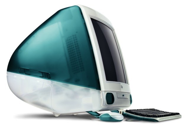
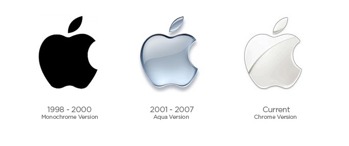
The iMac G3 debuts in a series of eye-popping colors and design that clearly differentiated Apple from the rest of the PC marketplace. The iMac line also led to the introduction to Apple logo’s first update in 22 years. The Apple logo dropped the rainbow and took on a monochromatic, translucent look. The move was a declaration that Steve Jobs was changing the company; it also proved necessary to avoid the garish appearance of an enormous rainbow apple atop a Bondi Blue iMac. Of course, that’s not much better than the name Jobs originally wanted for the iMac—the MacMan.
2001
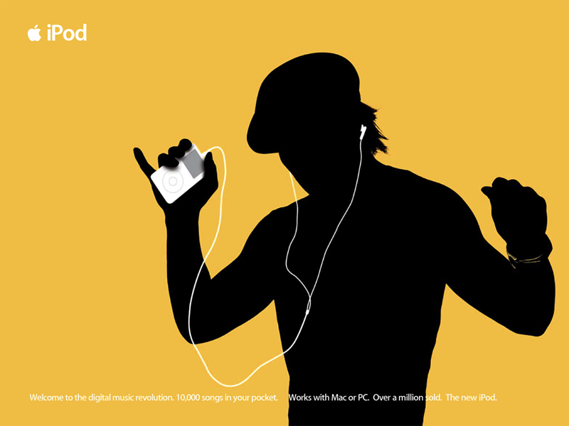
The iPod is released, named by freelance copywriter Vinnie Chieco. “As soon as I saw the white iPod, I thought 2001,” Chieco later said. “’Open the pod bay door, Hal!’” Add the “i” prefix, and the iPod was born.
Two years later Chiat/Day would introduce the “Silhouette” campaign, credited with bringing the iPod into the mainstream. “Black figures silhouetted against colorful backgrounds, white iPods in hand, white headphones trailing to their ears, dancing.” Jobs didn’t like the ads at first, because they didn’t show the product.
2002
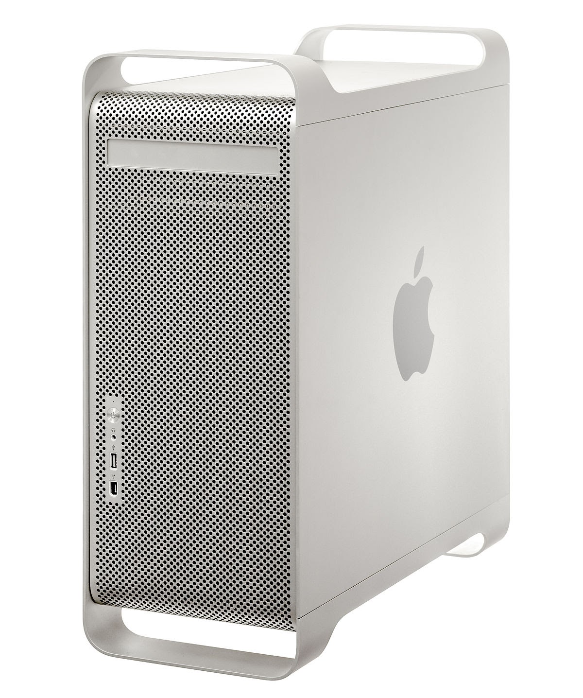
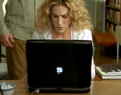
With the introduction of the Power Mac G5, Apple begins to move away from their translucent rainbow of colors in favor of a steelier, frosty look that persists to this day. Another design fix was made for laptops — the Apple logo no longer appeared upside-down when the lid was opened (known as the “Sex and the City Problem”).
2007
With the debut of the iPhone, Apple Computers Inc. becomes Apple Inc., and the so-called “Aqua” Apple logo gets upgraded to “Chrome.”
2012
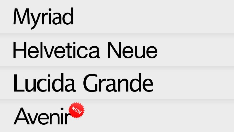
After the death of Steve Jobs in October 2011, many of the changes to Apple branding could be seen as incremental, rather than revolutionary. In 2012 the company added the Avenir font to its in-house favorites, appearing in Mountain Lion and iOS 6.
2013
With the iPhone 5s, Apple introduced the world to a new “color” — Space Gray. The aluminum finish would feature prominently on all future iPhones, iPads, MacBooks, and later Beats headphones.
2015
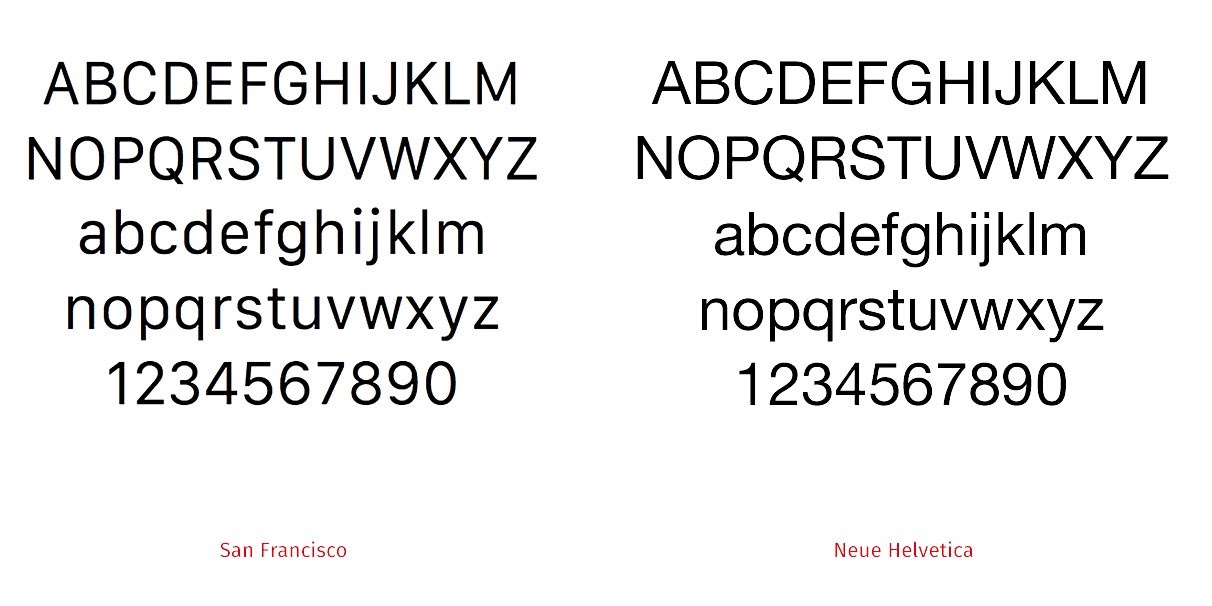
In another blink-and-you-might-have missed-it update to their visuals, Apple dropped Helvetica Neue as their default (“the world’s favorite typeface” per Wired) to be replaced by a bespoke font, San Francisco.
2017
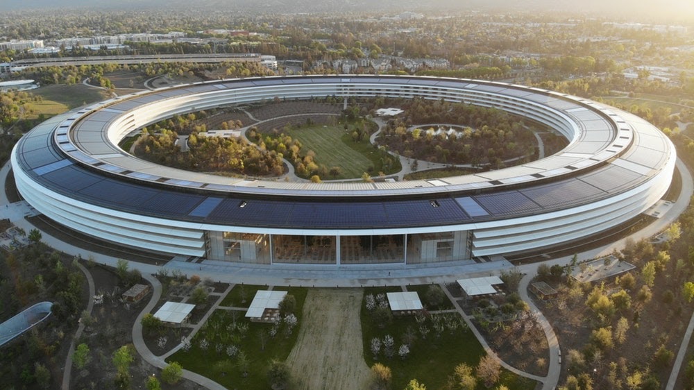
Apple’s new corporate HQ is a $5 billion, 2.8 million-square-foot, Norman Foster-designed spaceship, officially known as Apple Park. Every inch of this thing has been designed to within an inch of its life—even the circular pizza boxes served up at the Apple Park Café have been patented.

The corporate signage has also been transformed into more imposing, monolith-like structures.
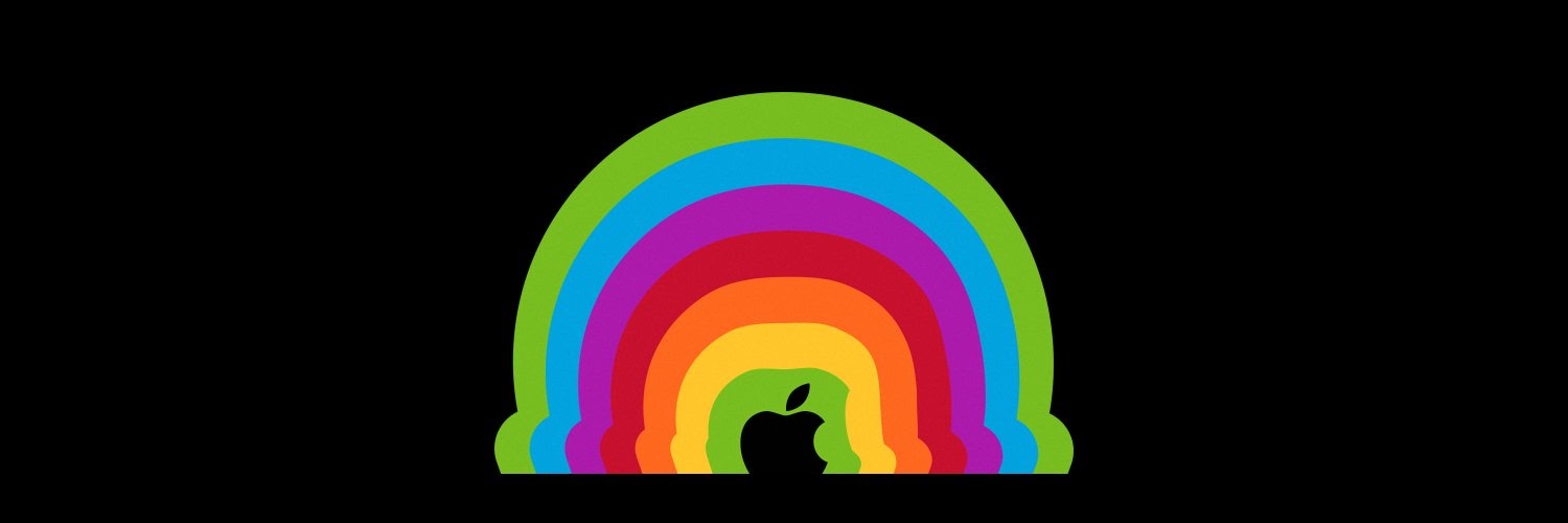
2019
Everything old is new again — at Apple’s March event launching their new content services, the familiar rainbow returned to the company’s imagery. According to the website The Blast, Apple has applied for a new trademark on its multicolored icon, intending to sell “hats and caps” emblazoned with the logo.