Design has power—to attract, to influence, to change how businesses operate and interact with their customers. But the coronavirus pandemic has also provided the design community with a case study about how design can help communities understand and eliminate the spread of a deadly virus sweeping the entire world.
Many communities are applying the principles of disaster design to spread information about the coronavirus, with great success. But before we get to the designs, what are those principles, exactly?
The Basics of Disaster Design
Time is critical during a crisis, and having a framework to deploy a campaign saves valuable time. This framework should be established long before a disaster occurs, so that it’s ready to be deployed when it’s needed. A comprehensive campaign for crisis design relies on the following:
- Consistent Messaging – taglines and talking points, with everyone in the organization adhering to the same message.
- Strong Visual Language – consistent use of colors, typography, and illustration.
- Inclusive Language and Communication – words that describe an understandable mental model and “use the same dictionary.” We’ve included some examples below.
Now, let’s dive into each of those a bit more.
Consistency
Consistency is crucial to any creative campaign, and that’s especially true when you’re designing for a pandemic. When every level of leadership—from the Prime Minister of a country to the Board of Tourism director of a small town—communicates a message in the same way, it’s easier for the general public to comprehend and rally behind that message.
Consistency starts with a robust brand guide, and a brand guide doesn’t just mean a guide to the visual elements. It also includes specific talking points, tone of voice styles, and shared goals, ensuring that everyone can execute the brand quickly and consistently.
A Strong Visual Language
Your job as a designer is to communicate, first and foremost—not just to make things decorative. The goal of disaster design is to communicate clearly with a broad audience, and a simple approach is often the best. This kind of design is all about how it works, and not how many design awards it could win.
A strong visual language is easily recognizable and translates across multimedia—from bus stops and community banners to social media outlets.
Inclusive Communication
There was so much to learn about COVID-19 during the initial outbreak, and we continue to learn new things every week. One surefire way to speed up understanding difficult topics is to make sure that everyone uses the same language—and that the language is one that’s easy to understand. Taglines should be catchy and memorable. You should speak the language your audience understands—this is even more important when your audience is an entire city or country.
Who got it right?
These three communities nailed their coronavirus pandemic design campaigns, applying each of the principles effectively. Ultimately, these creative campaigns kept infection numbers suppressed and local communities safe. Let’s learn more.
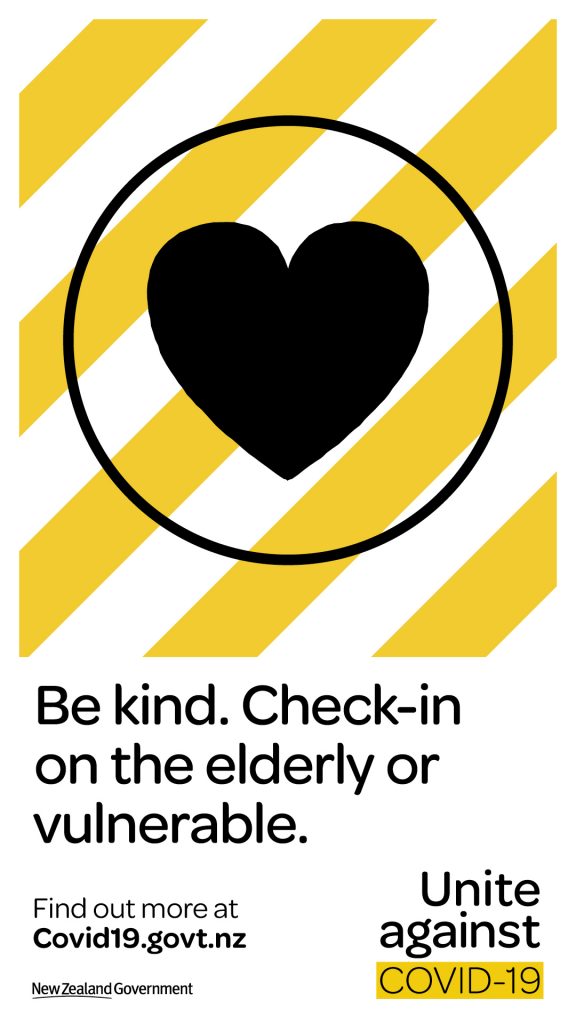
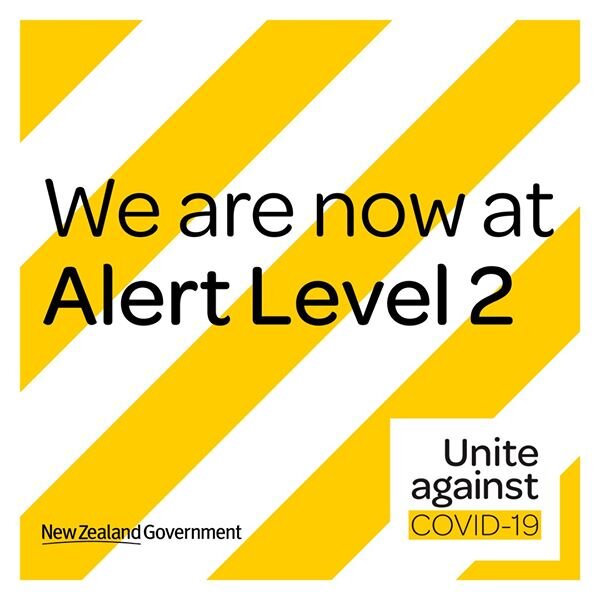
New Zealand: Stay Home. Stay Safe. Be Kind.
Many factors contributed to New Zealand’s success in its fight against the coronavirus—given the country’s relatively small population and its geographical solitude, it started with an advantage over more centrally-located, densely-populated countries. But that shouldn’t take away from the country’s creative campaign.
New Zealand’s Coordinated, Multi-Pronged Response
The visual language of New Zealand’s pandemic response is strong, consistent, and a bit jarring. It’s bright and severe. The yellow and black lines show that this is an official and coordinated response across all visual platforms. The country has gone from a strict seven-week lockdown to a return to almost-normal.
In an interview, design and culture journalist Akiko Kurematsu said, “It felt like a collective achievement… a huge sense of relief, gratitude, and pride in what was accomplished here in New Zealand.”
The New Zealand campaign chose words like “bubble” to describe your immediate household. This language is something that kids and adults can understand and use together. Almost everyone has a working mental model of how a bubble works.
It’s important to note that New Zealand’s pandemic design wasn’t flawless—most communication was in English, while New Zealand is multicultural and multinational. But ultimately, it’s working.
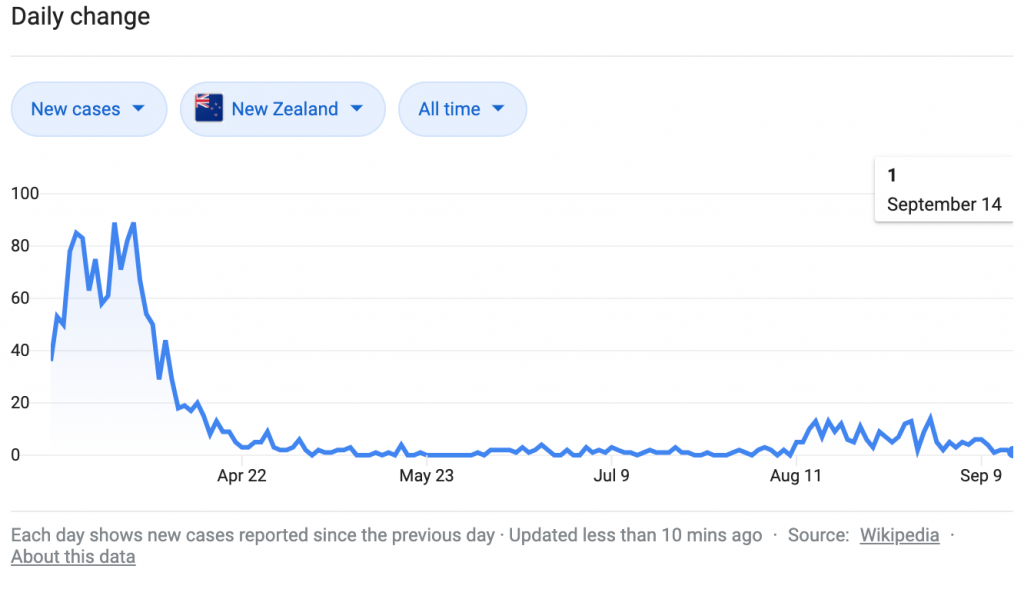
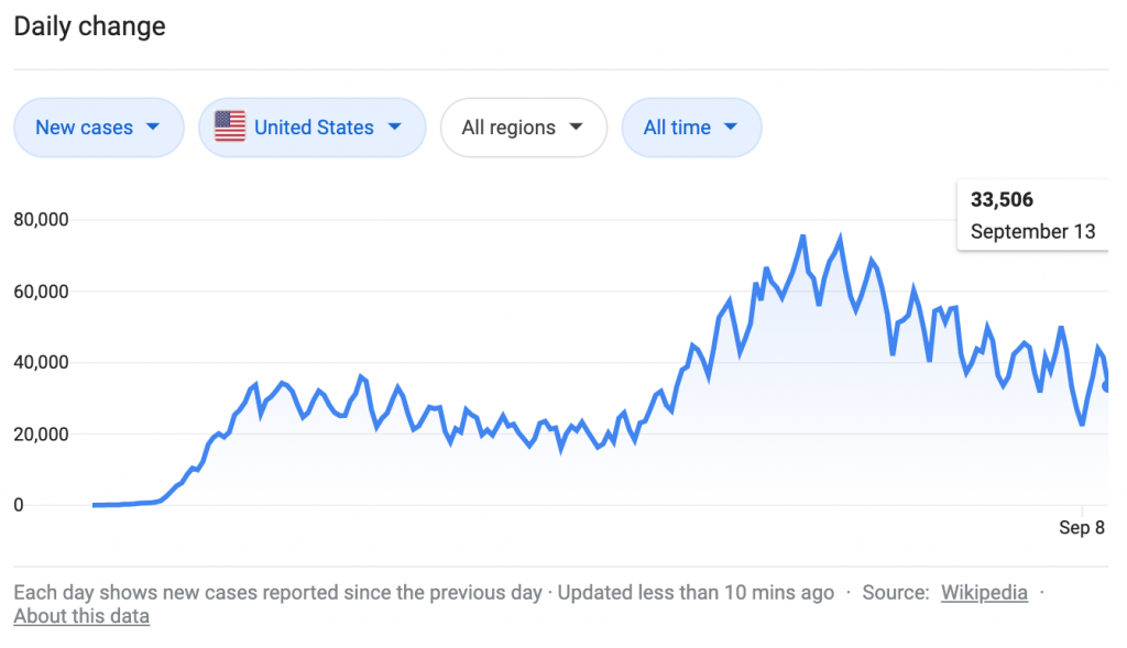
The country reported fewer than five cases per day all summer, down from a high of 90 cases per day in the spring. In the United States, for reference, about 30,000 cases were recorded each day in the spring, and cases more than doubled in the summer.
Graphic Sources: https://g.co/kgs/dZKrn9
Japan: Avoid the Three C’s
Japan took on coronavirus in a different way than the US did. With no formal lockdowns, scientists are still trying to tease apart why Japan has had so few cases. Theories range from under-reported testing and asymptomatic carriers to cultural factors.
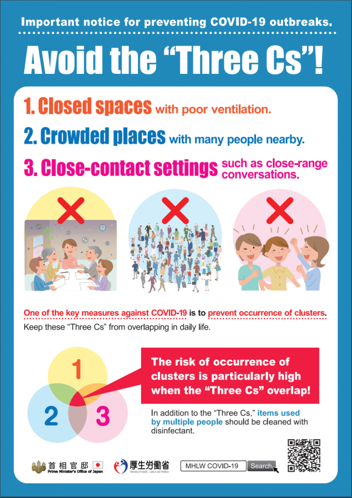
Instead of focusing their language on staying home, Japan’s leaders focused on a “cluster strategy.” They encouraged people to avoid the three C’s—closed spaces, crowded places, and close-contact settings. The country’s posters read like friendly infographics, with a Venn diagram reminder to avoid areas where the three Cs overlap. The use of a consistent, easy-to-understand tagline helped spread the cluster strategy and has potentially helped spread the message of safety.
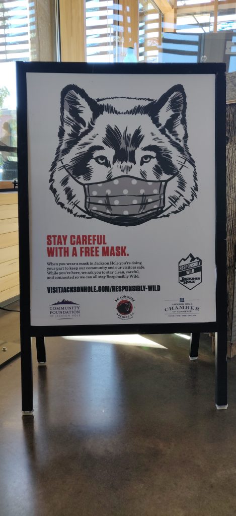
Jackson Hole, WY: A humorous and on-brand response
In the shadow of Wyoming’s Teton Mountain Range, Jackson Hole is where the old American West comes to life. The surrounding alpine forest and high desert, is renowned for its wildlife—moose, elk, wolves, and bear call this land home, while bald eagles soar overhead and cutthroat trout swim in the crystal clear waters of the Snake River.
The Jackson Hole Travel and Tourism Board channeled that natural energy to create a humorous, on-brand creative campaign, encouraging everyone to “mask up.” Now, that’s pretty basic hygienic safety advice at this point. So how do you take information that everyone has heard a hundred times, and get incoming tourists to take notice and behave properly while on vacation? It requires some creativity.
The campaign’s slightly absurd signage connects travelers with Jackson Hole’s famous local wildlife and the town’s old west feel. The understated implication—if a wolf can wear a mask, so can you—is on point. The illustrations are simple and straightforward; they communicate in such a way that adults and children can quickly interpret the message. The campaign balances the need for adventure with the need for safety.
Stay Consistent, Develop Strong Visuals, Be Inclusive
Designing when the stakes are highest requires far more than an eye for design.
Your role as a creative is not to be the gatekeeper of a campaign but rather to be the campaign’s instructor. When creating a coordinated campaign response, your responsibility is to ensure that people understand how to use the different elements together and maintain consistency when many people are working on the project simultaneously.