The Earth isn’t flat, but a couple auto companies have sure made it feel that way.
Toyota became the latest car company to update its brand guidelines with a new, flat logo in the past year, following in the footsteps of three automakers—BMW, Volkswagen, and Nissan. The company’s European marketing and communications material will bear the new logo, which is the same as its old one, only without the chrome and 3D-esque shadows. But the company said not to expect changes to its fleet of vehicles.
Toyota is the second company to release its new flat logo this month—Nissan became the first, as the company released its own in mid-July. According to Nissan, its new logo is a reimagining of its old one, updated for the digital world—a “reimagination of the iconic Nissan brand logo for a new chapter.” A three-year process kickstarted by SVP of global design Alfonso Albaisa and led by deputy GM of the advanced design department Tsutomu Matsuo yielded a new logomark that’s familiar, but thinner and lighter than its predecessor.
Unlike Toyota, Nissan’s new logo will grace its fleet of vehicles. And it stands out from the rest in that it will be illuminated by 20 LEDs—a reminder, according to the company, of its drive towards an “electrified future.”
If those logos and that marketing jargon looks and sounds a bit familiar, it might be because Volkswagen made what basically amounts to the same exact change last September.
And BMW flattened their old logo in March.
Not everyone is a fan of the shift. Some felt that the new designs came off as “cheap.” Jamie Kitman, an automobile writer, theorized that cost might have had something to do with the redesigns.
“I wouldn’t be surprised if there was a cost element,” he said over email. “These flat jobs are likely cheaper and easier to make. When you’re in the business of cutting corners, no way you’re going to leave money on the hood—literally.”
So what’s behind the flat logo trend and who gets the credit (and/or the blame) for leading the charge?
As with most innovations in the technology world, it seems that the shift can be pinned on Apple and Jony Ive. At its September 2013 Worldwide Developers Conference, Apple debuted iOS7, its updated operating system with a completely-redesigned user interface. That included a pivot from shadowed, 3D-esque icon design to a completely flat look for app icons. Reaction to the design change was mixed, but users adopted the new software at rapid speed, and the flat icons have become the new normal for hundreds of millions of Apple product owners.
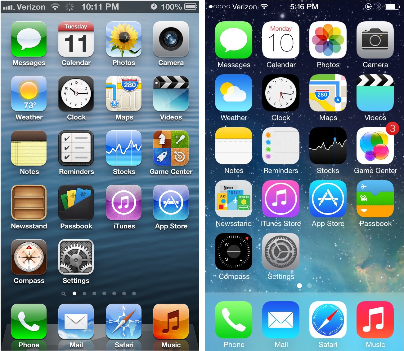
Right: Apple’s flatting, from 2013’s iOS 7.
Over time, since Apple’s shift in 2013, we’ve seen brands flatten their logos for adaptability—on screens and in print, on cars and on app icons. MINI flattened its logo in 2015. Citroën updated its logo in 2016. Audi made the shift a year later in 2017.
Flat logos aren’t just running rampant in the auto space, either. Pizza Hut, for example, released a new flat logo in 2014. Taco Bell made the switch in 2016.
But now, as all these companies are shifting to flat logos, Apple is shifting away from them—back towards its skeuomorphism of the late 2000s. iOS 14, its most recent OS update slated for release in the fall, brings heavier shadows and a little texture back to the app library.
These logos draw polarized reactions on both sides of the aisle—some feel that the flat logos are clean and sleek, while some feel their cheaper facsimiles of their more robust predecessors. But the logos are taking over the auto space, and it doesn’t seem like car companies will be adding a third dimension any time soon.