Feeling blue? Pantone is, too.
This week, the dominant color company announced its 2020 Color of the Year was a throwback: Classic Blue 19-4052. In some ways, this choice is a departure from recent Color of the Year picks. Pantone’s past selections have been indicators of a trend, a finger-on-the pulse moment, and maybe Classic Blue will be, too. While Pantone’s pick emotes a warm twinkle of nostalgia, for now, Classic Blue’s pulse reveals a decidedly slower heart rate.
So of all places, we didn’t quite expect to see much Classic Blue in Manhattan’s hip Flatiron District (our home turf). But always ones to be thorough, two of our top color scientists [ahem] here at Ceros took a 1-hour walk around Ceros’s backyard to gauge how frequently we’d spot Classic Blue in the wild.
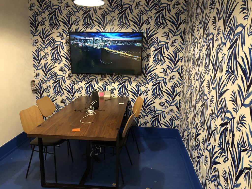
Although, in full disclosure: we didn’t even have to leave the Ceros office to get our first sighting. Each conference room in our office has a theme, and one of these rooms, named “Blue Note,” is almost completely Classic Blue. Without even leaving the building, we have the first challenge to our initial assumption regarding Classic Blue’s un-cooless.
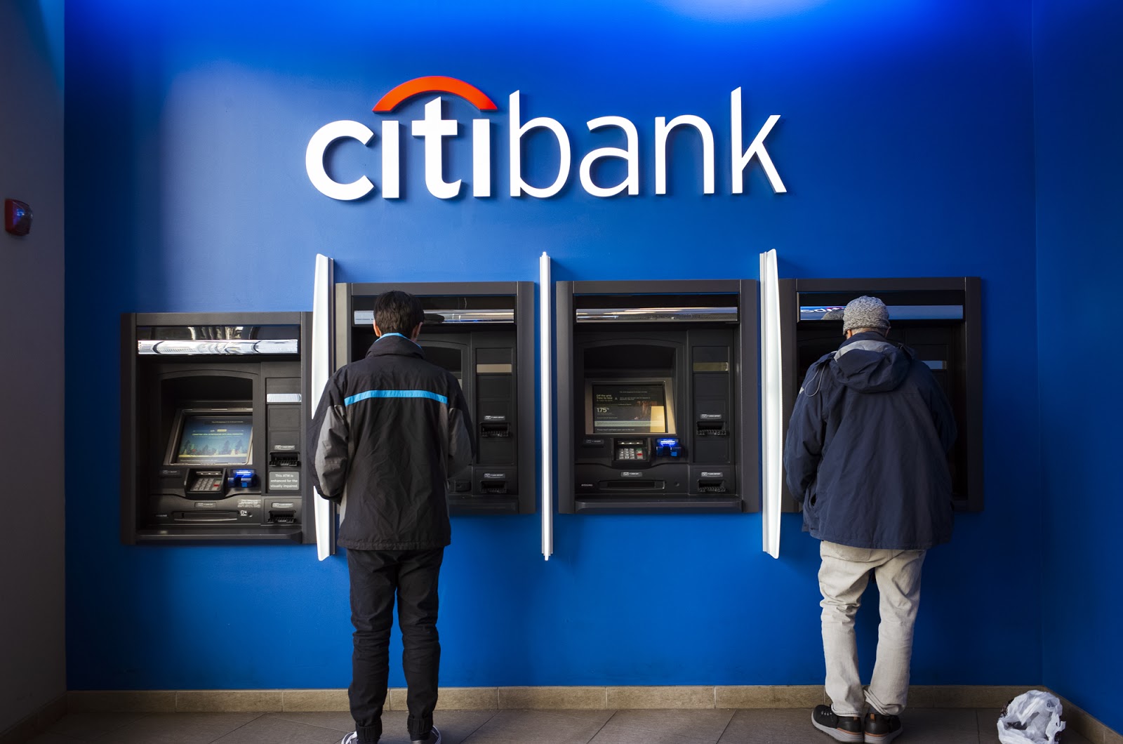
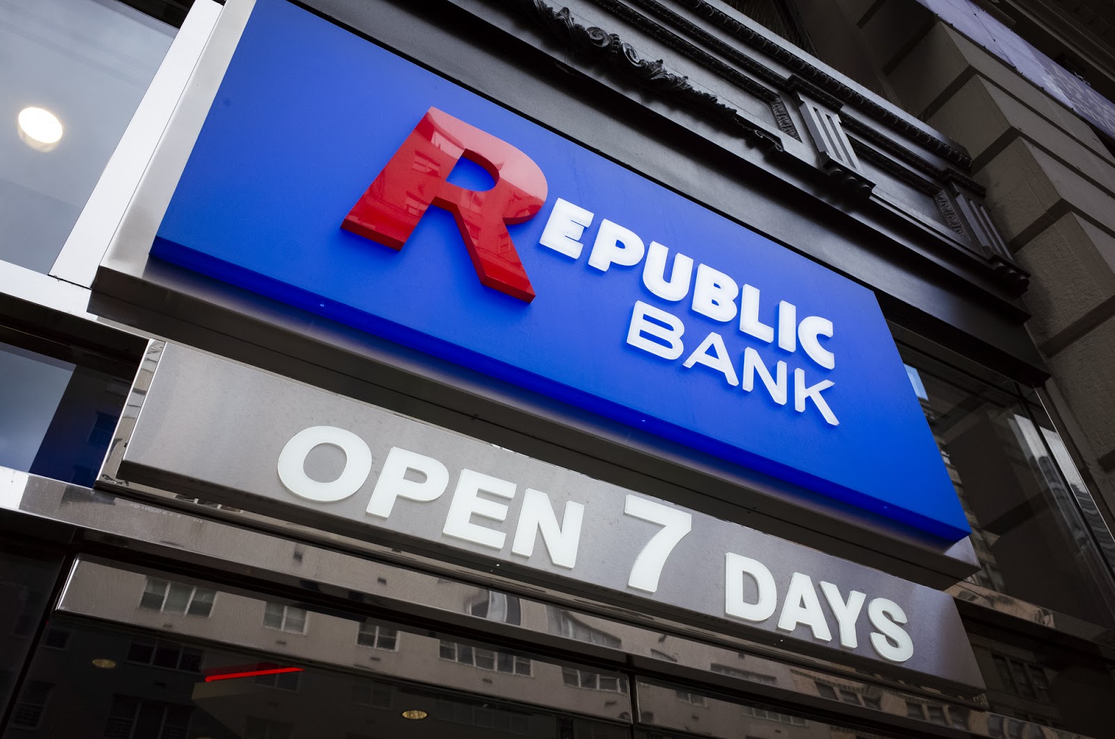
But regardless, we continue outside. Pantone says the shade represents stability and dependability, and that shone through in the type of brands that use Classic Blue in its palette. Classic blue is especially common in the always-stable banking sector. Just take a look at how many financial institutions make use of the hue, or one extremely close to it.
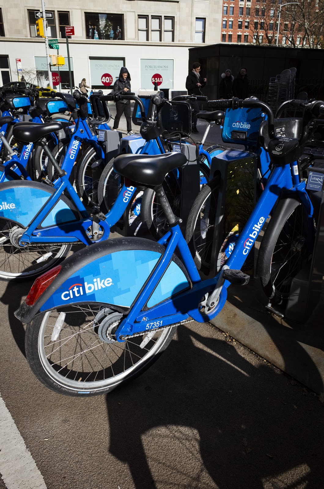
Also, thanks to its primary sponsor, Classic Blue adorns over 12,000 Citi Bikes across the boroughs.
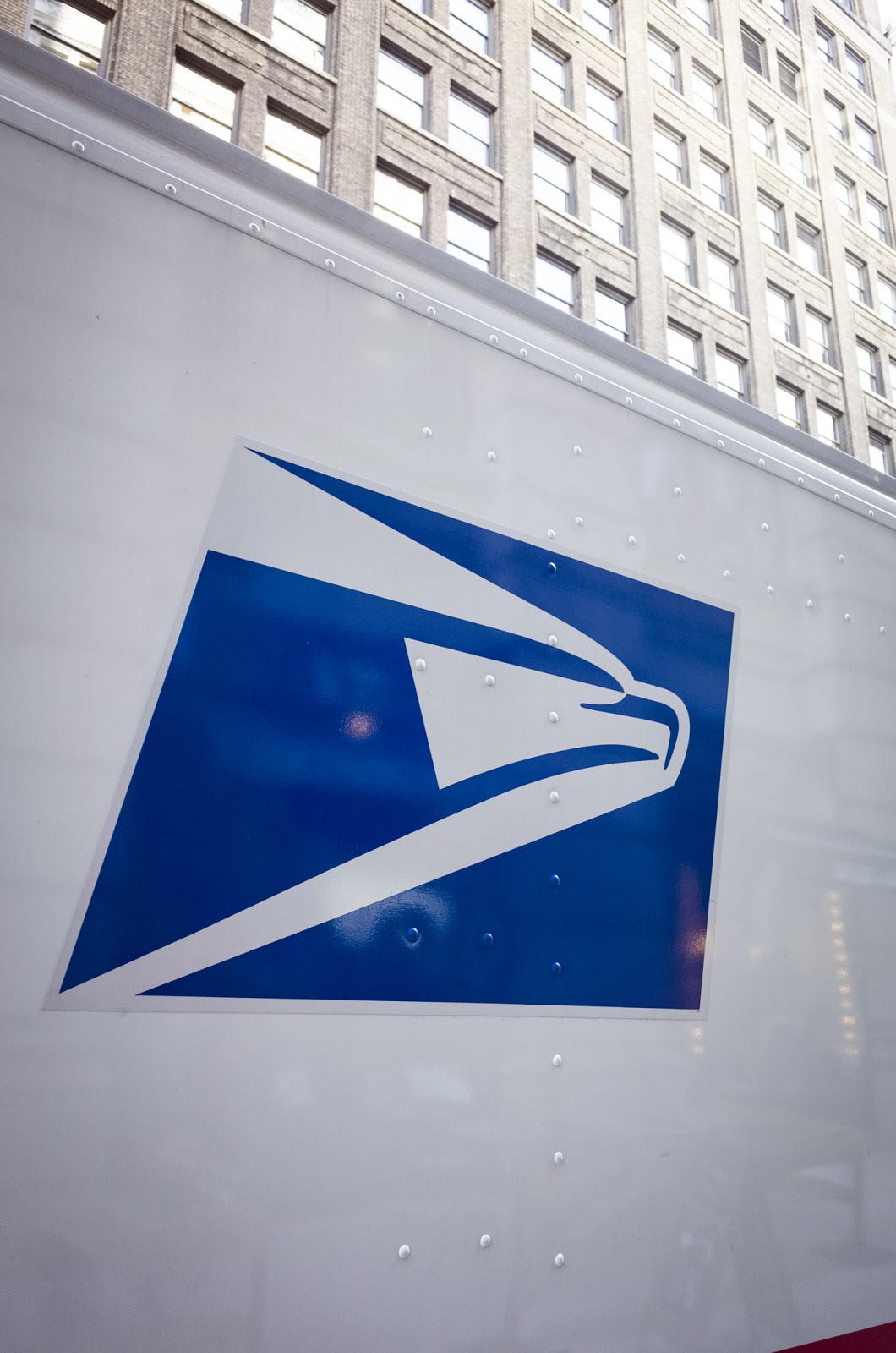
We also found that the paradigm for American reliability and consistency, the United States Postal Service, makes prominent use of the color in question.
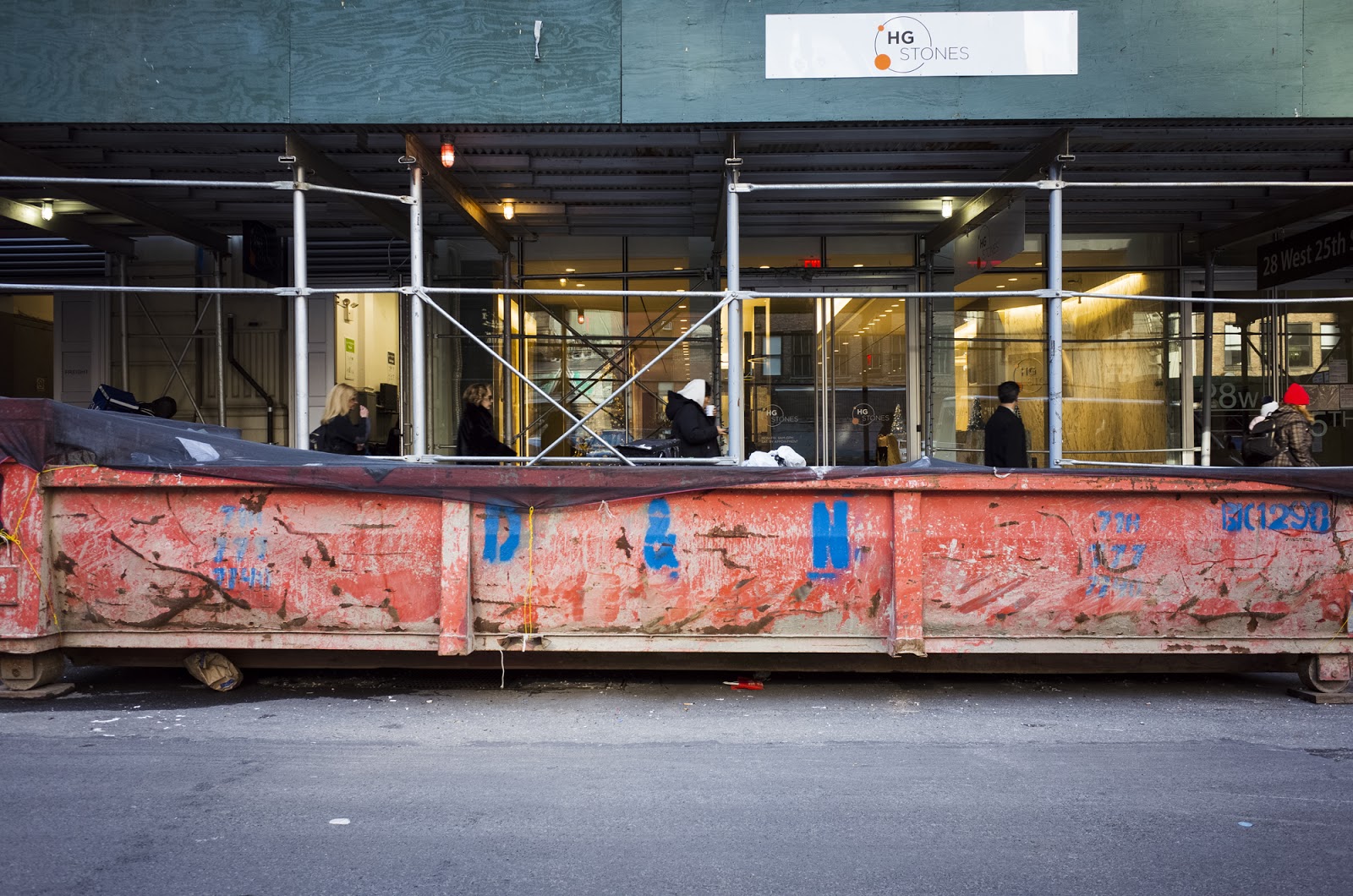
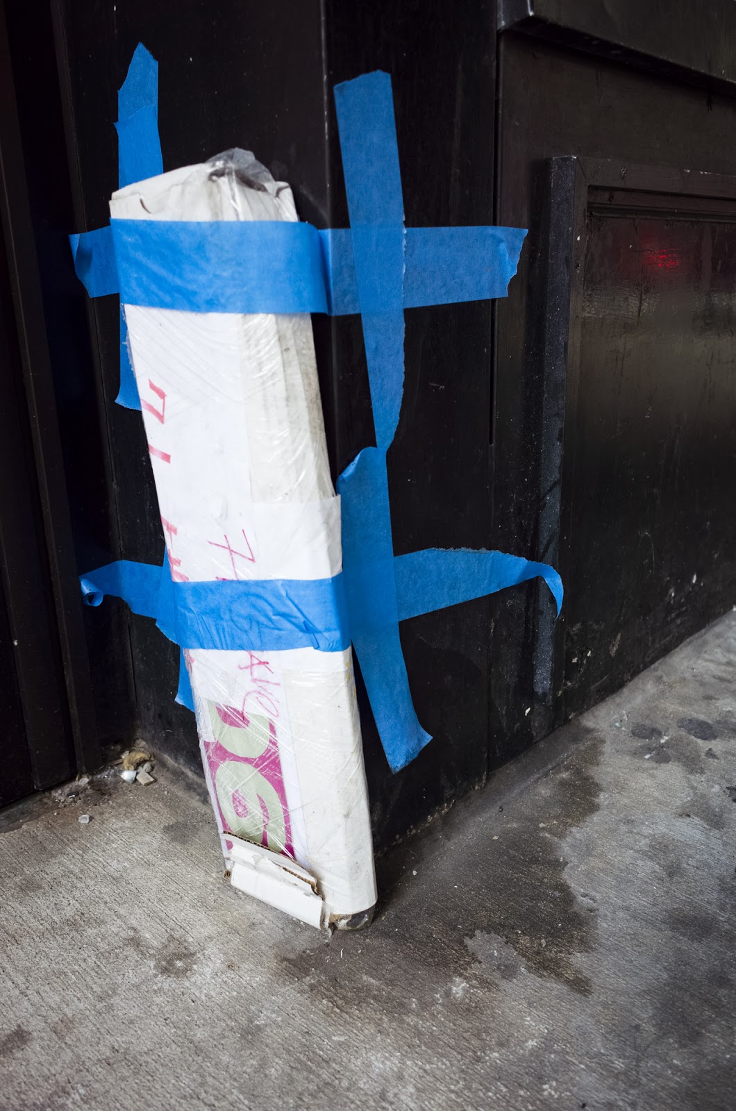
If there’s an industry that has the most urgent need to convey calmness, soothing and relaxed, it’s construction. The simple shade of blue was common at NYC’s many construction sites—we noticed the shade in hardhats, painter’s tape, dumpsters, tarps, signage, and more. Sometimes it was an accent color, like on this dumpster outside our office, and sometimes it clearly dominated.

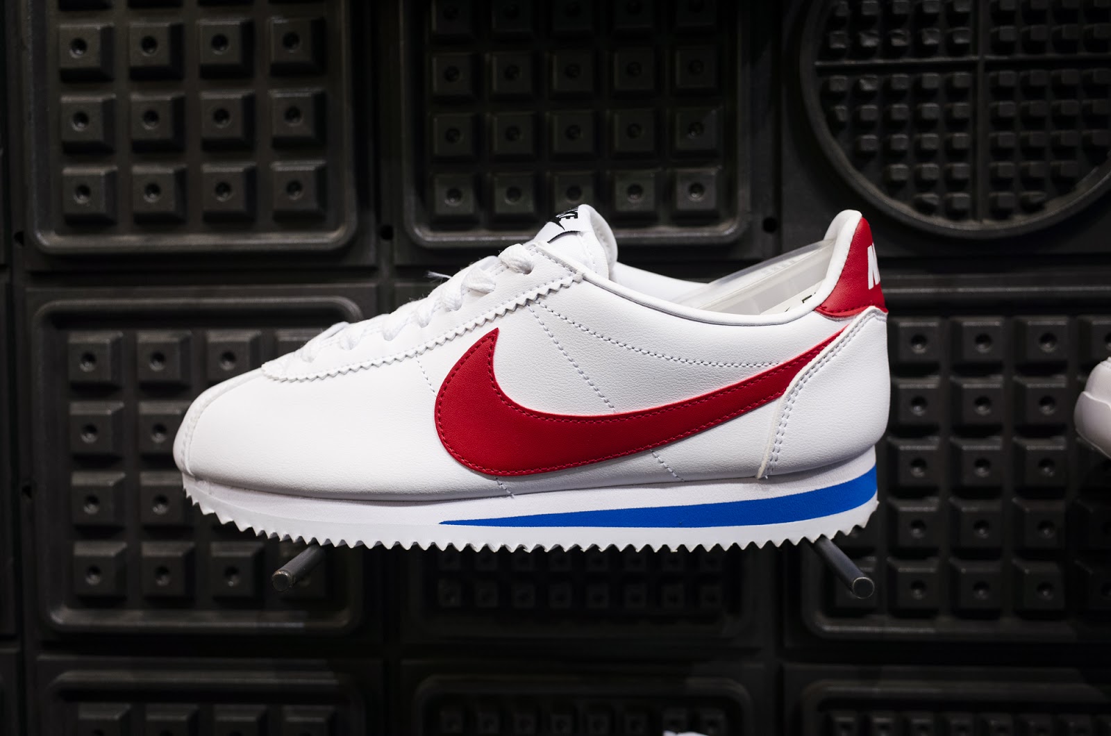
We continued on to retail, but didn’t have much luck there. It largely made sense—everything about window displays at most retailers tries to evoke hip, trendy, cutting-edge. Blue didn’t appear too frequently in the windows, but we did notice it a few times inside some stores. Perhaps its most apt sighting of the day, we saw a little Classic Blue in the original colorway of a pair of Nike Cortez.
So to recap, we didn’t expect to see Classic Blue in a lot of hip, trendy places, the types of places that we’re used to seeing former Pantone COTYs like Living Coral. Frankly, we didn’t expect to see very much of it at all in this neighborhood. That was mostly true, but not completely. We did see Classic Blue far more frequently than anticipated, but mostly related to the aesthetics of banks or construction sites.
But it seems like that’s the point; classic is right there in the name. It’s reassuring, calming, soothing in the face of uncertainty… and the places that we saw the color seem to be attempting to evoke that exact feeling.