UI and UX designers have been calling for the death of skeuomorphism—the design concept under which objects in a graphical interface imitate the design of real-world objects—for years. First, it was dead, then it was risen from the dead, then it was just out of fashion. But this debate simplifies the influence that skeuomorphism has wielded over both interactive designers and users. It collapses a few complicated questions: Is skeuomorphism a useful design principle anymore? And if so, how?
In the debate over its value, skeuomorphism and “flat” design often get pitted against each other—even though they are not, actually, mutually exclusive. The former is a principle, the latter is a style.
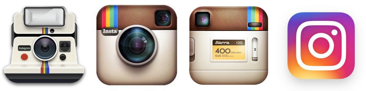
Skeuomorphic design can often be hyper-realistic—as seen in the earliest Instagram logos. (Remember that moment in 2010 when the logo was an actual Polaroid camera?) Realism doesn’t matter to flat design, which can border on abstraction, taking its influence from the International Swiss Style of the 1920s.
But the effectiveness of flat design in UI is still predicated upon “affordances.” In other words, users have to know the properties of something to know what action to take. So while flat design isn’t trying to adhere to the real world, it can certainly incorporate—or even rely on—skeuomorphic forms in order to be successful.
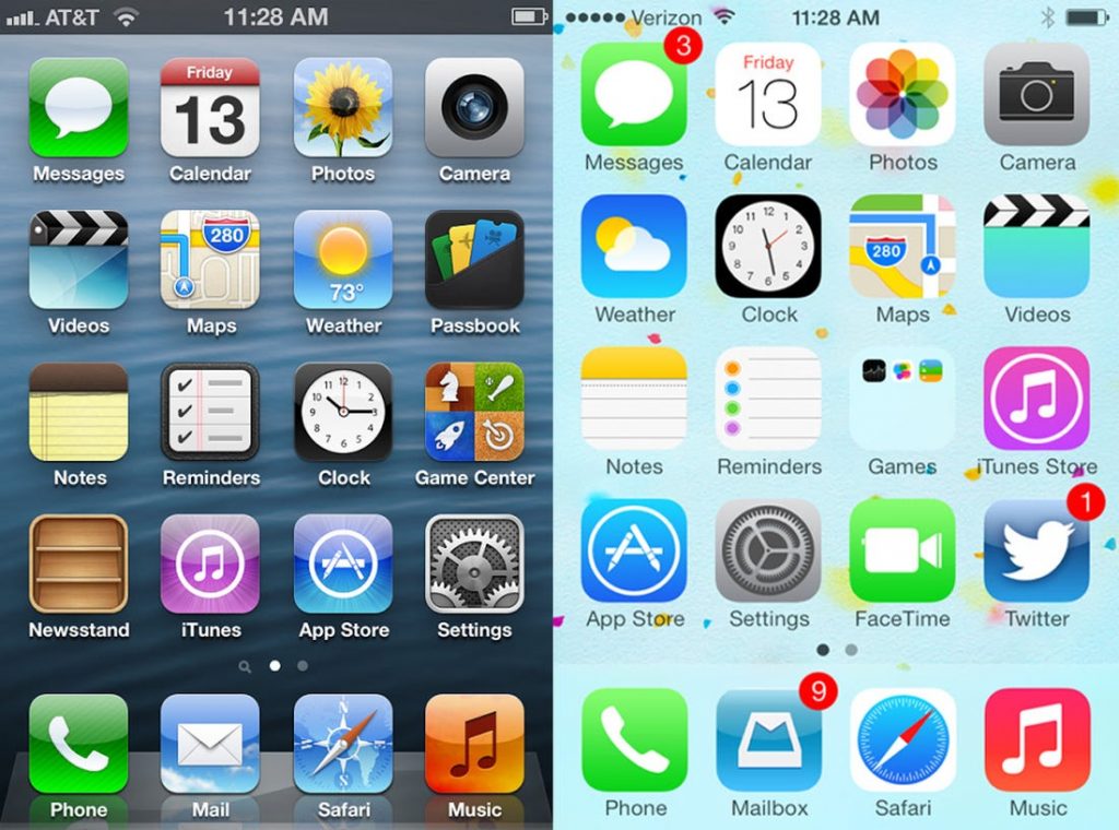
The theory has it that flat design took hold of the design world (yet again) in September 2013, when Apple software update iOS 7 introduced a new app style: flat, matte, high contrast. Since then, flat design has proliferated, moving from one rebranded industry to another—though interestingly, Apple seems to be moving away from flat design already. And as when any trend reaches saturation, speculators are bound to ask: when will flat reach its tipping point?
Hello, Neumorphism
Enter New Skeuomorphism, a.k.a. “Neumorphism.” The term was coined by UX/UI designer Jason Kelley, and then adapted by Michal Malewicz for his post “Neumorphism in user interfaces” for the UX Collective. Malewicz describes Neumorphism as a specific style that basically lifts flat designs with dimension—a 3D style that maintains a sort of “flat” effect through a minimalist palette.
Malewicz gives the credit to this Dribbble post by Alexander Plyuto for starting the trend. The post reads, “Let’s imagine that we live in a dimension where skeuomorph is still alive and continued its evolution in mobile interfaces. What would applications look like then?”
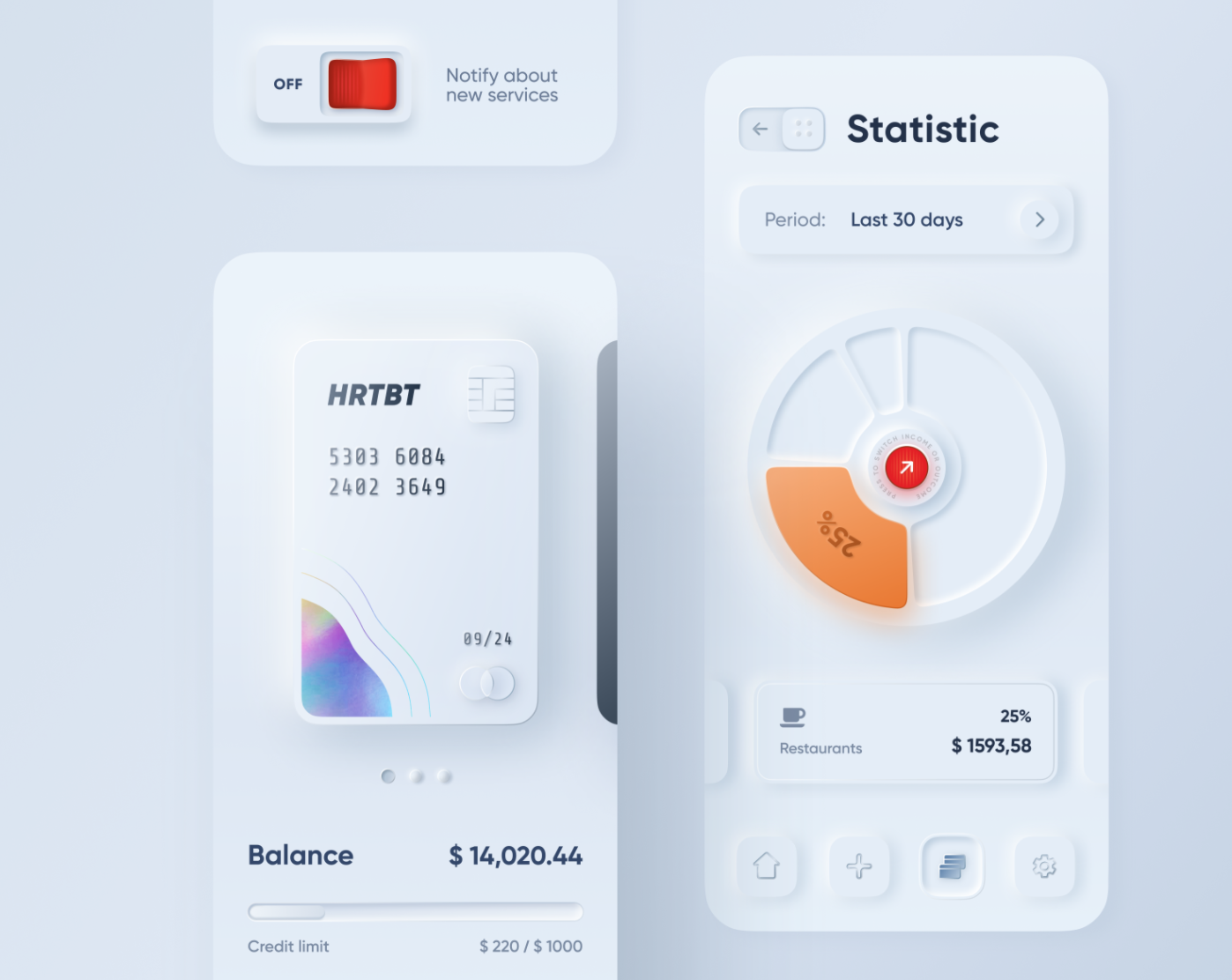
For Plyuto, apps would look like the millennial apartments that get featured in Architectural Digest—satin, minimal, white. What makes this style identifiably neuromorphic is how the 3D illusion is created by color. Plyuto has kept both the background and the foreground color the same, using a very light shadow to make each icon look like it’s hovering.
Some of the skeuomorphic toggles—like that bright red button that reads “off”—look like they were plucked from the side of an old flashlight, or a Walkman that has run out of batteries. Yet, those same toggles and switches seem to be sticking points—there’s text next to one, there’s an arrow pointing in another. While the shapes are familiar, it doesn’t seem as though their uses are intuitive.
As Malewicz points out, neumorphic designs struggle with the same functional problems that all flat design does—it’s unclear what’s clickable and what’s not.
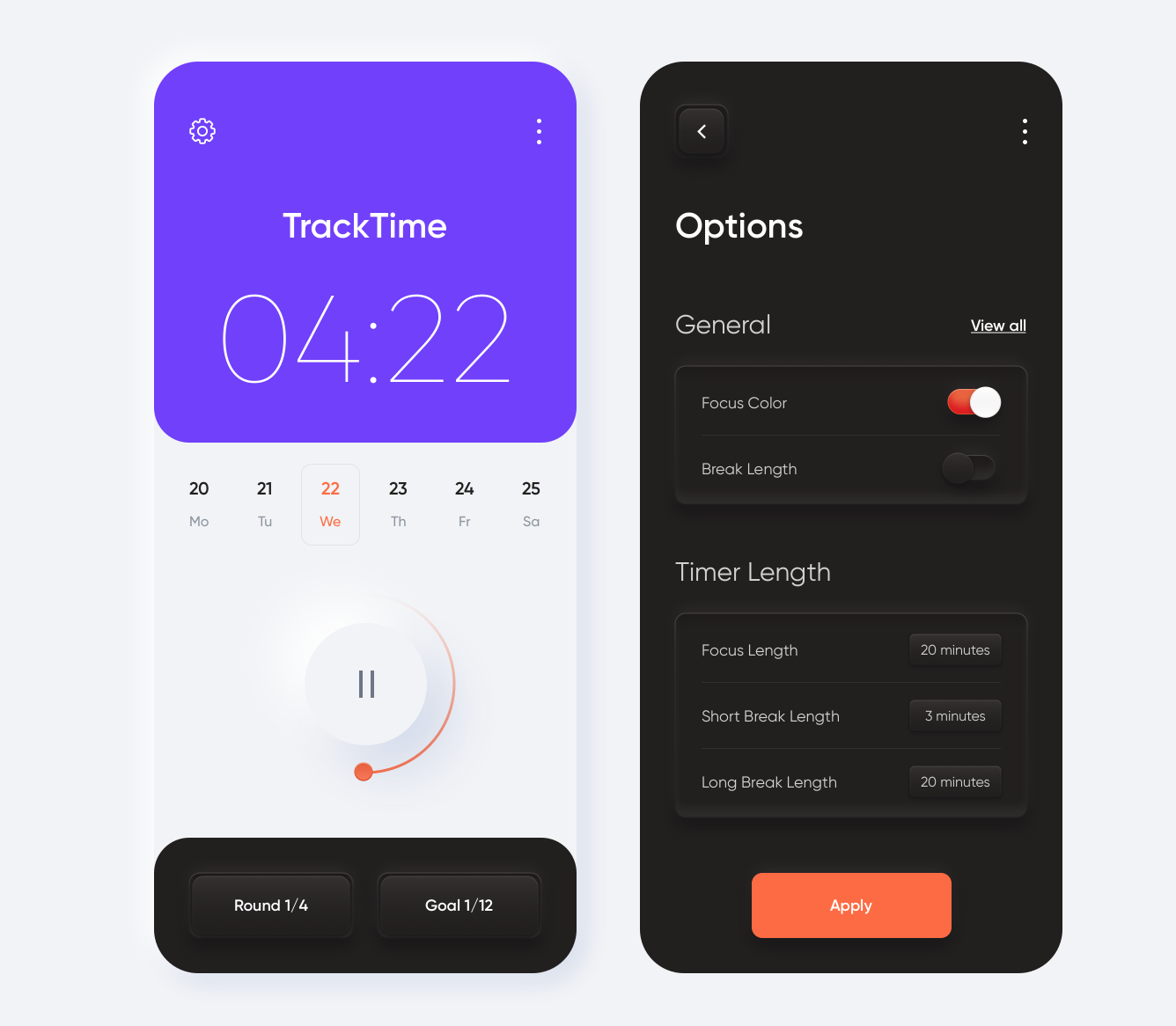
For example, in this mobile app tracker designed by Outcrowd, some visibility concerns begin to arise. In the dark mode, there isn’t a lot of contrast between the cards and the buttons that rest on top of them. “20 minutes” is a button, right? If “20 minutes” is a button, does it mean that “Goal 1/12” is, too? If you click on 20 minutes, does it turn orange to signify that it’s been pushed, or do the shadows simply invert? You can imagine how hard that would be to see for someone who’s visually impaired, or in a room with bad light.
While the functionality might be questionable, there’s something about how these subtle shadows and highlights interact with the flat aspects of the design—like the periwinkle timer in the left rendering—that speaks to a different relationship to flat design, one that seems new. This is why, even though this is just a trend, so many are promoting it as a second coming, anyway.
Is neumorphism here to stay?
The most important tenet of modern design is that simpler is better. This might account for why flat icons, in their isomorphic distillation, have been so popular for so long. Neumorphs—while perhaps a fun throwback to the plastics of your childhood—make interaction complicated. They’re context-specific, and, as Malewicz points out, they’re not that easy to code. But even with the difficulties neumorphism poses, it’s delightful to look at. And often, that’s enough.