Among all the unpublished manuscripts, personal letters, and other artifacts emerging in this centennial of J.D. Salinger, the most revealing may be two drawings the author did sometime after going supernova.
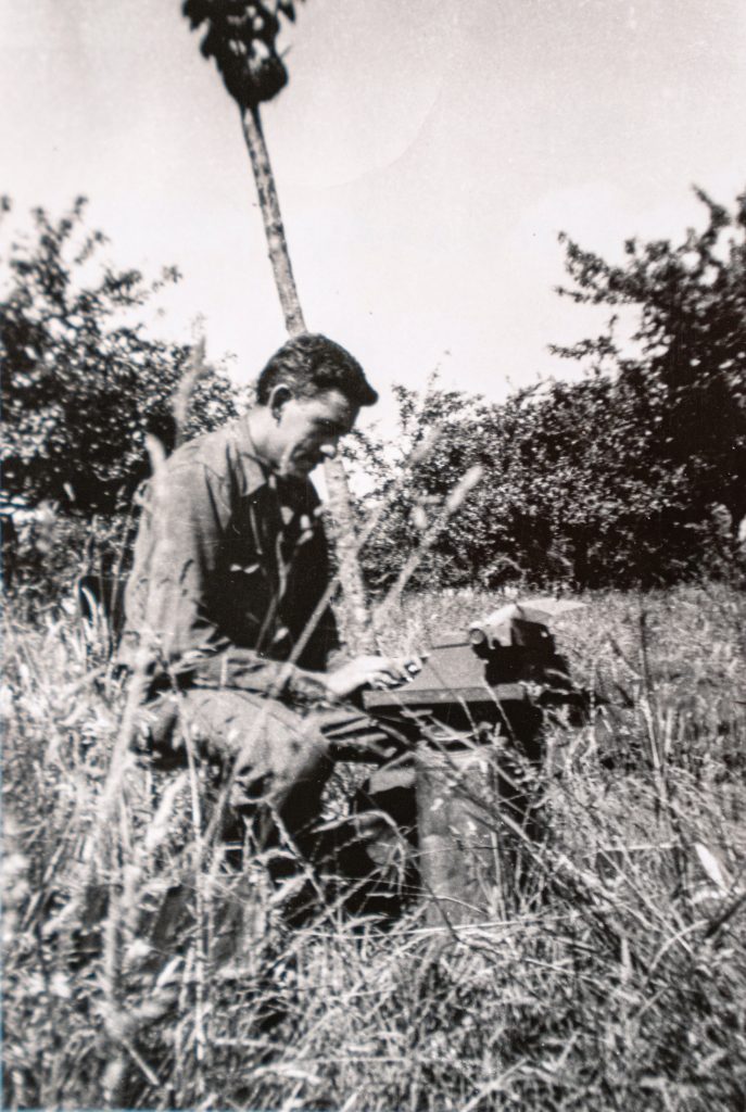
In 1951, his debut novel, The Catcher in the Rye, sparked massive acclaim, sold millions of copies, and inspired its author to move from New York City to a home on a dirt road in Cornish, New Hampshire. Here, he entered early-stage Salinger Syndrome—shunning interviews, refusing photographs, becoming a world-renowned recluse—and, it turns out, adding “graphic designer” to his resume.
Salinger was always more than protective of his prose. He nearly mutinied over a proofreader’s insertion of a single comma into a New Yorker story. Post-fame, his sphere of control extended far beyond just words. In 1959, as publisher Little, Brown & Company was preparing a hardcover edition pairing two of his short stories, Salinger not only demanded that his photograph be removed from its dust jacket and that the cover include only his name and the stories’ titles. But he also sent a sketch specifying the exact color of its border: a “shade of brown #118 or #117 from the color chart of Webster’s New International Dictionary, Second Edition.”
The kind of detail raises a few questions, namely: Are these the notes of a bibliophilic aesthete? A creator not just of characters, places, and plots, but some Wagner-styled comprehensive-artwork totality? Did he perceive a whole spectrum of visual cues in books beyond what most of us see? Or, to put it bluntly, is “shade of brown #118 or #117” his version of from The Shining‘s typographical fugue “All work and no play makes Jack a dull boy”?
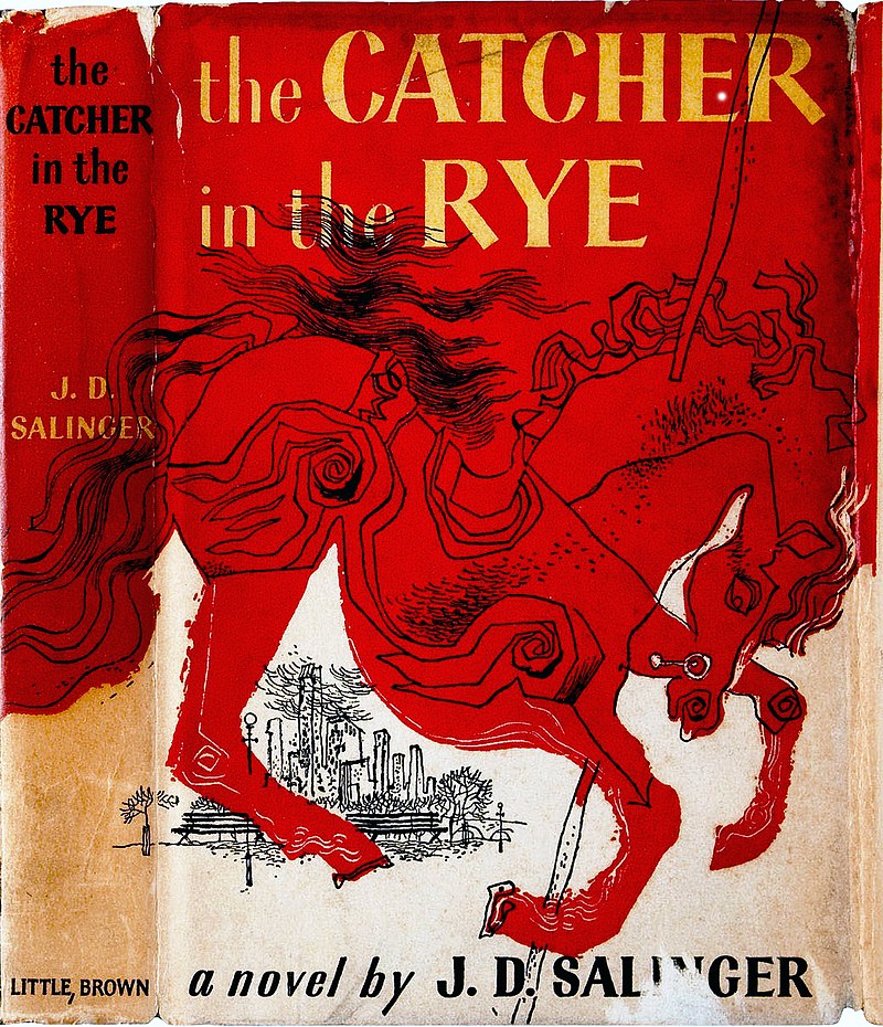
Maybe all of the above. Salinger’s specs for his cover aren’t mere acts of redaction. Simply by imposing such restrictions, the practicing Buddhist created an austere visual style of his own. He had a sure eye for tones, placement, and font. In 1964, once Bantam acquired the paperback rights to The Catcher In the Rye, he again designed its cover—a field of Exeter crimson, title and author’s name in all-caps gold serif font. That cover became a generation’s visual signifier for literate soulfulness and teen angst, making its sole tragic appearance in the hands of Mark David Chapman, who was photographed holding the book after being arrested for the murder of John Lennon.
Courtesy of AbeBooks
Salinger’s life was as original as his fiction, but his drawings suggest a hidden kinship with a cadre of other sui generis authors. Some, like Günter Grass and Tolkien, were multimedia visionaries, their world views as discernible in brushstroke as in type. Others, like Saint-Exupery and Vonnegut, leaned toward comic surrealism, sending off verbal jeux d’esprit with sketches or one-panel scenes. Still others are mostly cautionary tales. A year after The Catcher In the Rye came out, Jack Kerouac was shopping a follow up to his 1950 debut, The Town and the City, and he, too, sent a publisher some thoughts on cover design—a study-hall pencil scrawl of a man, on a road, bound for “Denver,” “Chicago,” “New York” and other sites in all-caps. He got a pass from the publisher and waited another five years before his crowning achievement was published.
Courtesy of The New York Public Library, Astor, Lenox and Tilden Foundations and the J.D. Salinger Literary Trust. Photographed by Robert Kato
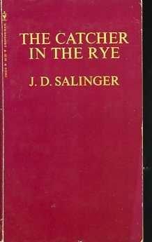
In 1990, while Salinger was still living in Cornish, married to a woman 40 years younger, and writing fiction he had no intention of publishing, he returned to cover design. Little, Brown had reacquired paperback rights to The Catcher in the Rye and other works, and were preparing to publish the first. Salinger sent a letter to his agent with some thoughts on the new covers. The New York Public Library’s new exhibit of Salinger arcana includes a typed letter to his agent, dated June 25, 1990, where the author decrees “all four book titles to be printed in jet-black ink. In plain simple type, much like 36 Point Caslon 540 ATF.”
He goes on. “I would prefer, of course, that the title and author’s name be placed lower, more nearly centered on the cover than outlined in the attached sketch … Bantam thought my original mid-cover placement of the title for Franny and Zooey not suitable for ordinary sales-rack display. (So I added thin green parallel bars across lower third of the corner, to compensate for any imbalance, top-heaviness, or placing the title too high at the top. I think my vivid diagonal bars should carry things off nicely enough.)”
In the upper-left corner of the cover design, Salinger’s scrawl diagrams the color each bar should be, arrows pointing to: green, orange, blue, purple, black, brown, red, and yellow.
After his signature, Salinger adds this suggestion: “Why not send this along, as is, to Little, Brown, with the sketch in tow.”
Beside this letter and sketch, the NYPL’s Salinger exhibition has mounted a copy of Little, Brown’s 1991 paperback edition of The Catcher in the Rye. Whether a sheer triumph of the will or testament to an unsung visual style, the cover is exactly as its author specified.
Courtesy of The Ann Arbor News