Can a font really be racist?
Well, not exactly. Fonts are inanimate. They don’t say, do, or believe anything—they’ve never even retweeted anything sketchy. But fonts can (and often do) have problematic origins. Maybe they were created by a designer with racist, anti-semitic, and/or totalitarian leanings. Or maybe they were used (sometimes even created) for propaganda purposes, or to stifle dissent in certain populations. Even in our current climate of heightened sensitivity, it is hard to imagine castigating a designer for espousing the values of whoever designed the fonts they choose. But maybe it’s time to just stop using these fonts, anyway?
Now that one of the most prestigious type organizations has folded amid allegations of racism, it’s a good time to ask ourselves whether the fonts we rely on to convey messages also have some unsavory associations. As the Wu-Tang Clan’s RZA showed with his rewritten ice cream truck jingle—the original song was a remnant of minstrel culture—we can wash away the residue of racism, even when we didn’t know the residue was there. “Replace negativity with positivity,” RZA recommends, and we agree. It’s just a good practice. Here, we’ll uncover some of the tainted pasts of some common fonts.

Fraktur
The Fraktur family of fonts—often referred to by its style, blackletter—has a complicated history that’s stained by its association with the Nazi party. Blackletter was originally a script used across Europe from 1150 to the 17th century. In particular, Fraktur became the traditional and formal typeface of Germany leading into the Nazi period. At first, the Nazis were more than willing to carry on the tradition… until they learned that many blackletter fonts had Jewish origins. Hitler commanded the Nazis to adopt Antiqua typefaces, first developed in the 15th century, as a replacement—as well as the geometric sans-serif Futura, for which he had a particular penchant. The great and tragic irony is that the typographer who designed Futura in 1927, Paul Renner, was arrested when Hitler shut down the Bauhaus.
If you’re looking for an alternative, think about using the medieval script Rotunda. Sometimes it’s considered a blackletter; other times, it’s seen as its own thing. It’s related to Carolingian minuscule, and was mostly used in Southern Europe.
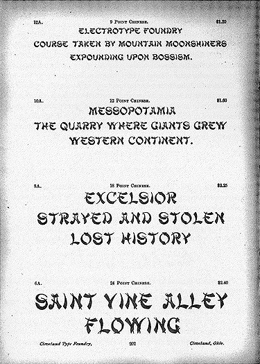
Mandarin
Henry Thorp, 1883
Originally issued as “Chinese” by a foundry in Cleveland, Mandarin was one of the first—if not the first—“wonton fonts” produced in the United States. A wonton font is a Roman typeface offensively styled to evoke an Asian writing system. Beginning in the late 19th century, the creation of these appropriative typefaces came about as a result of new immigrant populations from Asian countries (China and Japan in particular) residing in the U.S. Unfortunately, they are still commonly and inappropriately used in various food-related contexts, including on restaurant awnings and grocery store packaging. Some other more recent examples include:
- Buddha – Schelter & Giesecke, – 1894
- Ginko – Paul Pegoraro for Monotype, – 1995
- Jing Jing – Steve Matteson for Monotype, – 2002
- Kanban – Ed Bugg, – 1986
- Wedge Gothic – Barnhart Brothers & Spindler, – 1893: Originally cut for the Chicago Herald, the font was renamed “Japanet” in 1925—and appeared as “Japanette” in VGC’s 1972 catalog.

Prokyon
Erhard Kaiser, 2002
This neo-grotesque sans-serif was designed by a nationalist and known member of the far-right anti-Islamic organization Patriotic Europeans against the Islamization of the Occident (PEGIDA). Technically, he’s a member of the local chapter based in Leipzig, called LEGIDA—which is considered even more radical. Whether or not you agree that Kaiser’s personal politics have an impact on the font itself, read Agyei Archer’s editorial to understand how the type industry’s support of Kaiser impacts BIPOC typographers. Kaiser’s other typefaces for the Dutch Type Library also include DTL Antares, Kis-Antiqua, Kleopatra, Quadro, and Fleischmann.

Neuland
Rudolph Koch, 1923
German typographer Rudolph Koch wanted Neuland to be the next great blackletter. He blended the jagged, interlocking letterforms of the traditional style with the space and legibility of a modern sans-serif. He might have been successful, if not for one issue: it was lost in translation. That’s because the U.S. had no history of blackletter. Rob Giampietro explains in his 2004 essay, “New Black Face: Neuland and Lithos as Stereotypography,” that when Koch’s font arrived on this continent, it was immediately perceived as a woodblock type. Also known as a circus type, woodblock’s chunky and crude letterforms were typographic representations of the uneducated lower class. These representations were strongly associated with Black populations, often accompanying depictions of former slaves in advertisements. In other words, Neuland fit well into the tradition of typographical Blackface that was already established in the states. Since the 1920s, Neuland use in stereotypical contexts has persisted—it’s on movie posters for Jurassic Park, Tarzan, and Jumanji, as well as covers for Richard Wright’s Native Son and Wulf Sachs’ Black Anger.

Neutraface
Christian Schwartz, 2002
This sleek geometric sans-serif was designed by Schwartz with consultation from Dion Neutra, the son and former partner of the modernist architect Richard Neutra. It had the goal of developing “the most typographically complete geometric sans serif family ever,” as Schwartz says on his website. But since its development, the font has become less associated with Neutra’s design principles, and it’s taken on another meaning: Neutraface has become the ubiquitous font for house numbers, developing an unofficial reputation as the typeface used by luxury developments everywhere. Recently, Neutraface became a popular meme on Twitter, where it garnered the cheeky moniker “the gentrification font.” As Bettina Makalintal reported for Vice, Schwartz himself has noticed the trend: “I’ve joked about it when I give talks for years,” he said. “Anywhere I would go in the city, there’s the typeface enticing me to buy an apartment that I could never afford.”
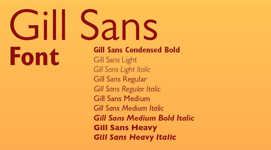
Bonus Bad Font: Gill Sans
Eric Gill, 1930
Gill Sans isn’t a racist font. In fact Gill, who also designed Joanna, was a socialist and very opposed to facism—at one point, he was a member of the Fabian Society. But Gill, who was a part of the Arts and Crafts movement and was well-known for his erotic art, participated in some problematic sexual encounters, which is why he’s ended up on this list. Of his own admission, Gill sexually abused his daughters, his sisters, and his dog. He wrote about it extensively in his personal journals, which were finally published in his 1989 biography by Fiona MacCarthy—and were met with scandal.
If you’re looking for a font to replace this particular humanist sans-serif, opt for Johnston. Designed by his teacher, Edward Johnston, the font might be familiar to you, as it’s the signage of the London Underground Railway (and has been since 1916). All you have to do is ask the Transport for London for permission. Another option: Frutiger, which has been described as a cross between Univers, Gill Sans, and Roger Excoffon’s Antique Olive.
There are more histories to uncover
In many ways, this short list is just the beginning of discovering what the histories of type have to teach us—both in its origins and in the contexts that it’s been applied. There’s no real way of knowing which fonts can be restored and rehabilitated through reparative contexts, and which should be forgotten, put into disuse. The answer to that will likely change as the times change. For now, the important part is simply to be able to recognize what we have around us, and to make choices that we can stand behind.