Try this experiment: find an architect you know, and ask them to write you a short note. Handwritten only, no typing.
Did it look anything like this?

You might not have ever noticed it, but it sure seems like a lot of architects write in the exact same unique style. What’s the deal with that?
Believe it or not, architect handwriting is somewhat of a contentious topic.
Necessity: The Mother of Invention
A quick Google search on the subject brings you a pretty plausible answer from some old school architects.
In the years before digital drafting tools became commonplace, having a uniform handwriting style was a necessity of a collaborative design process like architecture. Multiple people would be making their marks on any one blueprint—writing new notes, correcting existing notes, sometimes even just changing a word or two in the middle of a sentence.
Without a uniform style, you can imagine what a mess this would turn into in very short order.
So some architects were taught a certain style of writing—dictated by a combination of guidelines and the function of their frequently used tools.
The result is a typographic style that is extraordinarily even, with precise vertical lines, and a slightly bubbly aspect to curved letters. It’s strict, but surprisingly warm.
This style of writing was famously used by architectural illustrator Frank Ching, whose books on drawing and graphics—including Architectural Graphics—are standard issue material for architectural students. Ching used the distinct style throughout his many books, even including sections in the books dedicated entirely to the art of lettering. The style became so popular and synonymous with architectural work that Adobe created a font in 1989 based on Ching’s writing called Tekton and began including it in their design software suite.
Relic or Requirement?
In the age of digital drafting tools, does the architectural handwriting style still hold any relevance? Or is it doomed to go the way of cursive?
This is where opinions run strong in architectural communities.
“Some architects (or a few hipsters who took a drafting class) use it for everything,” says architect Luke Wesselschmidt. “If they send a card to their grandma, it’s in architectural script. I use it at work, but I rarely use it for anything else.”
To many young architects, it’s a relic of the past, and not really a necessity. Many university programs no longer teach the practice, or at the very least no longer beat it into students’ heads.
“I wasn’t taught architectural script in school, but a large number of my professors wrote in this style,” says Will Allured. “Architects should write clearly and legibly, but beyond that I think it’s strange to impose such a style on people.”
Reading through comments on architecture blogs, you get a sense that a lot of architects view it with a certain level of contempt—a frivolous thing that a certain type of architect does to seem sophisticated and learned.
“As long as it’s legible, no one cares what your handwriting looks like outside of school and/or your mother who is very proud of her architect child,” writes Reddit user crbn_kllr in the r/architecture subreddit.
Still, others miss the decline of the handwritten style, but theirs’ is almost entirely a romantic argument.
“It was a way architects could express pride of profession, and it was a great connector of all architects, everywhere,” writes Laura Thomas, Principal at Melville Thomas Architects, in her blog. “Watching it go away is like attending the symphony and seeing the musicians have exchanged their meticulous black tie for blue jeans. Something beautiful is missing.”
There is something to be said about aesthetics in a field like architecture—after all, great architecture is not just about maximizing economy and efficiency, but solving problems in a functional and pleasing way.
At the end of the day, the architecture handwriting debate seems to be a fruitless effort—just another battle in the war between progress and tradition.
“Romantic students keep the handwriting around, but not by professional demand,” says Wesselschmidt. “I even had a professor that wouldn’t allow us to hand mark on our drawings. That style is no longer in the world of presentation drawings, it lives in the sketches and notes.”
If you liked this story, you’ll love these…
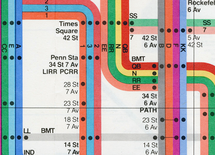
How Graphic Design Legend Massimo Vignelli Cracked the NYC Subway System
You Don’t Know Bauhaus
The Man Who Documents Design