It’s officially awards season—on Wednesday morning, The Recording Academy released its nominees for the 2020 GRAMMY Awards.
In addition to the awards for music, from Album of the Year all the way down to Best Classical Solo Vocal Album, The GRAMMYs recognize the people responsible for album packaging. Unless the performer is also the art director for the album (like Joni Mitchell, who won two GRAMMYs for Best Recording Package), this award generally goes to a designer working behind the scenes.
Last year, art director Willo Perron won for his work on St. Vincent’s Masseducation. Other Best Recording Package GRAMMY winners from this decade include Jonathan Barnbrook for David Bowie’s Blackstar and Caroline Robert for Arcade Fire’s The Suburbs.
There’s a lot of debate about what makes a good album cover, but here’s one easy way to boil it down into a simple question—does the album look like it sounds? Does its visual art match the sonic experience?
If the answer is yes, or even yeah, kind of, you’ve got effective album art.
So, who are this year’s nominees? Ceros Originals Creative Director Jeffrey Kurtz took a look at the artwork and analyzed below. But first, he had a few observations for the albums as a group.
Jeffrey Kurtz: This year’s nominees are full of hand-hewn qualities—illustration, textures, analog-process nods, organic and irregular line, form, and surface. There are limited color palettes seen here—both individually and, interestingly, as a group.
Finally, note that three of the five nominees are devoid of cover type all together. Perhaps this is a reflection of the streaming-service music experience—where 80 percent of the music industry’s revenue is now generated. Here, album art mostly serves as a thumbnail on the phone screen, and the album title, artist, song are displayed in company with the art. When present, though, there is a great deal of organic character in the typography of the nominees.
Let’s take a look at each of the albums individually.

Courtesy of Choco World Music
ANÓNIMAS & RESILIENTES, Voces Del Bullerengue
Luisa María Arango, Carlos Dussan, Manuel García-Orozco & Juliana Jaramillo-Buenaventura, art directors
Bullerengue is a musical style that originated in the Caribbean region of Colombia. It is largely driven by elderly women who engage in call-and-response over complex hand drumming. For many of the elderly singers featured on this album—including Fernanda Peña, who might be as old as 105—this is the first time they’ve had their vocals recorded.
Kurtz: One of the first sounds to hit your ears when you queue up this record is those drums on the lower left of the album cover. From there, the rhythm moves like the botanicals bobbing, weaving, and stretching across the album’s illustrated scene. The limited color palette, honest line quality, and organic texture hint at the weathered confidence of the singers.
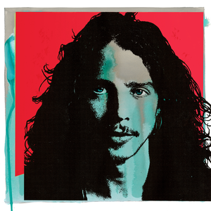
Courtesy of UME
CHRIS CORNELL, Chris Cornell
Barry Ament, Jeff Ament, Jeff Fura & Joe Spix, art directors
A posthumous release from the Soundgarden / Audioslave / Temple of the Dog frontman, Chris Cornell honored the artist’s career with a collection of his greatest works. Jeff Ament, the album’s art director who’s better known as the bassist for Pearl Jam, has already won a packaging GRAMMY for his work on Pearl Jam’s Lightning Bolt. Ament and Cornell collaborated frequently, and they formally performed together in Temple of the Dog.
Kurtz: There’s a lo-fi boldness to this cover, an embraced imperfect-ness. Left with few other elements to investigate, it’s Cornell’s face and eyes we spend the most time deciphering. Framed by a few layers of increasingly chromatic color, the high-contrast silhouette and solarized tones of his face land his enigmatic gaze directly at the center of attention, demanding engagement—a fitting corollary to a retrospective of Cornell’s illustrious career.
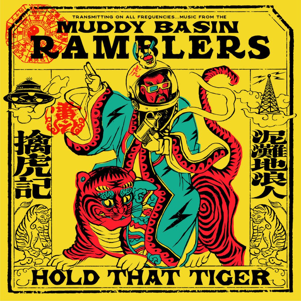
Courtesy of Hove / The Muddy Basin Ramblers Music Workshop
HOLD THAT TIGER, The Muddy Basin Ramblers
Andrew Wong & Fongming Yang, art directors
The Muddy Basin Ramblers are a group of American, Scottish, and English expats playing roots music in Taiwan, blending cultures, genres, and histories in a seamless way. The album title comes from the refrain of American jazz classic “Tiger Rag,” but the album art says anything but old-school American jazz.
Kurtz: Laying eyes on this album, we’re immediately met by a mashup of cultural references that leave us guessing what world we’re about to enter. The limited inks on a bold field of yellow, the headlining display type in multiple languages, the playful punches of both vintage 1920s sci-fi and Asian zoomorphic iconography, all organized by a distressed graphic frame. Can we just call it Circus Poster Pow meets Global Sci-Fi Pulp Fiction Wow? In the liner notes, we learn that The Ramblers are expats living in Taipei, which explains a lot. But in the end, maybe an emperor in a space helmet, wearing 3D glasses and riding a tiger donning polka-dotted eye-liner is a mystery more fun left unsolved.
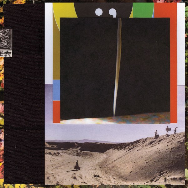
Courtesy of Jagjaguar
i,i, Bon Iver
Aaron Anderson & Eric Timothy Carlson, art directors
Bon Iver’s fourth studio album clearly resonated with the Academy—it was also nominated for Album of the Year and Best Alternative Music Album. This also marks the second GRAMMY-recognized collaboration between Bon Iver and Carlson, who was nominated in 2017 for his art direction on 22, A Million.
Kurtz: Stepping into this cover, we have choices to make. Namely, which way to go first? The album’s collaged composition of frames and imagery doesn’t make it clear what “door” to step through first, especially at the small scale our beloved stream-iverse UIs favor. Rather than a tutorial for how to interpret this record, the cover is more of a choose-your-own-adventure narrative. The clearest message is that we’re taking a journey into the unknown. The landscape with the voyaging figures confirms that. But still, what are their bags packed for? What’s over that horizon? What’s through that incision? What’s around that edge? What’s behind that frame?

Courtesy of FanTasy
INTELLEXUAL, Intellexual
Irwan Awalludin, art director
Intellexual is a project from Nico Segal and Nate Fox, two members of The Social Experiment, who frequently collaborate with Chance the Rapper. Awalludin, the album’s art director, has collaborated with a number of rappers to create their album art. He’s worked in the past with Rich the Kid, Playboi Carti, Mike WiLL Made-It, and Rae Sremmurd.
Jeffrey: Wonderfully suited to the band’s word-play name (and that of this eponymous album), the minimal line quality and abstracted content playfully invite us to guess if we’re peeping at contorting brain structure, or through a keyhole at wriggling bodies in an orgy. Either way, minimal composition leaves the curtain pulled wide for us to make our own evaluation.
UPDATE: The art directors behind Chris Cornell were announced as the winners at the 62nd GRAMMY Awards.