


Using animation and interaction effects can really bring your experiences to life. But if you’ve never designed animated content before, we know that it may be challenging to know where to start.
To help you get started, we’ve outlined a few best practices for incorporating animation and interaction effects into your experiences.
Consider What Needs to Be Animated
One of the biggest trends we’ve noticed when designers first start animating in Studio is that they create animations that are too slow. While a slow animation catches your eye, it does so in a negative way. If you’re making the UX worse with animation, then you must consider if what you’re animating truly needs that treatment.
It’s crucial when designing to take a couple of steps back and ask yourself these key questions:
Is this animation benefitting your piece?
Are you using an animation because the option is available?
How does the animation impact the overall story?
Animation can be powerful, but if used in the wrong way, it can distract from your content’s purpose. This raises another issue we find many new designers running into: if you don’t look at the whole project as a holistic experience, you may produce animations that don’t further your story. To develop successful interactive content, you need to consider your narrative, visual design, and animation/interaction effects from the start.
A great example of animation done right is Better Up's Mental Health Action Day landing page. In it, you’ll see how their animations work to serve the overall story and don’t detract from the experience:
Experiment with Animation to Find the Right Balance
The best way to discover the right balance for the animations in your experience is by jumping into the Studio and starting to experiment with different effects. You can imagine the concept in your head, but animation is best done in practice. What’s great about Studio is that it has a live preview environment you can use to tweak multiple animations at the same time and change how things fade in and out. Experimentation is key to discovering what works and what feels instinctual in the animation process.
Use Your Story to Dictate Interactions
When it comes to deciding what parts of your experience need interaction effects, it’s best to look at your narrative. Interactions also depend on your content type and whether you’re designing a magazine, infographic, eBook, or microsite. Deciding on interaction effects (clicks to reveal, lightboxes, etc.) begins early in the process, when the story is still a flat piece of content. With infographics, for example, we need to balance information aesthetically.
Because many interactions can be discovered in the copy during the early stages, these effects become a collaborative process between the designer and copywriter. Here at Ceros, we usually start with a rough script that provides the overall framework of the narrative. From there, the designer and copywriter work collaboratively to determine how information will be layered and where interaction effects are appropriate.
Similar to animations, interaction for interaction’s sake can be pointless and detract from your experience’s original intent. The best practice is to work out those areas of opportunity early on and take advantage of them. By creating well-placed interactions, you’ll gain valuable insights into your piece, understand where people are most engaged, what they’re clicking on to learn more, and how the content and design are working together.
Consider Differences in Designing Multi- and Single-Page Experiences
Your animation and interaction choices will change depending on how long your experience is, mainly because the user behaviors are so different. Multi-page experiences have more constraints and limitations within the canvas rather than longform, single-page experiences that allow for more flexibility. However, details may get overlooked when working on a single-page piece.
If you’re animating a multi-page experience, there is freedom in being able to animate different elements within each section. You aren’t constricted by an established flow. In contrast, when creating a long-form, single-page experience, your animations need to play nice with each other and must flow well since they’re contained in a single linear page.
One benefit of single-page experiences is the ability to repeat animations, which enhances the UX. If a user scrolls back to one section and down again, they are able to experience that animation again.
When implementing interactions, it’s just as important to consider whether you’re designing for a multi- or single-page experience. This largely comes into play with calls-to-action (CTAs). When working with a single-page, long-form experience, it’s easier to give your CTA a fixed position on the page in an aesthetically pleasing way. Since there’s less canvas space on multi-page pieces, there’s less opportunity to get your CTA front and center.
Interactions will be different depending on the length of your piece and the canvas environment you’re working with. Because of this, it’s very important to consider what you want your experience to achieve.
If you want interactions to follow a more linear journey, a single-page piece will work better for you. A good example of this is the experience we created with Contently:

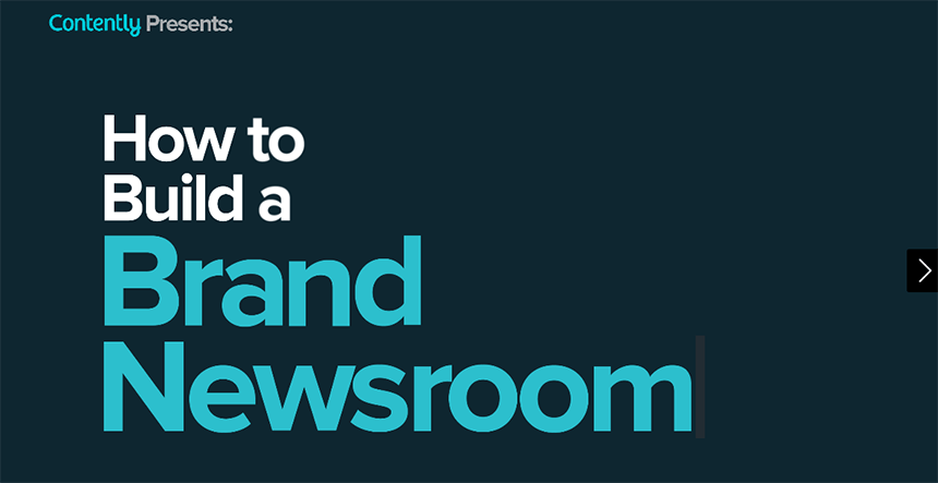
If you can envision using interactions to drive your users through chapters, a multi-page experience is a good option. Our Brand Newsroom piece created with Contently is a great example of interaction effects in a multi-page experience: